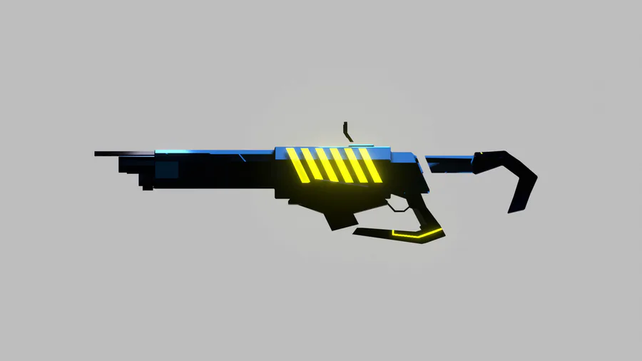
Added a few more details to the side of the gun just so it doesn't look too flat
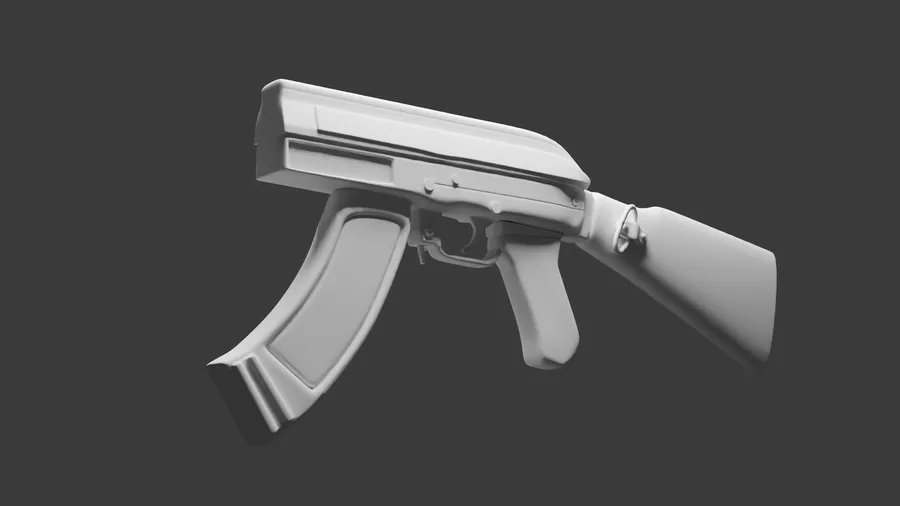
Next up
Alright I guess I'm going to be busy for a while.
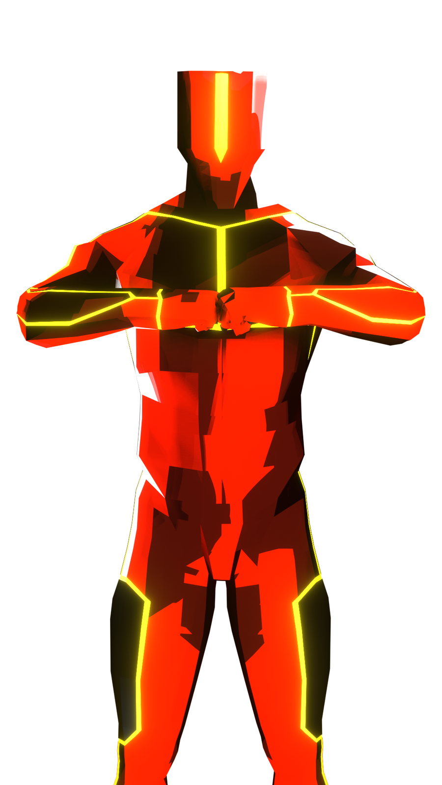
I'll just share the red version of the dude (-n-)
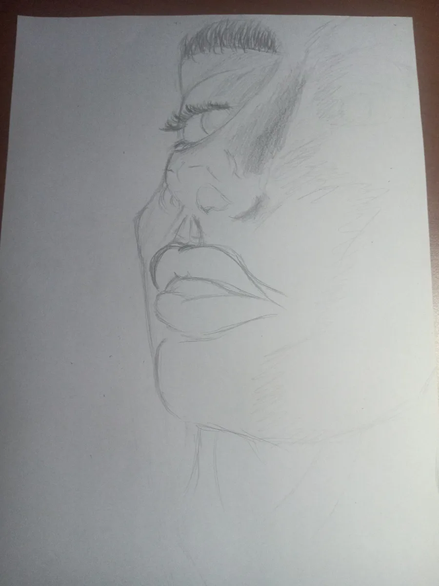
Haven't drawn in a REAAALLY long time.
Hope it comes out nice
I literally was working on right for "Male" character and then my battery died.
Shucks
Gun!!!
Concept art/model for THE game. It's not 100% perfect but it's close to the idea I have.
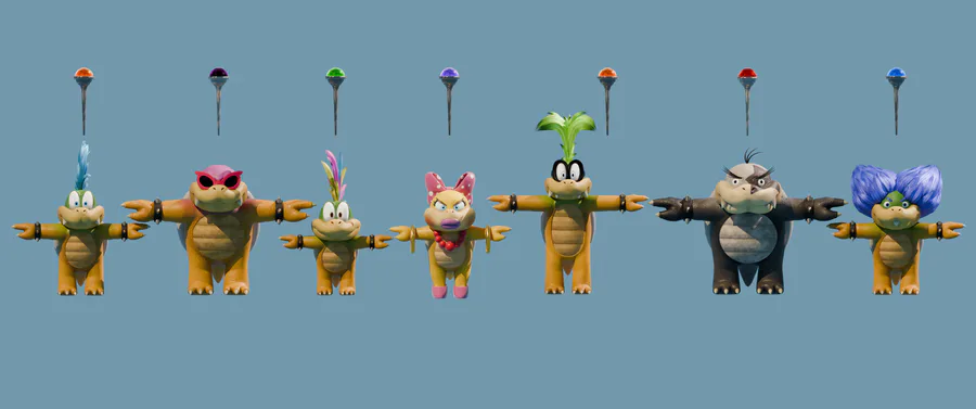
Here are all 7 Koopalings with my interpretation on how they'd look in Illumination's movies.
Give me feedback and any thoughts!
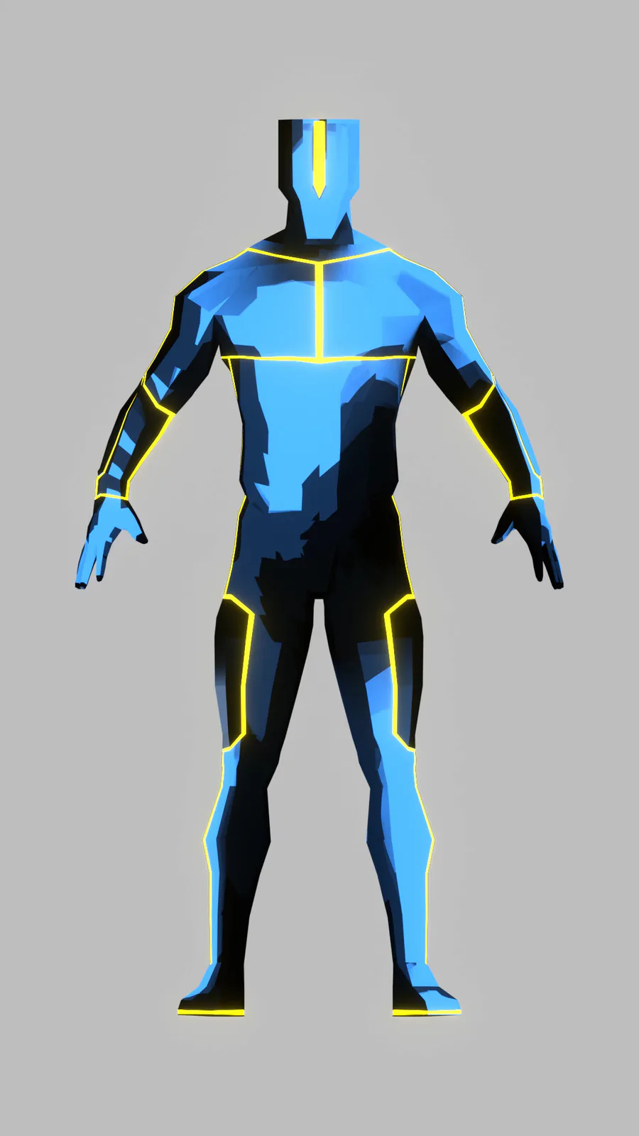
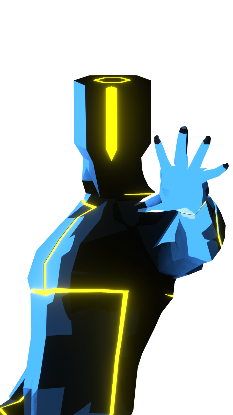
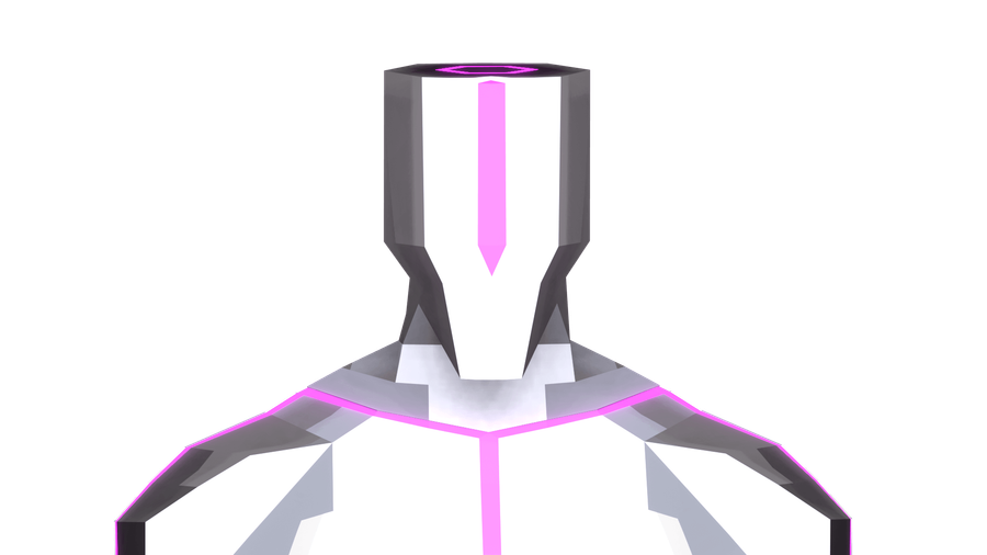
Character model.
Not official but it looks close enough to the "male" character I have in mind.
I outdid myself with this one though 😏
No I'm not dead just asleep...half the time 🫠
Game dev-ving is hard
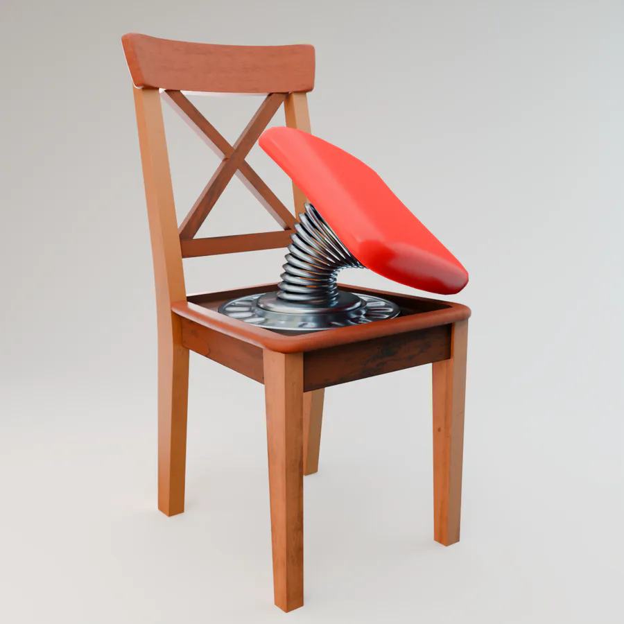
Here's another Bandit Trap inspired model I made in #Blender... Don't sit on this chair!! 
I want to create a game (I know it's weird coming from me) but the idea IS solid ✋👀🤚 but I need help.
I can't guarantee that the game will be a success but it's better to at least get it up and running.














4 comments