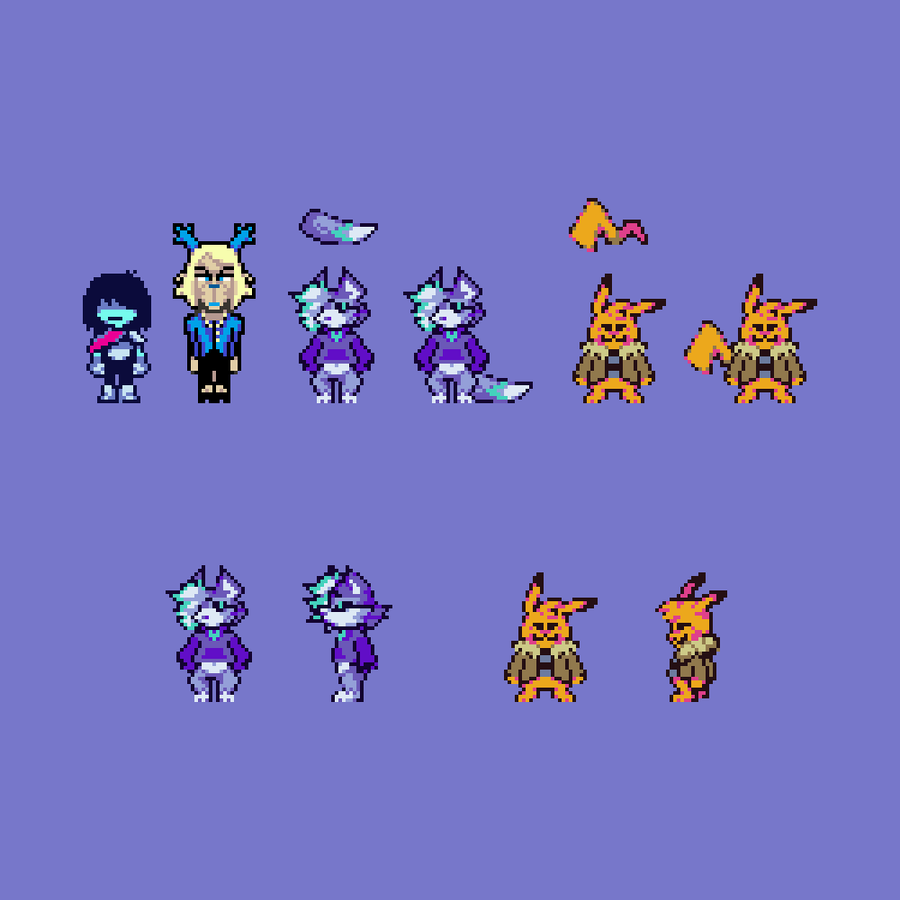
So I was talking to a friend yesterday about Undertale remaster mods and how some of them have some weird "remade" sprites and a generally overall inconsistent artstyle. And then we looked at UT Frosted and we peaked our pants!! And so it motivated me to finally take in one of these art tutorial requests and make one for picking the right color palette.
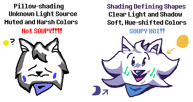
Beginner pixel artists often have a hard time when it comes to picking the right color palette and shading to their sprites. You'll often see sprites that look like this:

Now that? That looks terrible... But why does it look so bad or might be bad? Well, firstly, the color palette. It's just using darker shades of the same base color. That makes sprites look a lot more monotone and bland, no variance in color. This may work in scenarios where it could apply(like games that only use a range of black and white), but normally, you shouldn't do this.
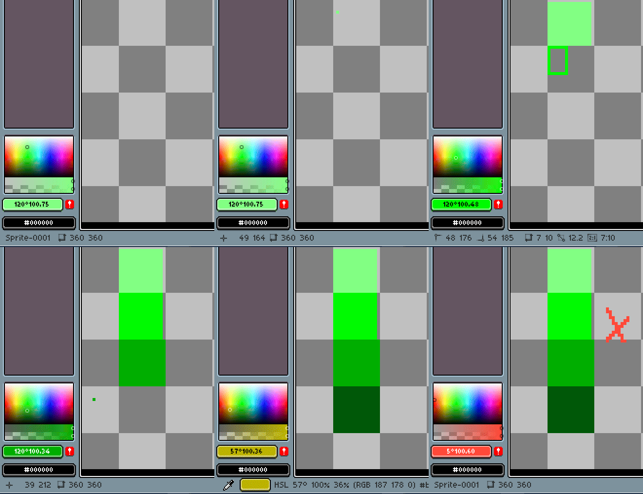
You want to pick a base color and move it throughout the rainbow. How do you do that? Well, one thing you need to remember, and a little color theory for you, is that warmer colors(red, orange, yellow, green) go towards the light, colder colors(cyan, blue, purple, pink) go towards the dark. Let's build a palette! Let's say you wanted to create a fire particle. You start with a base color:

And instead of going towards black for your darker color shade, you would shift the color a bit to the red, like this:

Better! And for a lighter color, you would then shift your palette towards, well, the light! Being yellow, like so:

Add one more dark red shade, and:

YOOOO we just made an awesome af fire palette!!!! Let's use it!
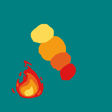
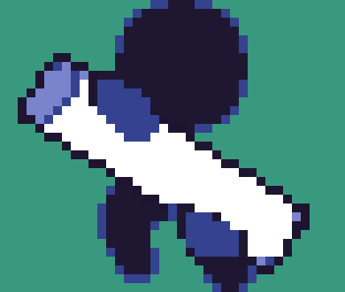
Beautiful. But if all that sounds too confusing for you, you could always just pick a palette from other people. They're just colors, afterall! I recommend a site like Lospec. So the next time you're trying to pick different shades of color, remember to pick a base color and shift it left or right on the rainbow. Shift a light blue to a purple, a yellow to red, white to blue or purple, etc. etc. Depending on your artstyle, you may want colors that look more washed out, so shift your base color to gray instead of black. Now that we learned this, let's bring Puos back and apply our knowledge to it.

Puos looks 10x better than if it had no shading at all! But damn!!!!!!!! It still looks ugly af! Why is that? Well, there is that second thing I didn't tell you about: Shading. Next part will discuss the shading side of things. Stay soupy!!
























12 comments