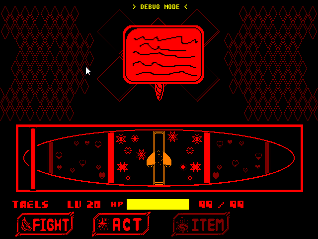
I see this with almost all of the Underfell, Swapfell, or otherwise any theme AU fangame and comic, and it's the practice of making nearly the entire battle GUI red or any single color. For people with eye problems, this is an issue. Having people stare at bright reds for most of their time is generally not a good idea.
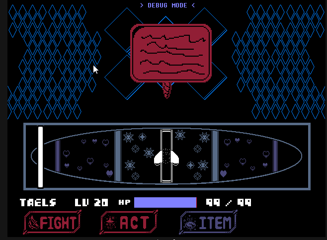
It would be oh so helpful if more people balanced the colors of their battle GUI. I think we've moved pass the Virtual Boy days, right? 👍
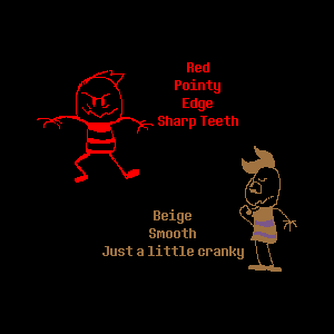
I also wanna add that not everything in Underfell is red. Red doesn't equal Underfell. The thought process that every Underfell take MUST have red or edgy personalities this fandom has brought upon is entirely wrong. I feel red should be used sparingly. Don't be afraid to mix it up with different colors, either.
Just a helpful tip.
(edited screenshots from True Geno)
EDIT: May 17, 2021 - Repurposed post to include theme AUs. Not restricted to JUST Fell!AUs anymore.












33 comments