Hello again and welcome to the 3rd dev log for everyone's favorite game that nobody will play!
After the last log, I assumed I'd finally start working on that illusive story mode I've been teasing for awhile, and I actually have a little, getting the code ready for this mode, as long as added a text system (made by Will_Wam on scratch)
But around this time I stopped working on this and DP episode 1 so I could finish The Dony Arcade - a collection of remakes of some of my old games held together with a little hub-world.
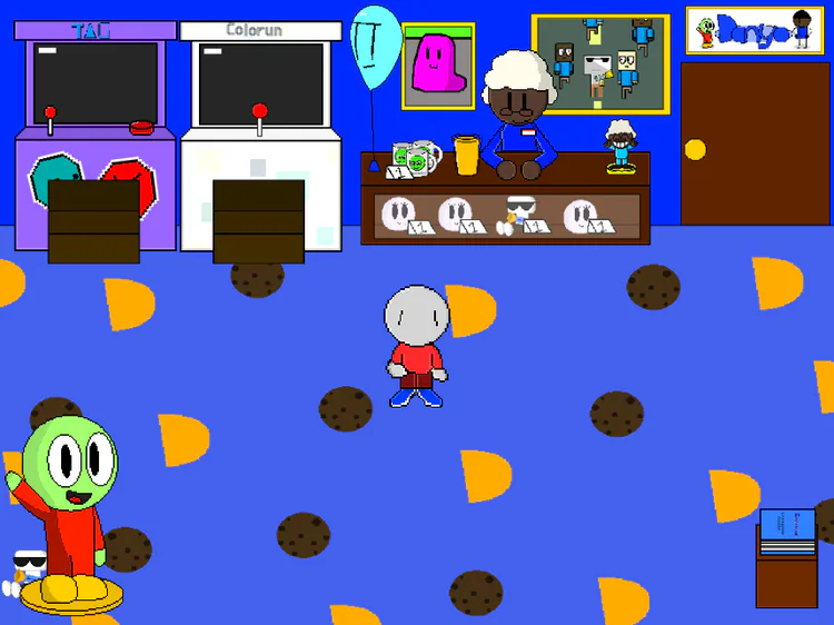
For that game, I made a remake of the very first game in the series (yes - another Tag remake, but this one's called Tag classic) in that game I basically made a mini Tag 2 with the old character designs, but during that I came up with some new ideas, like Redd having arrows over his head before the struck and other sound cues.
After that game was out and did decently well I took a good look and Tag 2 and realized that there were a lot of stuff that needed to be improved.
So, with all of that being said, let's get on about what I've been working on for the game since then!
Enemy sprite remake
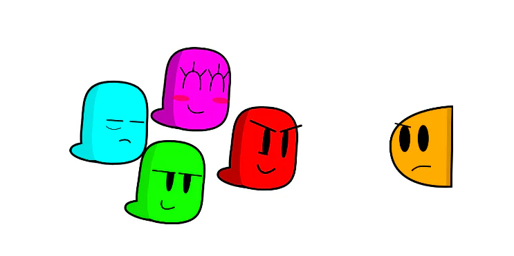
Firstly I decided I would remake the Tagger sprites, as they weren't really up to standards and seem to be untouched from the demo, and the more things changed from the demo, the better.
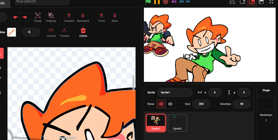
I also did this so that I could more easily scale the model if I so needed to. With my old way of making vector models, if I sized the model up, then the shadows would look wonky and i'd have to spend extra time fixing them.
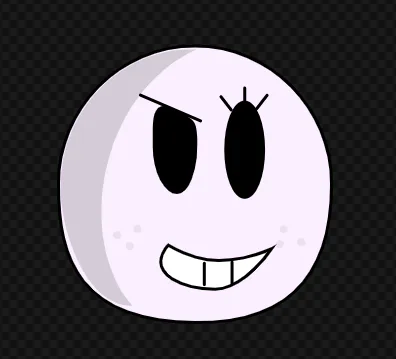
My eyes
But, with my new technique(making the outline layer go in-front of the shadow layer) I can easily scale them without having to do that as much.
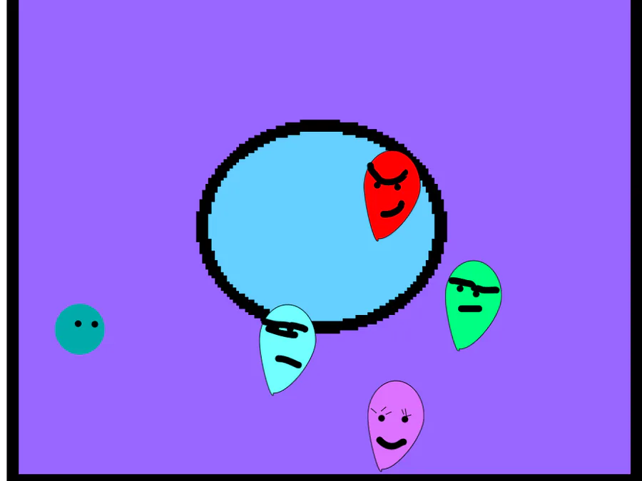
Anyways, here are the new Models! Think they look a lot better and more expressive!
Mechanic repairs
After looking at the gameplay, I came to the conclusion that there being 4 blobs moving across screen could be too difficult and frustrating, So I added a couple things to make this more fair.
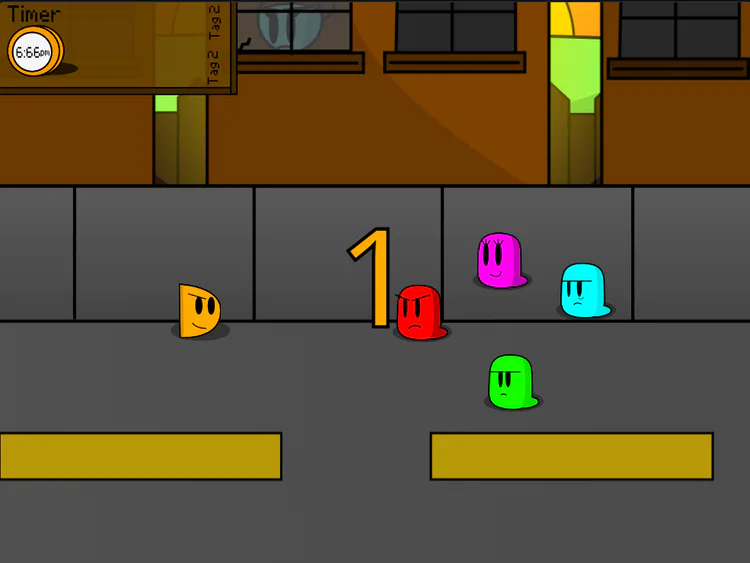
For starters, I added arrows to mark the place the Tagger is gonna go next on screen. You might say it's too easy now, but I think that it makes the game more fair. It now tells you exactly where to go, and the faster the enemies get, so do the arrows, which makes dodging the enemies more fun, and you eventually lose, it's because you weren't paying attention and isn't "Grean teleported on me !!?!?!?1//1/?!/" anymore.
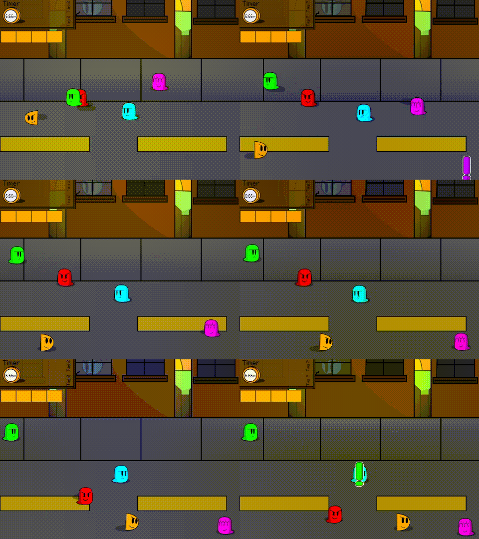
I also made some alterations to Pinke (the E is silent). Her pattern is that, unlike all of her other appearances, just goes around the corners of the map, preventing you from just camping there and avoiding all challenge. I felt like needed improving, because if you just followed behind her you'd never get tagged. So whenever she fully completes a cycle around the map, there's a random chance that she'll either go clockwise or counter-clockwise, and whichever direction is told the the player with her making a little noise.
Home Run!
You know that Baseball pitcher power up I mentioned last issue? Yeah, I've been having trouble with how it controls.
Originally, it just pointed in the direction that the player was going in, and you'd press your jump button to fire, but that created a few problems.... 99% of the time you trying to aim the thing would just make you run into the guy you were trying to hit and lose. I've tried control inputs that makes aiming and moving separate things, but that causes issues when you take multiplayer into account, and nobody has multiple mouses lying around anyways.
If you have any tips on how I could fix this, I would really appreciate it. feels like i'm stuck at the moment.
New Thumbnail
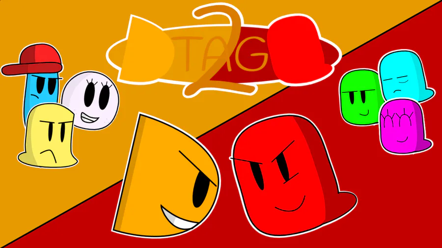
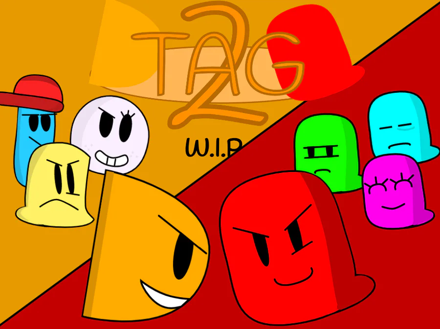
If you clicked on this post, then you probably noticed that the thumbnail image looks a bit... better.
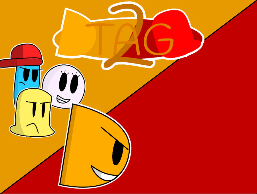
Like, for example, here's the old thumbnail.
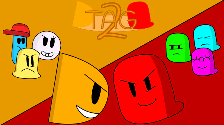
Yikes, that looks rough. The characters aren't very expressive that logo stinks, I could go on.
One day, I got tired of actually working on anything that day, so I needed a nice thing to do to pass the time and get at least one thing done. so I decided I'd swap out the previous title screen art for the thumbnail. I simply looked at the old thumbnail and logo and said, "yeah, that needs some work"
I started with completely redoing the supporting characters at the side. I had to apply my new method to the vectors, with was an easy process for every character except Ted. Like holy hell I had to do open heart surgery on the model to make sure the shadows didn't break when I sized it up.
Did the exact thing to the other side, made some tweaks to red, added some pop out and I was almost done. I edited the logo to make the TAG part not touch the Protag or Redd seen in the logo, and boom, here's the thumbnail today.
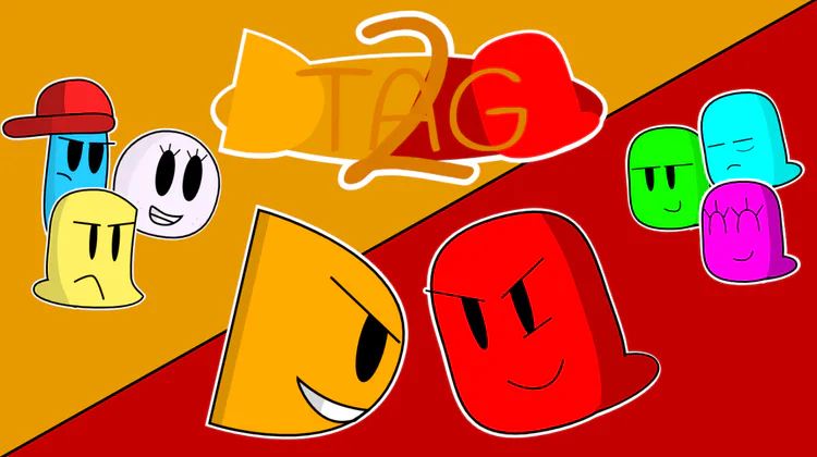
Might change Protag's face here, but besides that i'm basically done here.
Misc.
and last but not least, here's some extra stuff I've done that isn't major enough to get it's own section.
I've added unique death screens and colors for each of the 4 characters that reflect their own personality.
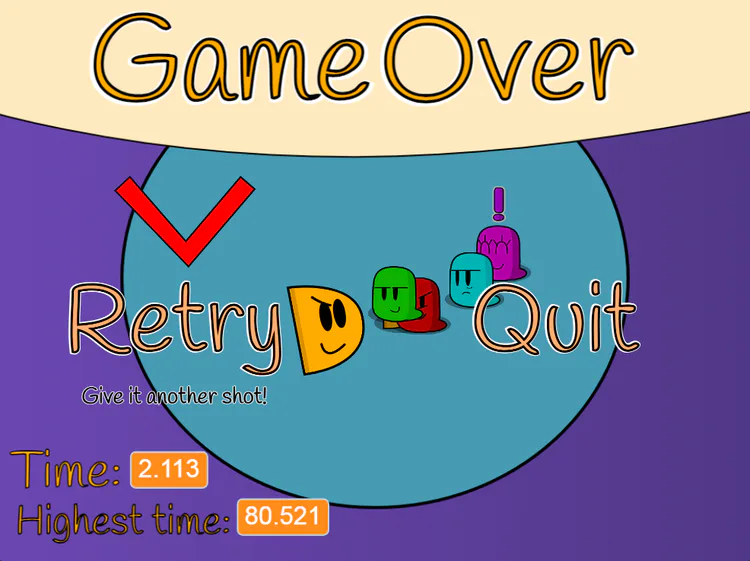
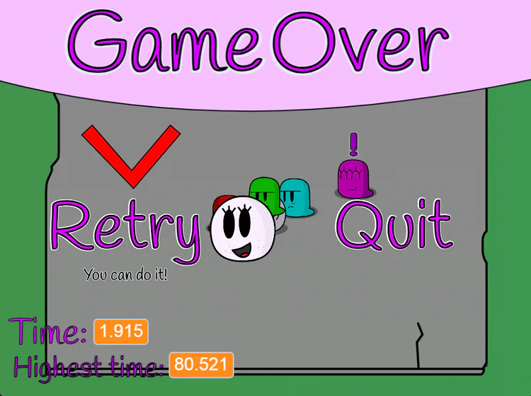
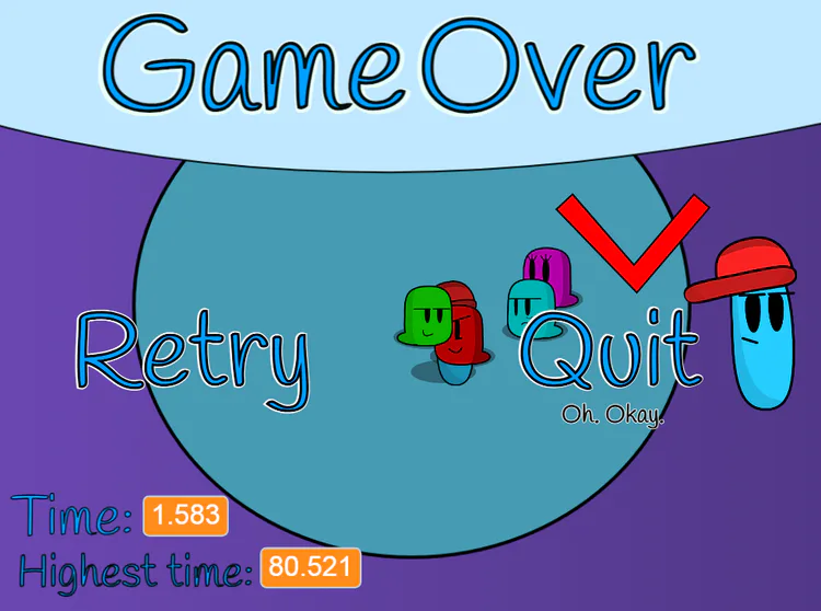
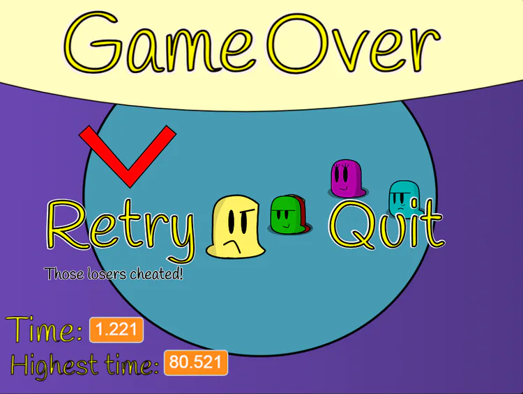
In multiplayer, I made the jump bar represent the character your playing as. I've also made it so that if one player is tagged, then the other can revive them by touching them.
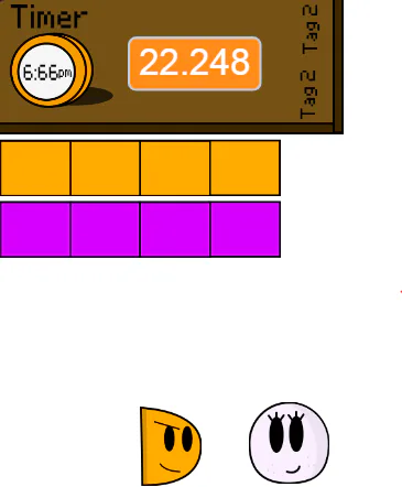
In the Down Town stage, I changed the design of the girl that was in the background, mostly because it looked kinda bad, but her design of having rosy cheeks and lip stick in a run down area could get taken the wrong way. Think i'll name her Martha.
End
and with that, that concludes the 3rd dev log for Tag 2. hope you enjoyed reading this, and see you next time!
#games #all #gamedev #tag2 #devlog #game #indevelopment #scratch #indie







0 comments