Hello there, it’s me Samuel (Eujota), with another art devlog!
Today we are starting a series of posts!
We will be showing you our entire process of defining the art style for the game. There were many problems we had to overcome in the process, which we hope to share with you!
INTRO TO PROBLEM
The first question we’ve got to ask ourselves when deciding what kind of art style we want is: what kind of art style does our game actually need?
Our game is a “2.5D” exploration/adventure game where you’ll be able to travel to many different real-world locations and experience different cultures, with a huge emphasis on being historically accurate and faithfully depicting the local customs and folklore.
From the beginning, we knew that the environment would play a big role in the final experience of our game. We need to create beautiful and interesting scenarios to keep the player motivated to continue exploring the game world.
As we researched the different locations in the game, we were overwhelmed with the variety of art to draw from!
We had an idea that as the landscape and culture changed, the game’s art could change with it to reflect the local art style. For example, if the player is entering the Japanese region, the art would subtly adapt to incorporate influences from traditional Japanese art.
This would give a whole world of possibilities to explore in our art!
Even with this idea, we would still need a base style from which to start all the cultural art styles.
The base style would need to give consistency to the game and be recognizable as Tales of Kulplex; it would need to create the right atmosphere while being easy to adapt.
This is what I want to share with you today!
THE EXPLORATION BEGINS
So, let’s dive right into the process!
Our initial idea was to have a painterly art style, taking influence from traditional art pieces and simulating their painting mediums.
We also wanted to try a digital “painterly” style, which is similar to traditional art, except without trying to mimic actual paint. It is much more loose and has visible brushstrokes in the final image.
We began doing our research and as always, gathered as many references as we could:
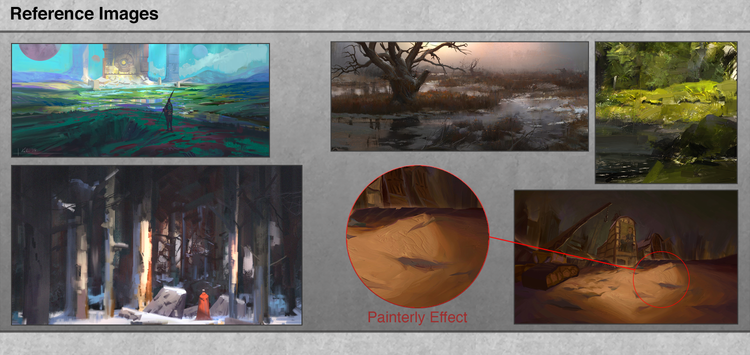
We tried to take inspiration from many different painting styles and mediums. The images on the left side are good examples of the digital painterly style, they have clear apparent brushstrokes but still, look like digital painting. The ones on the right side are digital as well, but they try to mimic the effect of real paint.
In the following piece, we tried to achieve the traditional painterly style:
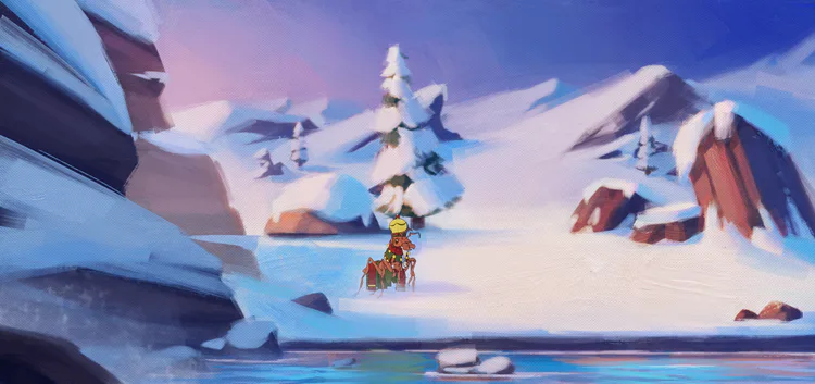
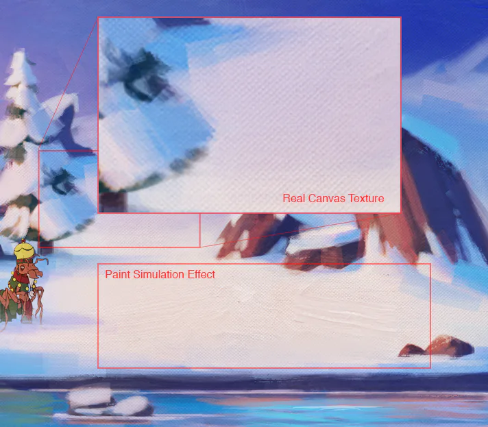
The following piece is the same image but with a digital painting look:
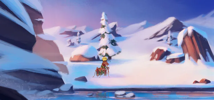
And another exploration of digital painting:
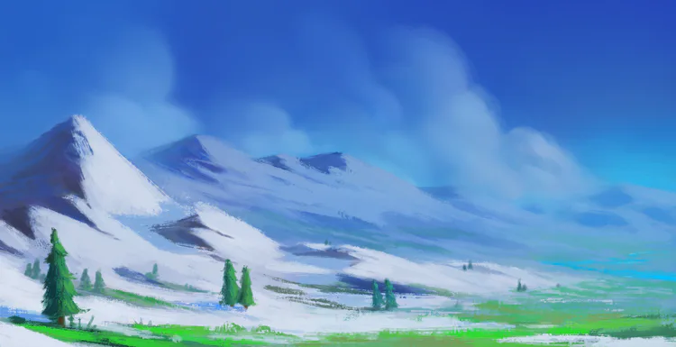
NEW HORIZONS
After doing some trials, we were not happy with the result and we realized that we needed something more realistic and grounded for our base art style. The heavy brushstrokes and paint simulation effects were taking away from the immersive experience we wanted for our game, and mixing it with other styles would be really difficult and not effective.
By going back to the drawing board and rethinking some of our plans, we came up with the idea of having the base sprites rendered in a simple, more realistic way, almost like a fake 3D render, but hand-painted and with some touches of the digital painterly style. That way we could leave the more painterly effects for the different cultural styles that would be applied on top of the base.
This allows us to play with the variations of mediums, color, and paints used by each different culture, and keep the base simple.
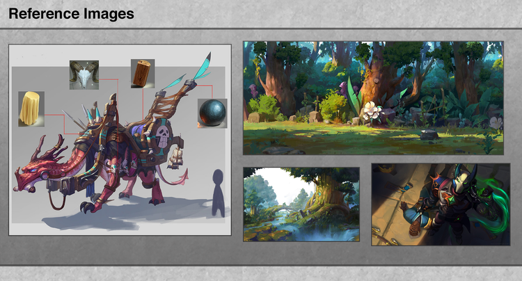
These references exemplify what we were looking for with the simple and rendered style for the base. All of them are clearly digital paintings, but the brushwork is not that apparent here, instead, the artists tried to paint each different material in a more realistic way, rendering the lights as they work in real life, almost like a 3D rendering program.
Our first takes on the rendered style for the game:
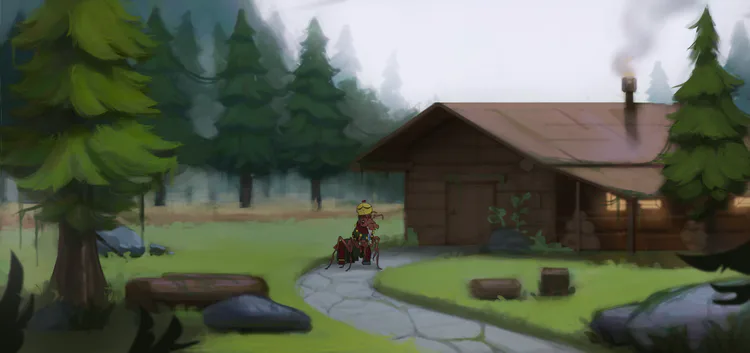
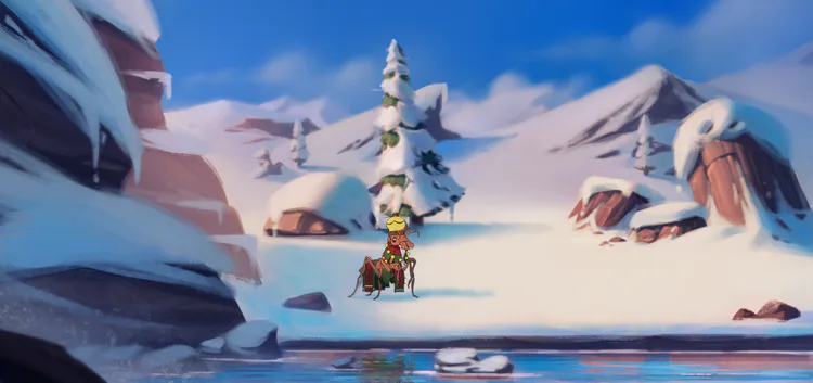
TEAM COMMUNICATION
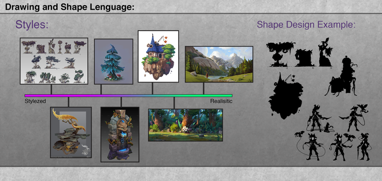
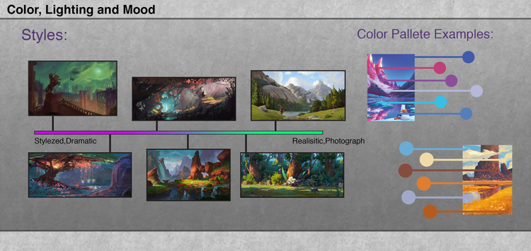
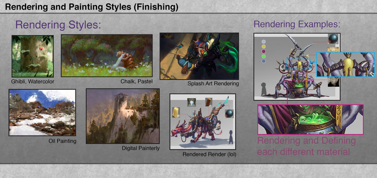
During the process of discovering the style of our game, I’ve created this simple chart for our team, breaking down into small pieces key components that make a style. When working as a team, it is important that all of us are on the same page.
Our job as concept artists is to communicate ideas in a clear way, both to our audience and to our teammates.
What I did with the following chart was to break down some core ideas of what makes a painting in smaller parts, and then explain how each part could contribute to the creation of a style.
In the “Drawing and Shape language” section, I showed how exaggerated forms create a more stylized unrealistic image:
In the “Color, lighting and Mood” section I explored the idea of contrasting colors to create a dramatic scene versus using a toned down color scheme for a realistic mood:
Last, in the “Rendering and Painting styles” part, I tried to show what differentiates rendering styles and gave some examples of possible rendering options:
The objective with all this was to show some basic art concepts and style ideas to a team of artists and non-artists.
THE FAMILY GROWS
After some time of sketching, trials, and errors, we got the amazing Samuel Cunha (yes, another Samuel) to join and help us with the style exploration. It was really good having someone to paint with me and give direct live feedback on my work. Doing stuff together is always better than working alone, in my opinion.
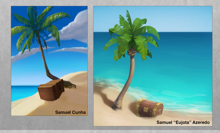
Both mine and Samuel Cunha’s take on the “rendered base style”.
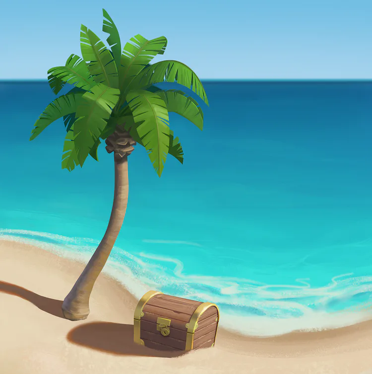
This is the final result, a mix of my tree, with the more precise and hard Cunha’s edges and brushwork. We felt that this image really captured what we want for the base style of our game!
FINAL THOUGHTS
As you saw, defining the graphic style of a whole game is not an easy or quick task to complete.
It requires a lot of thought, teamwork, iterations and a ton of mistakes! That’s the job of a concept artist, after all, to make mistakes in order to discover which way not to follow until you discover the right path.
I’m thankful for the amazing team that we have, and we are happy with the overall results we achieved.
Stay tuned for the next devlogs in the upcoming weeks, where we gonna show you the process of defining each art style for cultures that will appear in the game!
As always, you can get in touch with us and follow the development at:
Discord: https://discord.me/talesofkulplex
Facebook: https://www.facebook.com/talesofkulplex/
Twitter: https://twitter.com/talesofkulplex
See you next time!
Eujota

0 comments