Introduction & Conception
I’m going to talk about my personal map creation process for our newest battleground, Sunset Isle.
When starting any new map, there are countless things to consider. How will this design compliment our gameplay? Does it stay true to our design goals? What would make this map different from the others? Our gameplay is what it is, and the map needs to be designed to play off the strengths already in place. I am constantly asking myself throughout the process, “what aspects of gameplay are covered by our other maps, and how can this one achieve something new?” I’m always examining the floor plan, map’s footprint from various distances, and more, in order to really answer this question.
Defining The Design Goals
While all my maps begin as various sketches, laying out the goals I want to achieve is a secret to success. As in, physically writing them down, not just having these ideas in my head. Even a small paragraph of text is a powerful guide and reference. As I made my initial designs, these are what would become Sunset Isle’s core design goals.
Size
I wanted this map to be middle ranged in size. In The Maestros, each level is designed with an ideal team size, but should still be appropriate for teams of plus or minus one member. Sunset Isle thus is created for 3v3 and 2v2, but remains smaller overall than other 3v3 maps.
Map Feel & Spacing
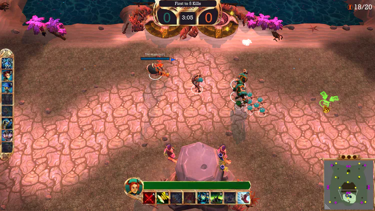
Most of our maps make heavy use of blocked areas to grant players large amounts of space for vision-based play. I designed Sunset Isle with the opposite in mind, granting players more space to move, but still including corners and blocked areas for special maneuvers. Too much space can be disorienting however, so finding the right balance is important.
Transform Point & Neutral Spawn Zones
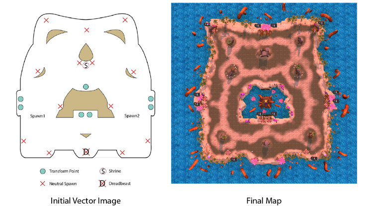
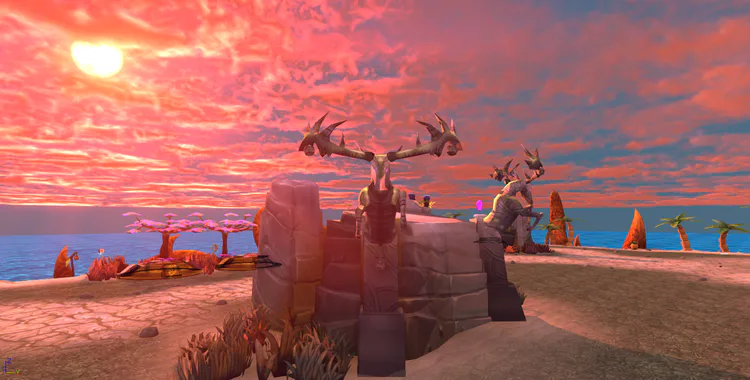
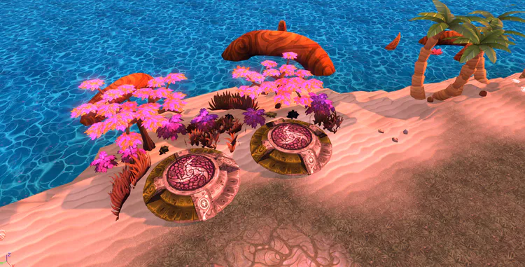
Typically in most of our maps, these two gameplay elements are positioned based on expected gameplay flow; where we expect players to be at certain points in a match. With this map, due to its open nature, I wanted to do the opposite; use these elements to control the flow itself. Thus, I placed the transform points around ’s the map’s central axis, while neutral units closer to and on the outskirts. By placing the Dreadbeast, the tamable super unit, and the Shrine, the score-altering objective, on opposite ends, players will have to make important decisions on where they want to focus their combat efforts.
Thus, player movement here is intended to feel different than other maps, creating more of a pinball effect with players bouncing back between various points of interest, as opposed to the more wandering based gameplay other maps impose.
Gameplay Flow
Gameplay flow is the one thing that unites the former design goals, and the most important. If I poorly utilize the above elements, gameplay can become sloppy. Lack of engagement, players unable to find each other, and so forth.
My (Personal) Creation & Documentation Process
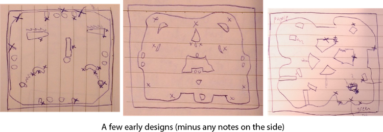
With all these in place, I made many map sketches and designs that could fulfill my goals. While ultimately I would settle on one, even failed designs may have something to offer future maps. Save those sketches!
Personally, I like to bring my final paper designs into Illustrator, and recreate them there to be paired the the full design document I’ll be making next. I create images that illustrate specific things, such as transform point and neutral locations, gameplay flow, and even images that outline potential problems (and perhaps fixes), all to compliment the new design document.
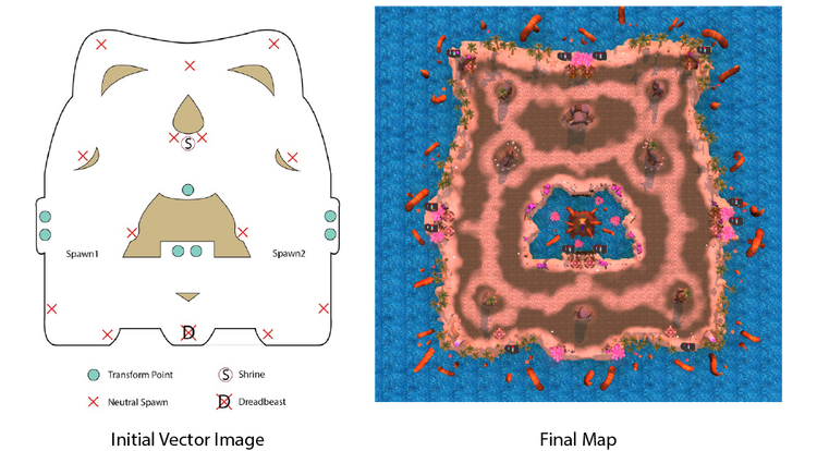
I always review my work and try to bring out any potential flaws to discuss with the team. Sometimes team members with little design experience may have the perfect solution to a problem! As an example, here are two problems I saw with initial Sunset Isle map designs:
-Map areas (particularly the south) being neglected.
-Gameplay turning into a merry-go-round of players not finding each other.
Art Direction & How It Can Affect Gameplay
Due to the small size of our team, I had to be careful with what I wanted, knowing that new asset creation was limited. Aware of what I had from the start, I wanted this new map to be an island with pretty lighting. A design and color palette that would stand out. While my initial vision was simple, I was fortunate to get more assets than expected, and was able to create an extra good looking environment.
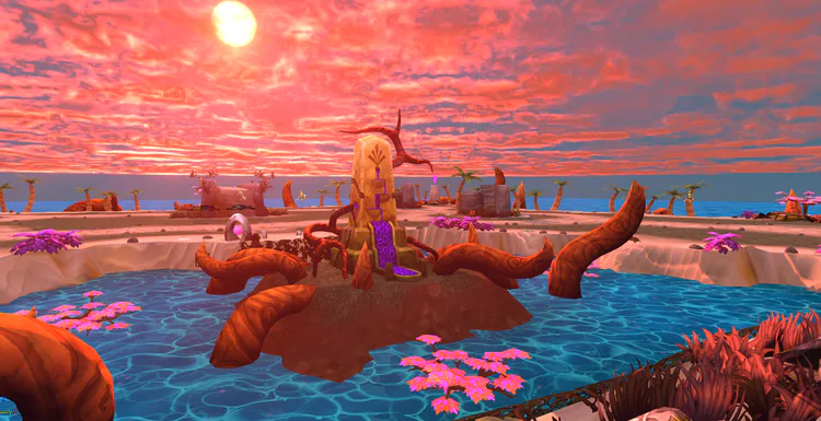
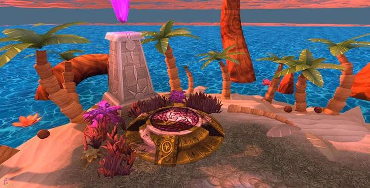
Art direction and asset placement can do much more than make the environment pretty. Landmark assets can help players differentiate and recognize areas, painted terrain can help guide movement, and much more. I used this simple design fundamental, as with all our maps, to smooth any map-related hiccups in gameplay. As a simple example, literal paths in the terrain help guide players to important areas.
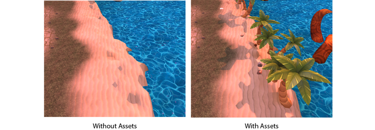
Lastly, I’d like to address an unexpected problem that I encountered in this map. With the combined efforts of the the lighting, color palette, and “soft” art style, it was difficult to discern where the island begins to dip off into the water. It was unclear where the maps boundaries were. I tried solutions like additional terrain textures (wet sand), but it was too subtle. Nobody likes invisible walls in games, but with asset placement, the problem was made much less severe. A simple fix to a more complicated problem.
Conclusion
Sunset Isle is a map far younger than any of our others, and is of course still in need of more testing. Hopefully, you, the person who cared to read this in its entirety (I thank you), will get the chance to give it a try sometime soon. Did I succeed in my goals? Hopefully you’ll be able to tell me!
See you in-game!



0 comments