Art workflow, Dani
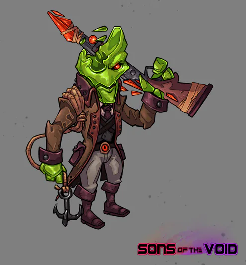
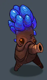
After making one of the main characters and a few enemies, now I’m 100% focused on designing the first world: Fungi Ruins.
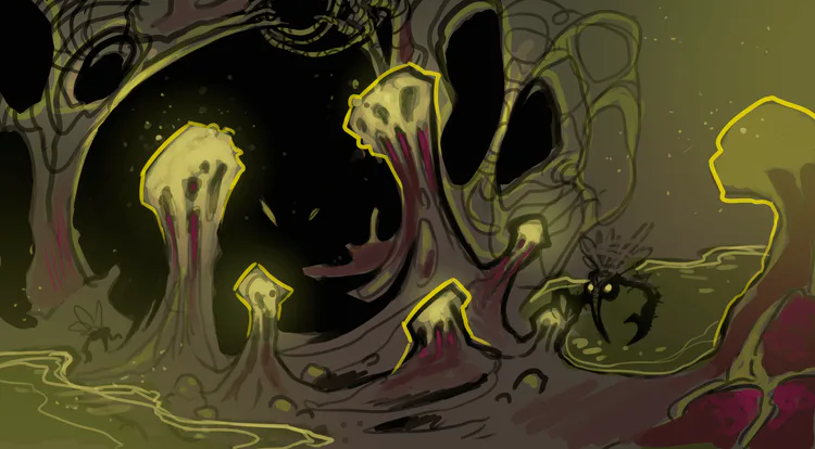

This world is based on an ancient civilization, destroyed by a massive plague of space fungi.
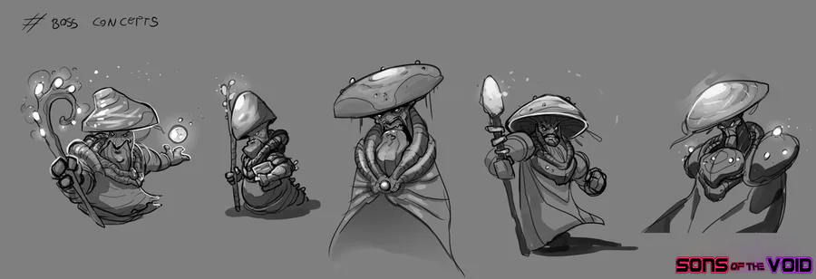
After many sketches, I started with generic enviroment concepts, just before starting making tiles.
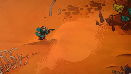
At the beggining I tried with more dirty and natural colors, thus making the fungi look more unpleasant and smelly. But I didn’t quite like the results, so I tried with a different palette, taking references from other games (Wildstar) and using more saturated colors, giving them a more retro and alien feel.
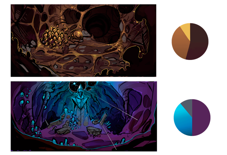
I always try to synthesize any basic color palette (either for the environment or character) in 3 colors: 2 less saturated and another with lots of saturation, whether they are in similar ranges (as in this case) or complementary.
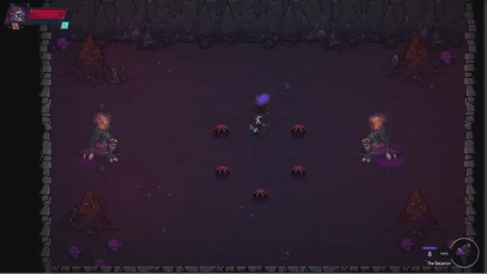
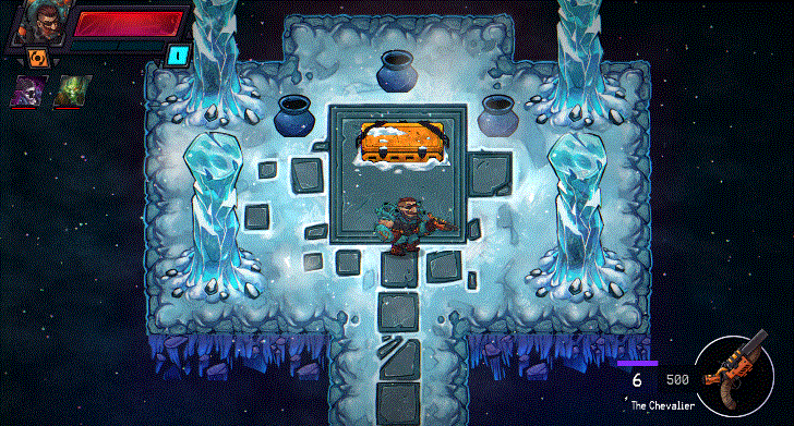
Usually, once I have decided what palette to use and I have the final concepts, I start making an ingame composition to see if everything fits and feels as it should. I also do this because afterwards, when I’m making the tiles for the levels, I can give the tiles a more natural feeling for them to fit together.
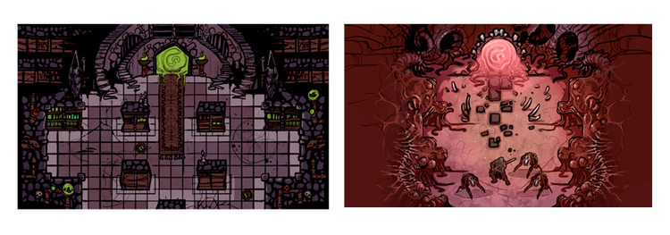
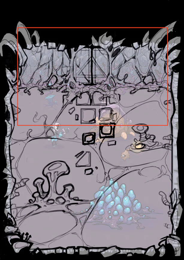
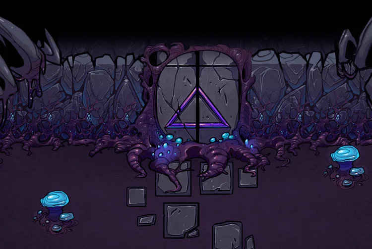
Making tiles that fit perfectly (with pixel art is easier), was a really tough work.
I could work faster by using the Seamless Textures tool, used to tile automatically between diferent drawings.
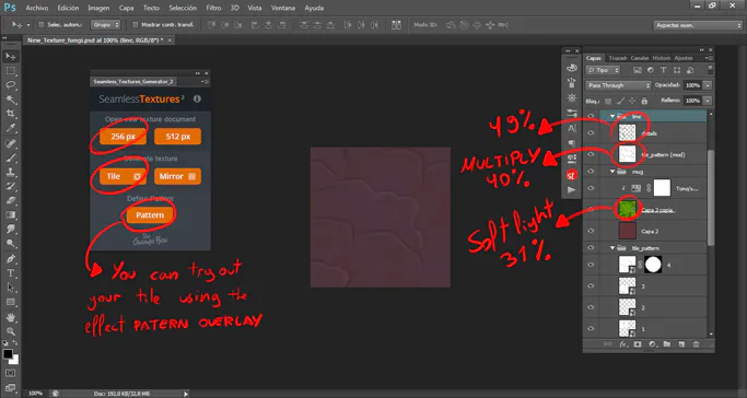
I always used low opacities on a base color complemented with a gradient. I also had to be careful with not drawing many small details so the pattern wouldn’t be to obvious. And if I wanted to use a specific texture to the tile, I always did it separately and adding a soft light mode with a max of 45% opacity.

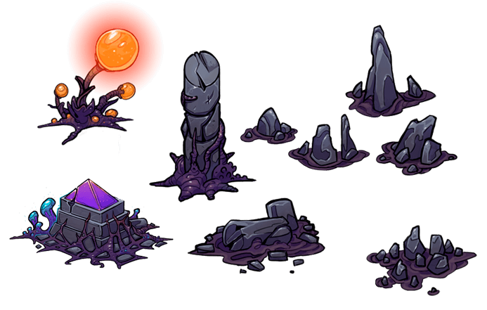
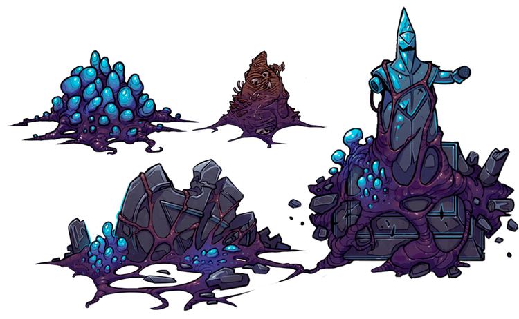
Once you have all the base tiles (walls, floor…), I filled the room with props, decalls and details.
I used an orthogonal perspective (sometimes faked), to make the enviroment more descriptive.
0 comments