
Hello reader! My name is Oliver, I am the user-interface designer for the game The Great Ape.
This is a follow-up post regarding the user-interface design in The Great Ape. I am going to write about how I handled the design process and implementation of the level select system in the game.
Planning
To start: the level select menu has to follow the same rules as the rest of the UI. I wrote about them in my previous post if you are interested. TLDR; it has to be accessible for the user.
The level select menu consists of the buttons and their placement. The buttons have to hold information and have a certain dimension whereas the the buttons placement defines how the user navigates the UI and how readability. Both have to be ‘perfected’ to create a streamlined user-experience.
Implementations
Buttons
Creating a button is easy. Creating a button that the user understands is a tad bit harder. I went with a compact rectangular size large enough to hold the levels name a thumbnail and score. The buttons follow the same style as the rest of the UI.

One of the level buttons
Placement/Layout
First implementation
The layout of the buttons is of high importance since it will impact how the user navigates the menu. The first implementation of the layout was a foolish one where I just added the buttons to a fixed grid with spacing between the buttons.
The main problem with this implementation is readability, an unorganized mess made it hard for the user to pick the level they were searching for and it did not look good in the graphics department.
Second implementation
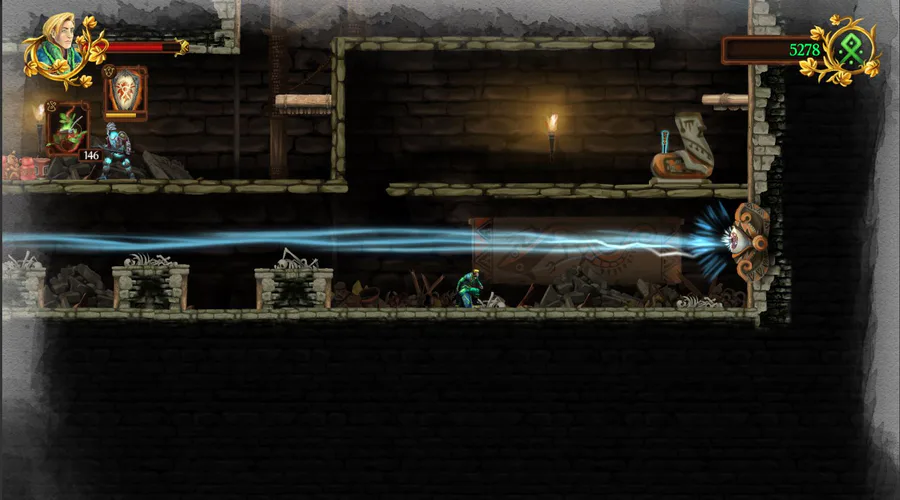
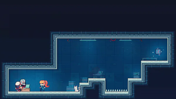
The second and current implementation was sought out to fix the problem with unorganization by categorizing the buttons into different ‘worlds’. This implementation features columns of worlds with rows of levels.
The names of the worlds are displayed in the level select menu which makes it even easier for the user to navigate the menu as they are numerical.

Current level select menu
Summary
This all together makes it easy for the user to go back and see their progress while also giving each level a theme to follow.
A minor complication with this system is that the amount of buttons you can display at a time is not enough for multiple worlds. An easy fix is just adding a scrollbar but scrollbars are not really compatible with controllers.
As of writing this I have not yet implemented a fix for this but my idea is to utilize the triggers (L1, R1) to navigate between worlds in the menu.

Thanks for reading this post and lastly, a gif demonstrating the current level select menu in all its glory.


0 comments