
What's up guys and welcome to this dev log!
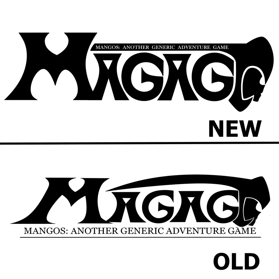
In this case, we wanted to show a comparasion of the old and new version of the game logo
In the old version, it looked stretched and the "G" letters looked weird, but in the new version, it is more symmetrical
Next up
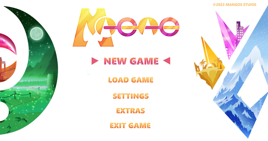
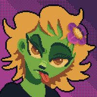
It's been a year since the last post. We're sorry to say that the game has not started it's programing yet. But here are some concept arts our artist did! make sure to follow him on insta (@/kotvls). And hopefully we'll update again soon, with more news.


Short intro of us 💕✌️
We're an eletro duo based in Seoul 🇰🇷 Heavily influenced by the 90s.
Our new album #Xennials is all about the nostalgia of that era 💽 CD listenin 📟 beeper beepin 💾 floppy disks floppin days 😎
Stream now! 🎧
https://open.spotify.com/album/3YwWhnHWVy5cA8XOpbaGRA?si=8E9awqU…
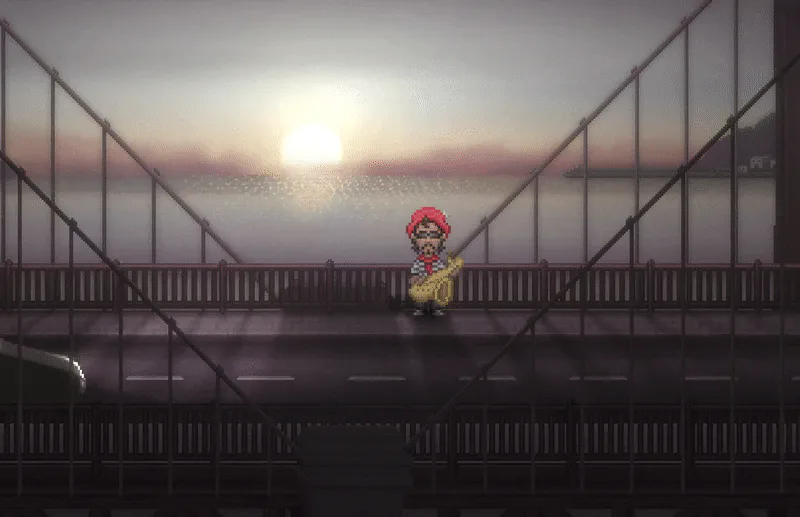

Been working lately on lots of 'behind-the-scenes' boring stuff that no one really cares about, so here’s a guy playing the sax for some reason.


Shoobies leave a sticky trail of mucus in their wake, which can impede movement for any creature that steps in it.


🍒Did you like the game? A demo is available for free on Steam.
✌️ Thanks for playing IndieGameiacs!
⚙️ Free Demo: http://bit.ly/UniDuni
📺 Full Video: https://youtu.be/5qEbVXg7GaQ
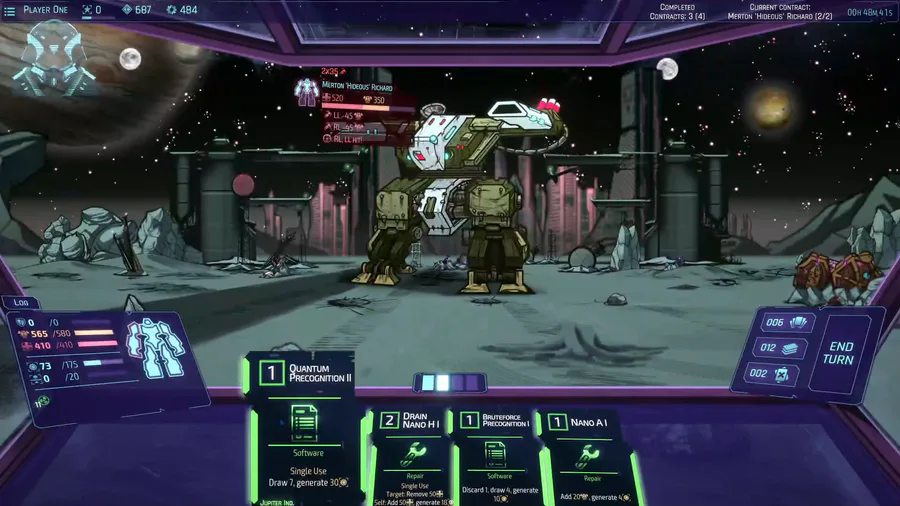
Quantum precognition is one of the most powerful cards. End game cards & equipment. Demo/alpha build boss is no match for this deck.

"Our work is never over" they said.
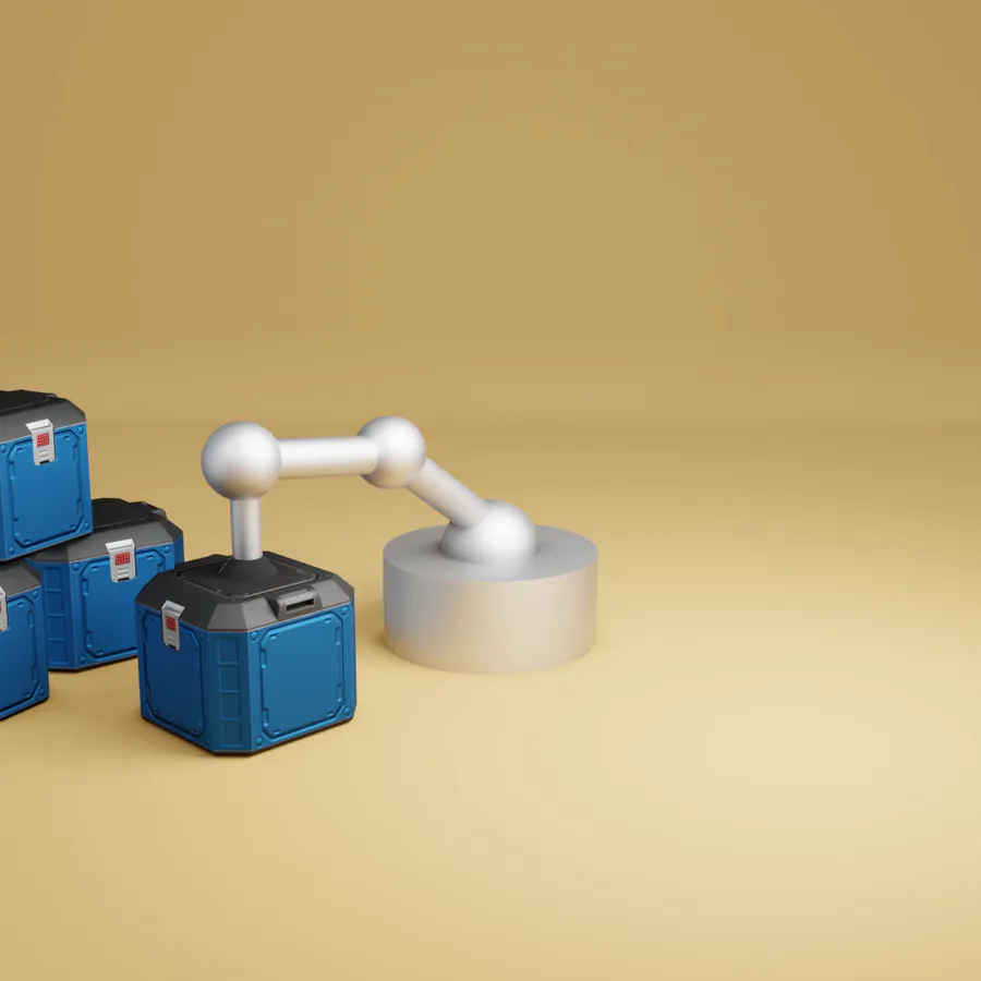

Sometimes the suction cup get sticky. Small animation I made in Blender after doing my tutorial on picking up/dropping objects in animations. Crate model by jQueary (https://sketchfab.com/3d-models/game-ready-sci-fi-crate-d98deca6…).
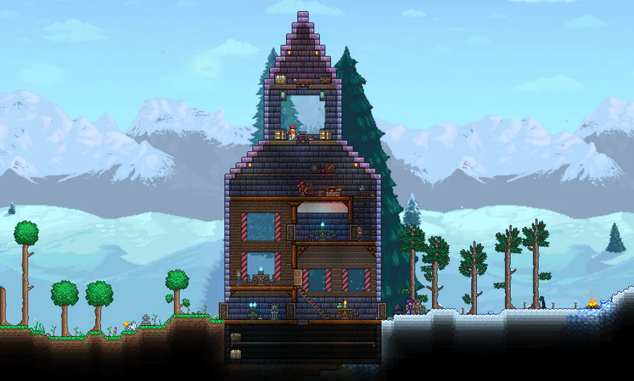

A house I've built a while ago. :)
It nicely separates the snowy biome from the grassy one.
It's built with painted Ebonstone.
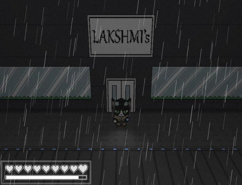
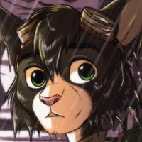
If you have more of an acquired taste, the restaurants in Niravasi have you covered! Maybe skip the salad bar, though.
0 comments