Comments (4)
Hey! I played it again, think I covered everything that’s in the demo but not entirely sure. I just wrote down my thoughts as I went so I’m being extra critical here :P
With the room transitions, they seem fine; it’s just the ones going put the bottom of the screen to the top of the next. I’m guessing the object is a 32x32 block? Why not place it just slightly outside of the room (might be tricky depending on what version of GM you are using) or just change those ones to a 32x16 or 32x8 block so that there is space for the player to appear below them but not so far down as it is at the moment.
For the shop interface I just thought it might be nicer with a Final Fantasy styled menu where you can move the cursor up and down. If you’re only going to have 3 items though I don’t think it’s a big deal – at least it matches the way you use them as well so it’s consistent.
-The choice of music is good except for the main track when you’re in the woods / mountains. It doesn’t fit with the rest of the pieces or the graphics (too produced and too electronic).
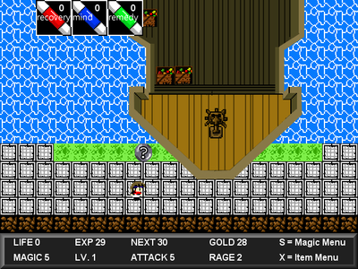
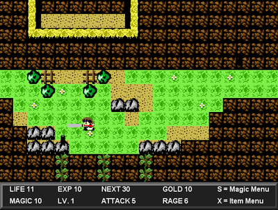
-New HUD looks much better!
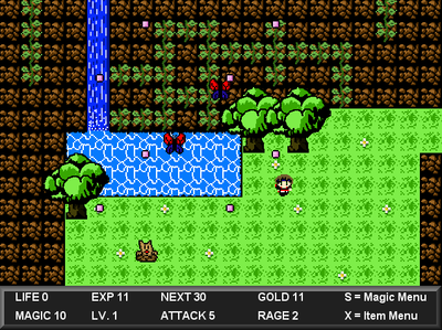
-At the screen up from the lake some of the trees are missing trunks.
-Talking to the ‘quest’ NPCs a second time should give you a different message, still telling you what to do but more concise.
-if you stand behind a tree and attack your sword shows on top.
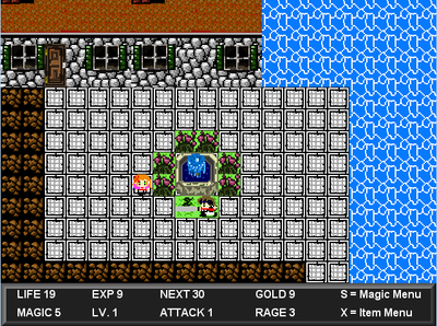
-Near the church where you get healed the fence on the right overlaps the rock
-It would be good to have visual/audio signals to indicate when you level up and a sound for when you get healed.
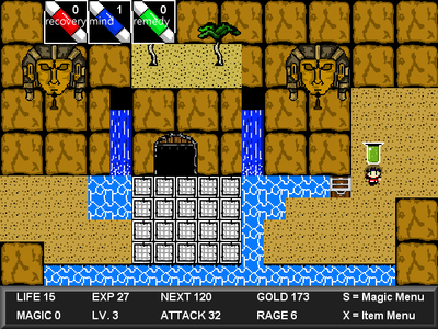
-Water should animate, even if it's only slightly. Though if you're using tiles for this it might be a hassle. The waterfalls look good.
-You can stand beneath the knights who are up on the walkway at the castle and hit them. Also the sword animation shows up there above everything else.
-Can't enter a lot of locations but I’m guessing because they’re not done yet. Looking forward to the castle! The vine climbing thing is neat as well. I like how it’s hinted by one of the villagers.
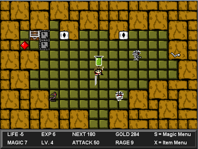
-If you go to the cave before getting the key you can still destroy the lock with your sword, it just doesn't open the door.
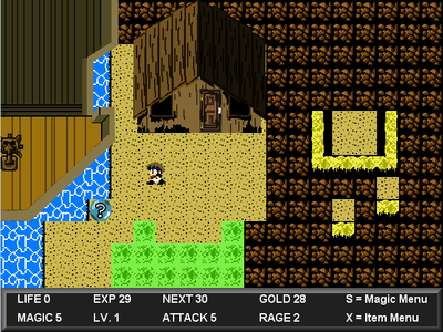
-I love the tilesets, the grass and mountains were really nice, also the cave. Some of the buildings look a bit flat but it’s not too bad.
-Maybe I just couldn’t figure it out but can you smash rocks yet? I’ve been all over the map but couldn’t find anything.
-The sound effect for opening the item menu sounds really default
-The snail enemies are cool, same with the butterflies. I like that you’ve put some thought into some of them! Those things that dig are tricky before you get the attack upgrade!
-Even though you can’t die I tried to play as if you would to see the difficulty. I think it’s spot on at the moment.
-Weird how when you attack and quickly press a direction your sword kind of slides with you. It adds a bit of strategy though so I kind of like it even though it feels a bit buggy ;)
-The rage system is cool, would be great to expand it. Perhaps you can find different rage attacks along the way?
-I like the clouds up the mountain.
Okay, that’s everything I can think of right now :) From playing properly, your game is pretty fun – I hope you keep developing it. My main problem with making RPGs is that I lose motivation for them before they are finished so my main advice would be to keep the project small/manageable - If you to get it to a point of completion go ahead and add more content but focus on getting it release worthy first so at the end of the day people will get to play it.
Peace!
Ok by reading what Jordan said I re uploaded this game with the changes he suggested. I didnt get some of them worked on yet but most of the changes i did were complete!
I didn’t play too far but here’s some feedback which might be useful:
-My favorite part of the game is the graphics. The world and characters are nicely drawn and show a sense of style and originality. What Kills it for me however is the HUD and interface. The dialogue boxes and menus clash really badly with the rest of the art. You should try going for a more retro pixelated look for here so everything stays consistent. Some of the shortcuts you’ve taken feel kind of amateurish like the shop interface. Why not have a proper menu with selectable items?
-There are a lot of drawing depth issues (eg the players hair is lower than the trunks of trees when going under them)
-When transitioning rooms you sometimes appear further in than seems natural. Like when walking down to a new screen you should appear right near the edge I think, not a few squares in.
-The animation of the leaves falling from bushes looks very unnatural. It would be better to have several smaller leaves kind of randomly falling out I think.
-It's annoying how bumping into people makes you talk to them, especially characters with long strings of dialogue like your father. I had to quit because I got stuck in a loop with a guy walking into me as well.
-Lines like "Fishing really fucking sucks today" sort of kill the mood for me. The pointless profanity just feels out of place.
Keep it up, I might give it another go later. There’s a lot of potential in this game, what it needs is little polish.
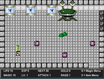
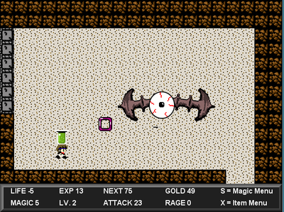
This is an updated version of my Demo that now has the title Destiny of the World. If you havent played this yet it plays much like the old school zeldas with some final fantsay. It has the old retro look and style of game play. This still has plenty of wrinkles that need to be smoothed out. So dont rate it as is! Im looking for ideas and such to take away or add to make this better. Enjoy!
#rpg
