 1
1


Next up
It is done!
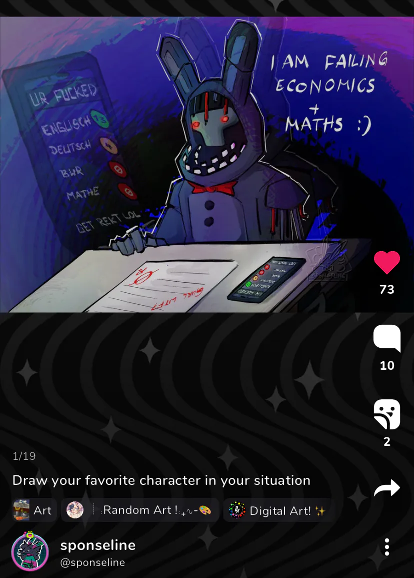
Friends. I might be failing this class and won't graduate. The fucking withered bonnie joke drawing has now become "i am failing". But hey, at least the stress will be gone, so actually this is a VERY good thing lol. If i mess up i'll make a sequel.
CW: slightly nudity in the form of one female chest. Two more things for the portfolio! Beauty and beast and Passing are done!!

I lowkey fell asleep (32/365)
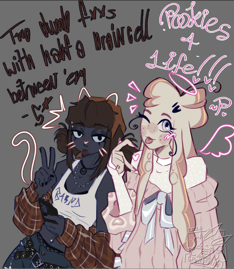
lil sahsa and ponty doodle. they're besties, your honor.
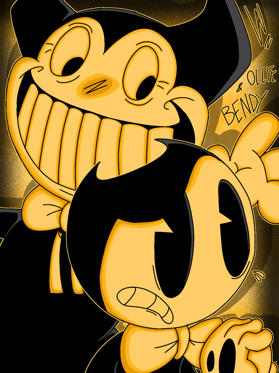

OLLIE AND BENDY!!
Wanted to draw these 2 fellas before the month ended since OOTIM was released this month last year!
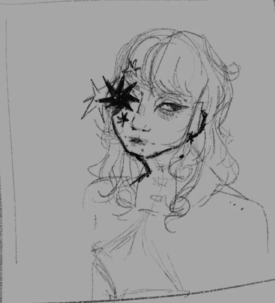
Little wip for a Self Portrait alternative. I already made one digitally, but i traced my face from a picture so it's identical, want to try drawing myself how i view myself. Will make some tweaks bc this is kinda basic rn! Idk what to put in the chest rn
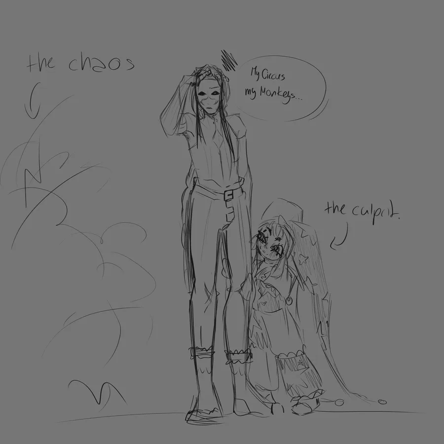
this is a daily occurence in the circus. just a lil doodle, plus a sneaky peek at my current (and hopefully actually good) Calicor redesign
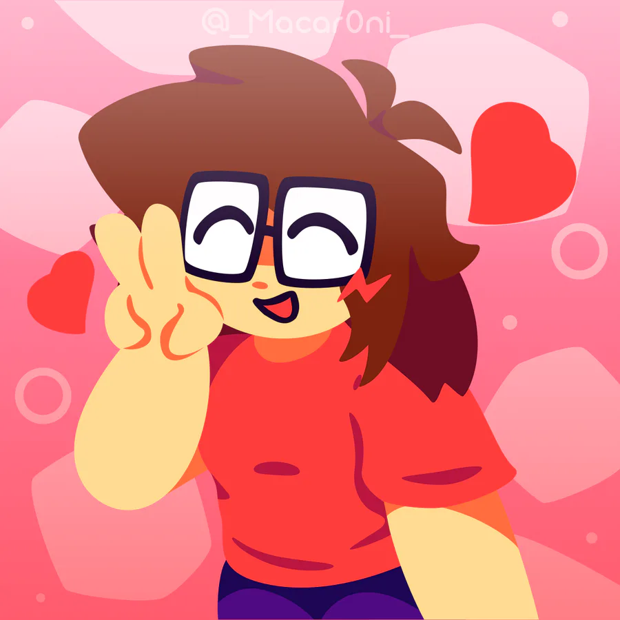
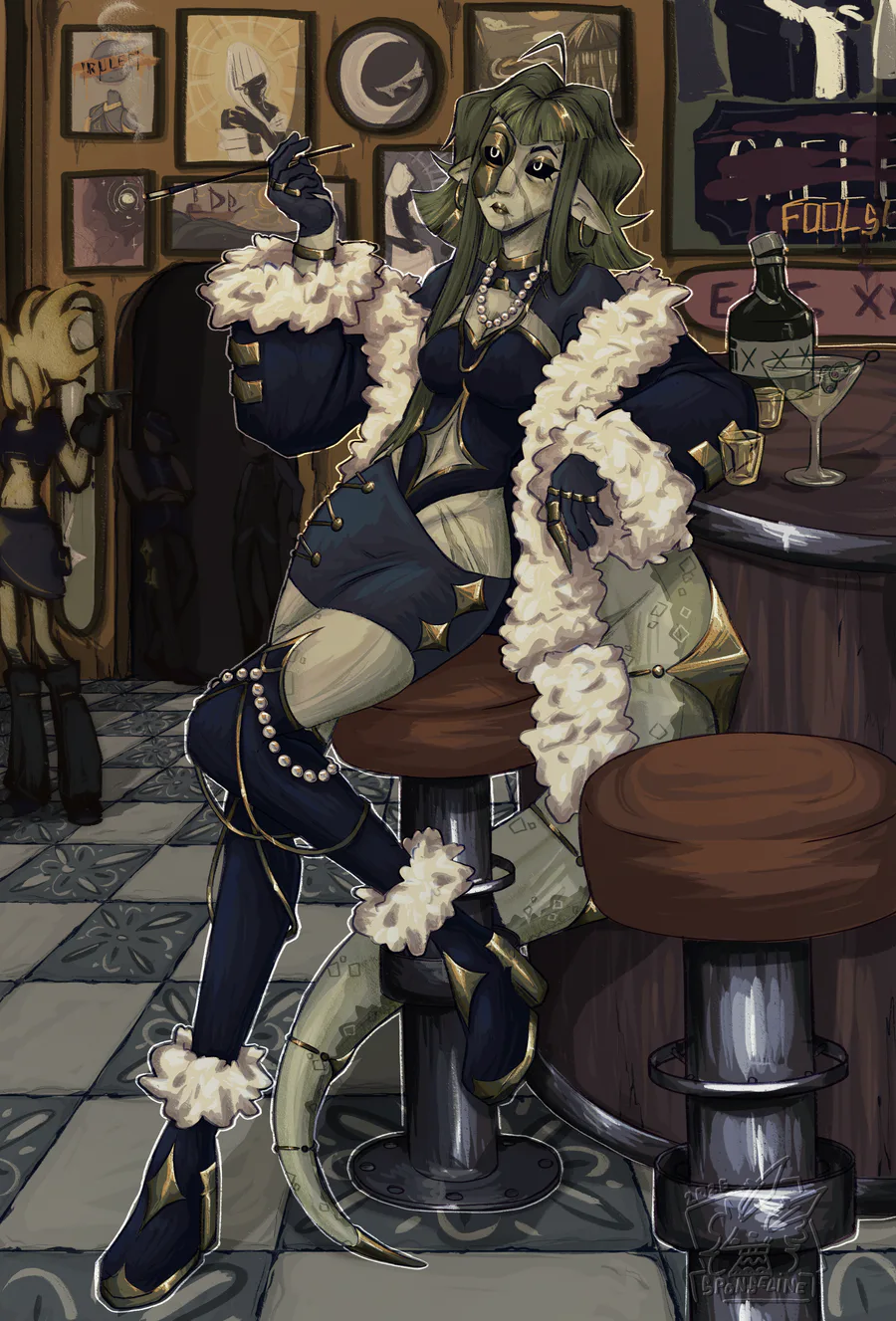
Late birthday gift for @cassregister  !!! :D
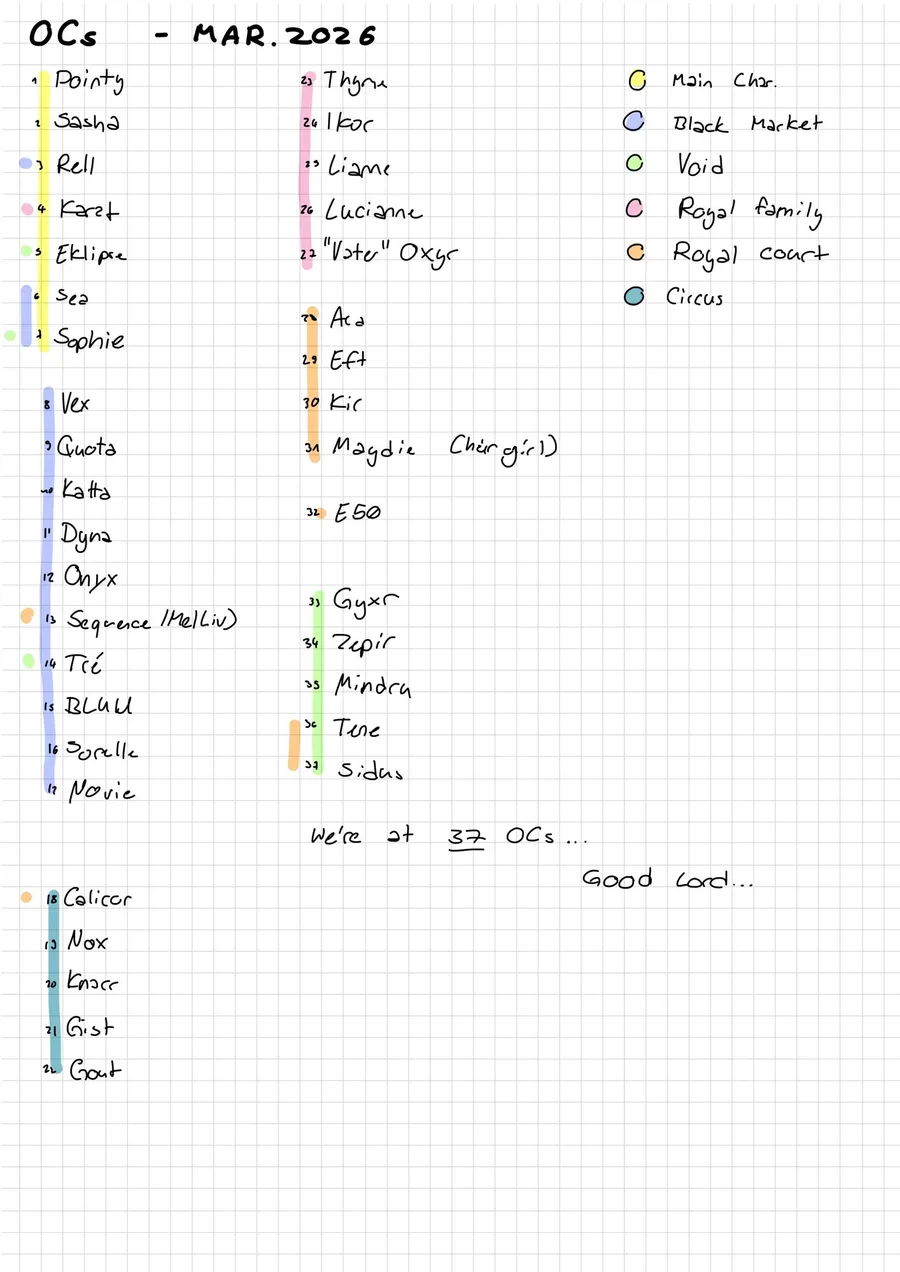
Made some notes in prep for artfight and... good god... I have work to do
4 comments