Welcome to Freddyland (Demo) Review
I joined some of my friends and we played the demo of Welcome to Freddyland. I have some thoughts I'd like to share with everyone and the dev team.
Gameplay(3/10)
TLDR: Slow, repetitive and Bland
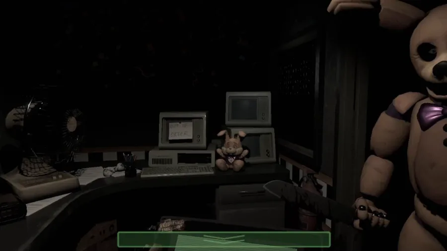
The game idea is very good on paper, but it's very badly executed on this demo. One of the "unique gameplay" is a color match puzzle minigame and watching out for a prowling animatronic. The only issue is that you bearly need to use your light on the mascot, as it vanishes in less than 0.5 seconds. Not give any challenge, as long as you don't count trying to see the puzzle as a challenge itself cuz the flashlight doesn't help much in that regard, but also is too repetitive of a puzzle.
They go straight to an SL Funtime Freddy minigame and avoid the mascot behind you with the flashlight. And don't get me started on the Post Shift 2 Instructions, If they are too big make it an audio log, like a park instructions or something or something that doesn't have a wall of text to read. You lads know the community hates books imagine reading instructions then?!
Art direction(5/10)
TLDR: Some are good, but there is to much
I'll give props for some of the 2D art I saw in the game. The instruction pop-ups are very well made, but they are overshadowed by the weird frame and PS2 instruction text box. Someone give that guy a raise, jokes aside it's a very good 2D art.... in contrast to everything else in the game. We are in an abandoned park right... Where are the attractions, decorations, game stands? I saw like, 2 rectangular structures with a simple render on top of it, Was that supposed to be a haunted house or what? If you're going to make a park themed around a carnival have some world-building process behind it, to make it more visually pleasing.
Also, what is that entrance design? It doesn't fit the theme of the game, like at all. I was on VC with some of my friends playing it we had a 20-minute discussion on how weird and off-putting it was. The name of the park could just be Freddyland, but for some reason, it is Welcome to Freddyland, with a PNG Freddy render on the logo in a green LED background and next to it on the right side there is another sign saying Welcome (why is that there). Another thing I wanted to ask, What are those weird green/pink/red ovals on that logo? Are those spotlights, neon lights?! Just follow one theme and go to the end with it.
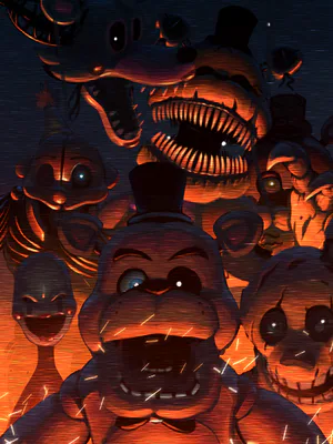
Now let's talk about the elephant in the room, the mascots themselves. From what I've heard from another dev, not related to the Freddyland dev team, the characters are from a model pack. Now, nothing wrong with using model packs, as long as you give credit to the creator it's fine, but these mascots don't fit the environment at all, maybe give them different clothing to make them more in pair with the environment or find someone to model mascots for the game, the community is filled with talented and I'm sure if you asked for help there would be a few people willing to help you and the team out.
Final thoughts + Feedback
Scott, if you want to make this game appealing you need to listen to the overall criticism and improve from the demo you showed. I saw you joined one of the firesides, and I bet you were very disappointed by how the game was being received. I was there as well, I wanted to see how the demo was since I didn't have time to play it.
I saw some of the posts on people making fun of the game, I don't condone that kind of attitude, nor support it.
You are a good person, and I know how much this project means to you. But you have to follow one direction to your goal, if you decide to open a lot of branched paths with different styles and don't get decisions, you will get Garten of banba... I mean SB Releas.... you will a mess of a game (same thing lol). My DMs on GJ are open if you want feedback and criticism. I know you and the team of devs alongside you can make a very eerie and cool experience just by sticking to one theme and style.
Always remember...Tomorrow is another day
ArcH1ve out


53 comments