Well it’s February already. I don’t know about you but time sure does fly quick for me.
Let’s get straight to the point. In this devlog, I’ll be talking about a new alternative attack for a certain weapon, one more power-up and implementing an exciting shader.
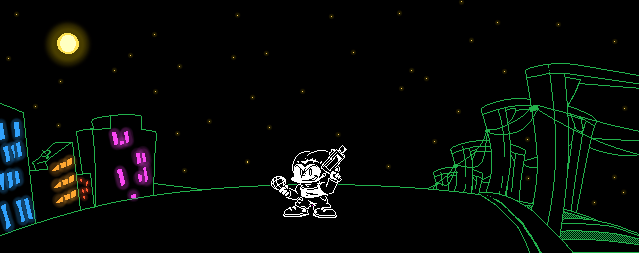
Charged Shockgun
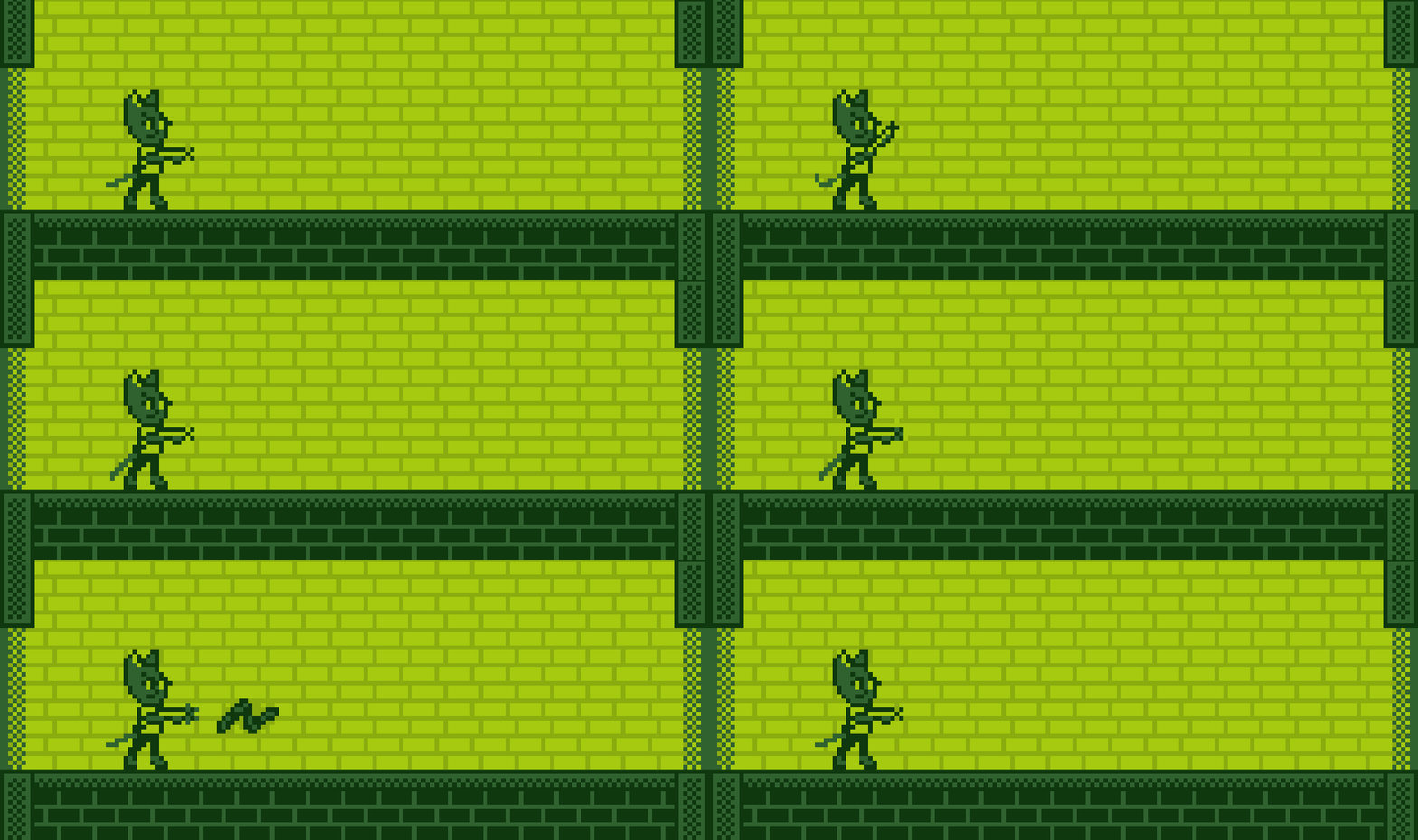
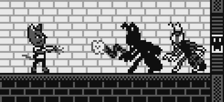
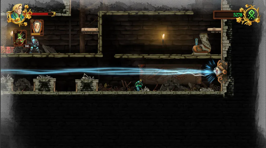
Hold to charge, release to shoot.
I’ve been suggested to implement an alternative attack of the Shockgun by having the player charge up the weapon to release a more powerful shot that can pierce through enemies.
Of course, charged shots consumes more ammo of about 5 which might not sound too bad but since I planned to have the Shockgun as a hidden weapon, Shockgun ammo will be scarce so don’t go crazy with it.
Invisibility
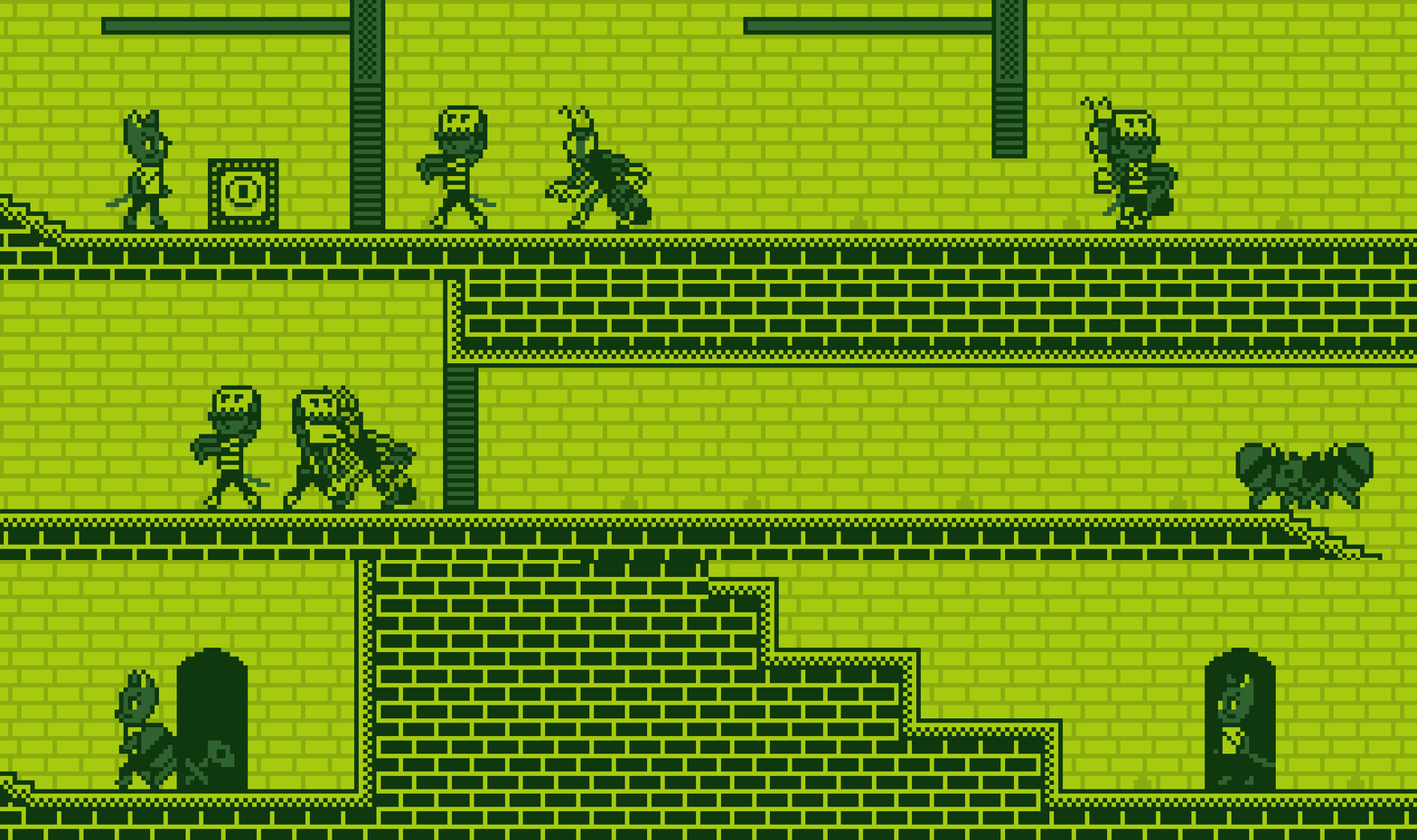
They'd have no idea you're there.
Since I made some enemies to behave differently by doing an unique attack whenever they see the player, I was thinking there should be a power-up that doesn’t trigger those attacks by making the player invisible to the enemies.
At the moment, I’m still experimenting on how this power-up should play out in the game. Currently, it makes the player invisible, invincible and able to pass through enemies for several seconds. For how generous this power-up provides, it’s highly likely to be incredibly rare and hidden.
This might change once I design the new levels where I’d have a better idea on how this power-up can be utilised.
Proper Fading
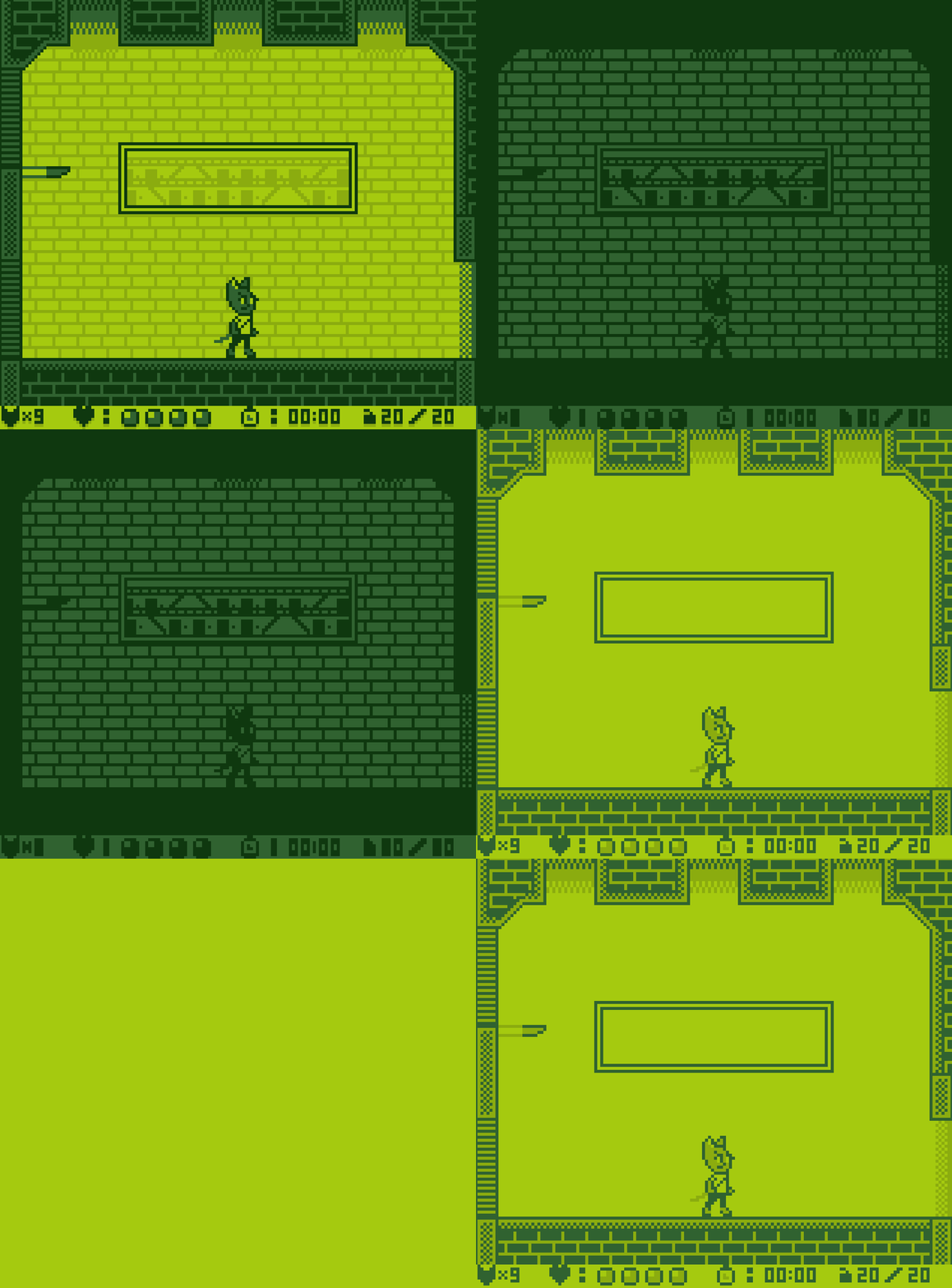
The palette dims or brightens as it should be when fading.
Because I want my game to be mostly authentic, the fading transition has to be accurate. The way how a real Game Boy does this was by dimming or brightening the palette. This sounds like a job for a shader but the problem was, I don't know how to make shaders.
I have at least attempted to learn how to make a shader that changes certain colours but I couldn’t figure it out so I decided to buy Pixelated Pope’s Retro Palette Swapper. It’s cheap and it does exactly what I wanted so I might as well use it for my game.
With this new tool, not only could I use it to mimic how a Game Boy does the fade transition, I can use it to change colour palettes so you know what this means.
Colour Palettes
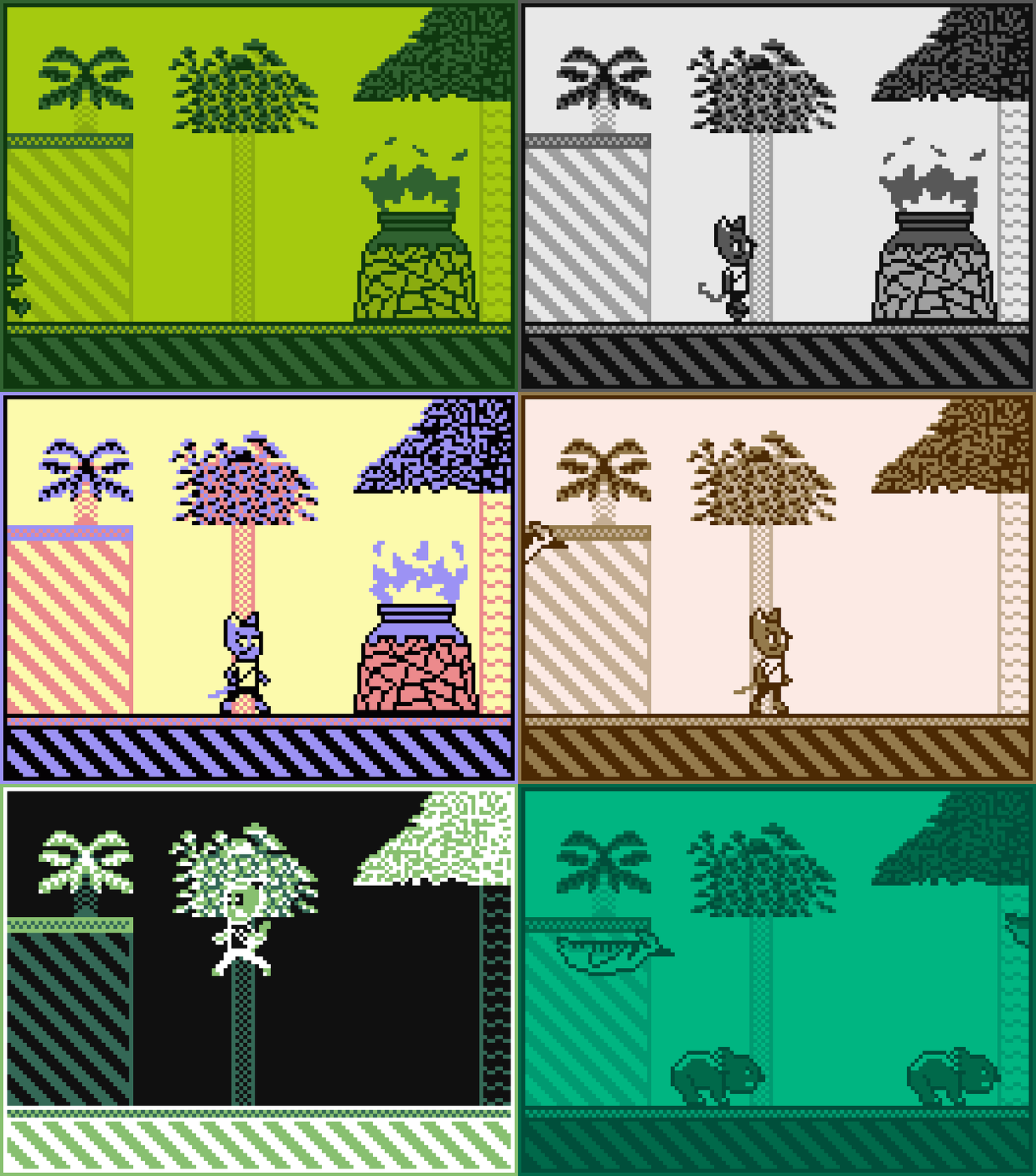
The intro cutscene shown in different colour palettes.
That's right, my game can now be displayed with one of eight different colour palettes so if you’re not a fan of the monochromatic green, you can change it to greyscale or something else instead. It’s up to your preferences because having options is good.
For now, the following options are:
Greenscale
Greyscale
Default SGB
Pastel Mix
Pocket
Brownscale
Inverted
Light
Conclusion
I'm afraid this is the last month I get to work on my game for essentially full-time as I now have to study for the rest of the year so progress is likely to be slowed down and I don’t think I could show off new things as often as I used to anymore.
On the bright side, I'm close to finishing the second public build of my game as the remaining things I need to work on are the level designs for the second stage, two bosses, more sprites and some music, perhaps even a new soundtrack if I manage to pull it off. I believe that’s all I have left since I don’t have much low-hanging fruit to pick. So even though I have to spend less time on the game’s development from now on, it’s still possible for me to finish the second demo of my game later this year since it’s nearly done.
Thank you for reading the January 2021 development log of ChronoVenture. I’m not sure I’ll be writing another devlog for next month since I don’t have much new content to reveal and discuss but if I do then I’ll see you then. Have a nice day! 

0 comments