Hello guys,
I revamped the older skill tree which was awkward and not to my liking:
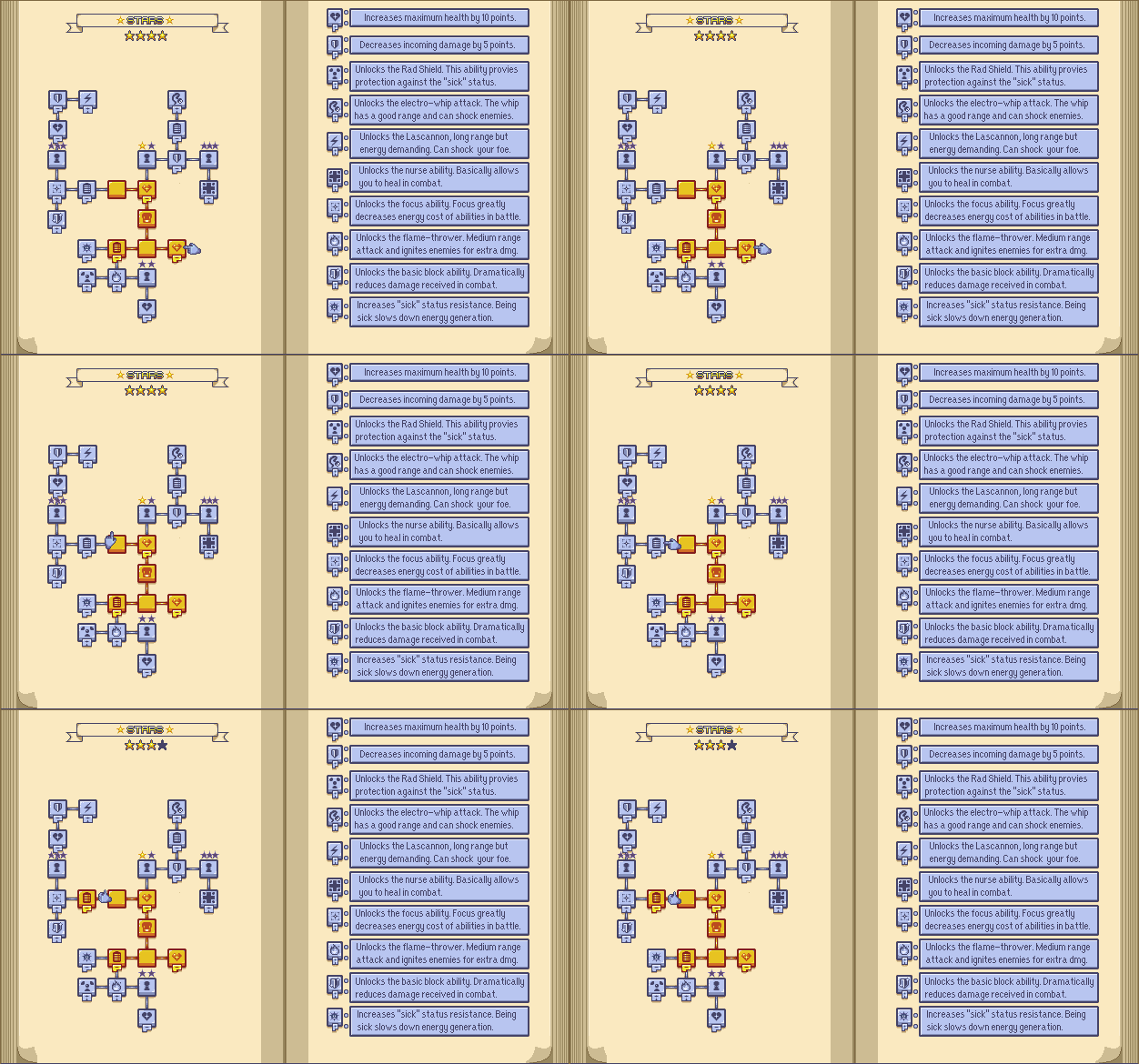
For one thing, it was too complicated with stars and locks and everything. Needlessly complicated that is. It’s like I was trying to integrate too many ideas at the same time and the whole process became bogged down in the details.
One level up system which I really enjoyed was how Final Fantasy X and Final Fantasy XII. In my opinion, it is the epitome of character progression.
I also love board games so I decided to work on those inspirations to come up with something:
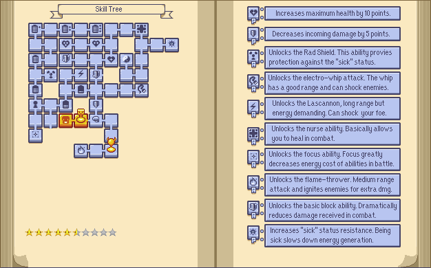
Here’s my explanation of how it all works:
Level Up Stars: Level up stars are acquired when a vocabulary card has been guessed correctly enough.
The progress bar goes up every time the card has been identified correctly until it’s finally mastered:

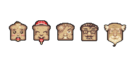
The Toaster Token represents Pan. Moving around the board costs 1 full star to convert blue tiles to orange ones. Half stars required to backtrack on already “conquered” orange tiles. That’s what I’m thinking at the moment but this is open to tweaking of course.
The Horned Token moves around the board sort of like the hammer brothers in Super Mario 3. It blocks access to certain upgrades and the foe it represents must be vanquished in order to process further into the progress tree. Might end up make it stationary though.
Padlocks block certain paths entirely. Certain objectives must be met in order for them to disappear. This can be to accomplish certain things in the story or complete achievements. I feel like this adds a lot of depths to the game itself. This was inspired by Wolfenstein: The New Order gameplay mechanics.
This is a first try at a layout and will likely change as testing continues.
What Else?
I’m redoing the title screen entirely. The current version is very rough and I don’t like it at all.
For one thing, this week, we’ll replace the text on the toasters on the menu with icons to make things presentable:
Story:

The animation is slightly improved but the following icons will replace the text:
Sensei Mode:

Options:

Tutorials:
I’m not quite down with the tutorial rooms and I’m still working on it.
Layout:
We’ll dump the pixel art text (1) which was taking too much room and add a star in the upper left so that the player knows when a card has been mastered:
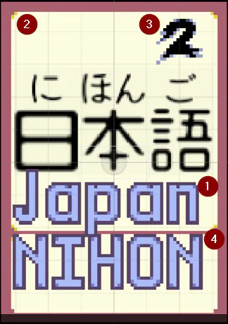
(2): This is where the Master Star goes.
(3): Also this week, the cards will now have different power ratings:

(4): That won’t be there anymore, we already have the furigana for that.
So basically most of the work remains in the actual coding to the game.
Get in touch if you have comments about the current build, thanks!

0 comments