SHT Dev Log #1 — Vision, Level Design, and Marketing a VR Game
In the last SuperHero in Training Dev Log we introduced the game broadly. This Log will focus on our vision for the game (as we’ve pivoted and down-scoped), difficulty curves, polishing for open alpha launch, online multiplayer, and how to start marketing an indie game.
Check out the most recent version of SHT gameplay above!
Our Vision for the Game
Since the last dev log, the team has decided that it would be best to down-scope SHT so that we can focus on making the overall experience as enjoyable as possible. We realized that somewhere along the line the design for the project would require more than the four current members. As we want to release our first project before expanding the team, we decided it best to focus on the quality of the game even if that means cutting back on specific features. As such, SHT will concentrate on players completing obstacle courses. Below is a new brief description of the project.
In SuperHero in Training, players play as a young hero learning how to use their power. Players will grow and gain new powers as they complete various obstacle courses and prove their ability as a hero. Players will try to finish the obstacle courses as fast as possible to receive better ranks.
As of this log, the Alpha is releasing in late October will feature around 10–15 levels. 10 of these levels will be tutorials that teach players the core movement systems. The remaining levels will focus on advancing the player’s ability as a hero by simulating an unknown environment and having players try to navigate through its courses.
The Alpha will feature around an hour of content at its initial release with plans already in the works for more content such as different environments for the courses and expanded powers/interactions.
Don’t forget to sign-up for the Open Alpha!
Creating a Difficulty Curve with Content
One of the jobs of a game developer is to onboard the user. This means not only getting them to play your game but teaching them how to play your game to increase user retention (keeping users engaged past the initial wow moment). In game design, this partially translates to teaching your players about the different elements of your game and how to use the core systems this way they can focus on gameplay and mastery.
Know your gameplay
Teaching others how to play your game can sometimes be difficult depending on the type of game your creating. Since we’re creating a VR game with an emphasis on movement, we focus on teaching users about moving in VR with our controller and basic VR skills (such as turning around and moving their arms, two interactions which aren’t common in non-immersive media).
When teaching others how to play your game, it’s important to know how to play your game. This means taking a few hours and being a player. Start from the beginning of your game and slowly go through everything to make sure the core systems make sense to yourself. A small example in SHT is using the Magnetic Hook with two hands versus one. When players use each hand individually they gain more aerial controller but can’t move as fast; however, when using two hands, players lose control but can move a lot more quickly (this can also help with last-minute adjustments before hitting a wall).
What makes playing your game fun?
This is very literal. It’s important to know what about your game will cause players to keep playing. Is your game easy to pick up but hard to master? Do you allow personalization with the character? Can the game be played with other players?
If you’ve designed your game around design pillars then you probably already have the answer to this question, however, if you’re still figuring out your core design then playtesting with strangers can help this process. Putting your game in the hands of new people will allow you to quickly find out what people like about your game and what people hate. You may also find more design elements to focus on from the playtesting.
Talking to potential players is one of the most important tasks when looking for design features to highlight.
With a VR game, it’s important to focus on the interactions and motions the players will be making. By making the core motions simple while also being tied to mechanics that require mastery a VR developer can engage users better. For example, in Beat Saber, the core motion is a sword slash. Most players understand that swinging a sword will cut something. From there the developers were able to add design elements such as slashing in specific directions and increasing difficulty by increasing the number of slashes a player has to make.
When in your game do players have the most fun?
It’s also important to find the most fun moments of your game. As you play the game, think about when you have the most fun. These moments are usually a little tricky and cause you to “actually play” the game versus analyzing it. If you notice yourself getting into the “flow” of the game, then the moment that leads to that is probably crucial to the overall game design.
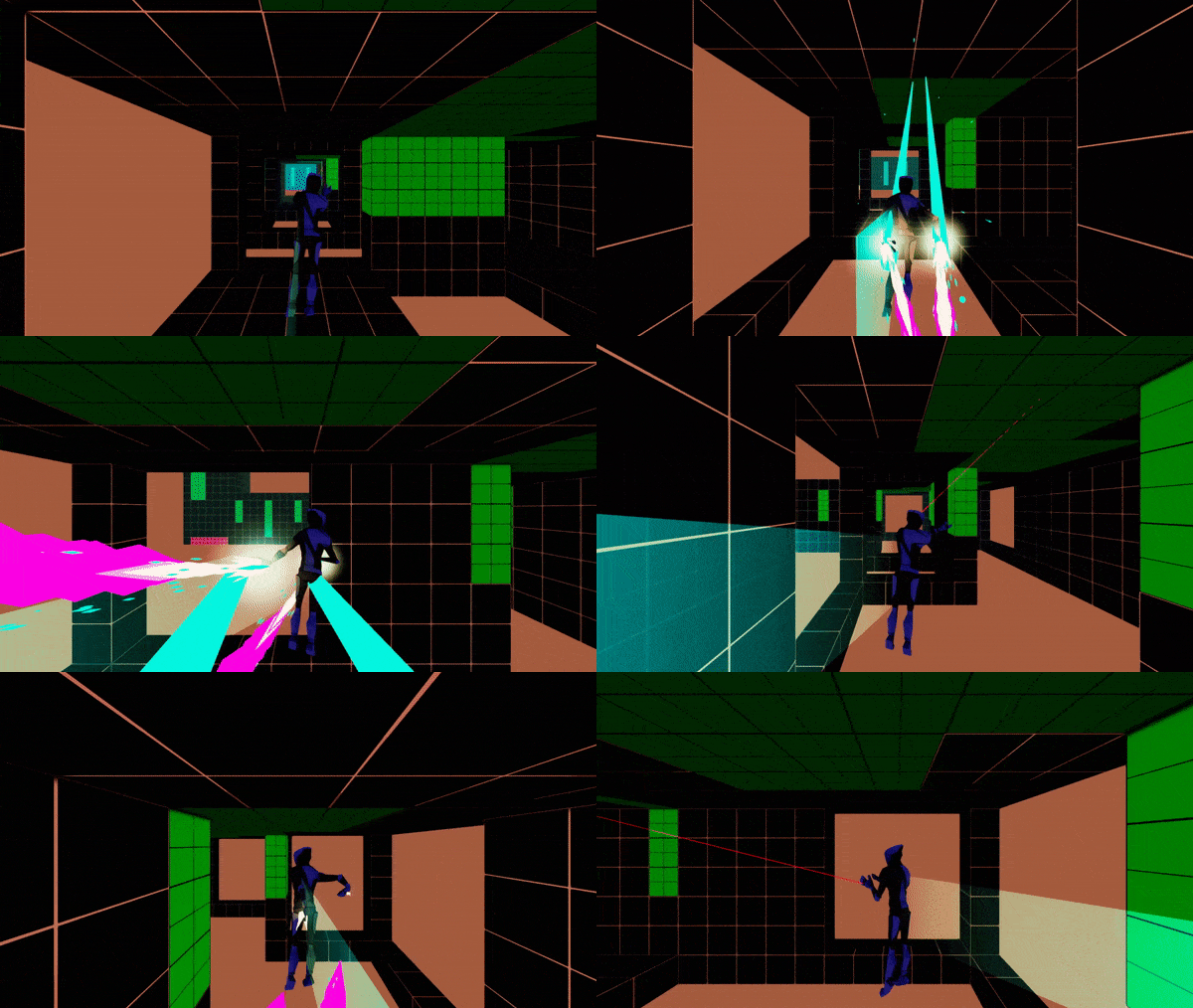
While we’ve been developing SHT we’ve noticed that getting close to a wall but not touching it and going through gaps in structures are the most fun. Thus we’ve focused the design to highlight these interactions. As players progress through levels, they’ll notice an increase in turns and situations where they have to make almost split-second decisions to adjust their trajectory.
How can you capitalize on those moments and elements?
Once you know what makes your game fun and when your game is fun you can combine the different elements from the what and when categories to create core moments for your game. This simple formula can help you make the beginning levels of your game more engaging.
Below is an example using SHT’s design with the swinging mechanic as a focus:
When: Moments, where there is no floor, causes players to have to focus on not falling in gaps and dying.
What: Obstacles that block the player’s forward momentum
Level Design Element: A section that contains no floor and obstacles the player has to dodge. The player will have to use their swing or thrusters continually, so they don’t fall, but if they see an obstacle or swing into an obstacle, they will have to change their trajectory to dodge the obstacles.
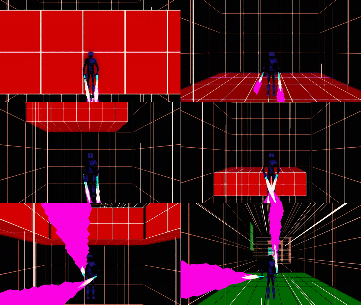
This isn’t a hard set method of design, but it can help make early levels more engaging. You can also change the formula up to increase difficulty. Such as adding one When and two Whats.
What can you use as filler, so your “best” moments are linked together?
Having the difficulty of your levels ebb and flow is essential. This means harder moments are surrounded by “break” or more relaxed moments. This helps the player to disconnect from the previous interaction mentally and gives them time to prep for what’s ahead. In SHT we do this by adding micro-sections that contain no obstacles (currently they’re just floors/platforms). This also allows for some variation in the level’s visual design (emptier sections of a level versus crowded ones).
Starting Level Design
Honestly, since SHT is our first “real” game (non-game jam or class project) we don’t have many tips for level design as we’re learning as we go, but the following sections are an overview of our current techniques and tips.
Too Hard, Too Easy, Just Right
After we created our base swinging and hand thruster mechanics, we began building sandbox levels where the player could play around with the overall controller to get used to movement in SHT. When we first started creating levels, many playtesters were saying the levels were too hard. This was because we were used to the controller, but others weren’t.
We decided that it was essential to get back to the basics by creating tutorial levels. With the tutorial levels, we decided to focus on teaching the player a core movement interaction. Meaning the first tutorial teaches the player how to move forward. The second shows the player how to turn, and they get incrementally harder from there.
Cubes for the Save
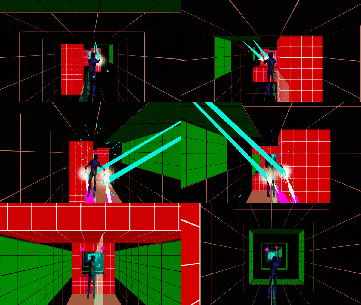
When reading around the internet and searching through videos, we found that at a base level it’s good to design levels around a core grid system (especially for games with unique movement controllers). With this in mind, we then created cubes sized around the movement controller. By snapping the cubes next to each other in various styles, we built obstacles, walls, and floors. For elements that move within the environment sized them based on the cube dimensions.
By building the environmental pieces based around the size of our cubes we were able to implement a simple grid system. We then took each of the parts and created the tutorial levels.
Letting your player die
Once you get to a point in the game where you believe the player should start feeling the difficulty of the game, it’s important to teach them how they die. This doesn’t mean forcing them to respawn, but showing them situations where they would die. An example of this would be holes with endless bottoms or that go off screen. Players can assume if they can’t see the bottom of a gap then it probably leads to death (this has been taught to players by older games such as Mario). If the death mechanic is unique to your game, then it’s also important to show them that the mechanic will kill them in an almost obvious way (it’s better to make sure the player understands the mechanic than to try to be subtle).
Make it more interactive
After you understand how to build an environment using your core design processes, you’ll want to start making your world more dynamic. One easy way is adding environmental pieces that are in motion. This will help your environment to feel more “alive” and allow players to truly engage with it. One of our favorite games for inspiration in fun level design and interactivity is, Runbow. Check it out if you want to research level design at an indie scope.
Designing Difficulty
When designing levels, it’s important to focus on the base difficulty but also to add replayability for the more advanced players that may be going through your game a second time.
New Players must be taught; Pro Players must be engaged
With the design of the tutorial levels in SHT we created them so that they show the player how to play the game, but also so advanced players can complete them quickly and move on to the main content. The first five levels are shorter and can be completed quickly. The remaining tutorial levels feature more advanced “shortcuts” in their design where the player can skip parts of the level by proving mastery.
Finding the Right Balance
When designing for both new and pro players, it’s important to remember where the player is in the overall content. If the player is at the beginning of the game, then it’s more important to teach than it is to focus on advanced-level play. If the player is towards the end of the content, then they should know the core features of the game, and you should focus on engagement and potential replayability (while maybe teaching them a minor mechanic).
Polishing a VR Game (Proving your game is worth playing)
VR games run into a unique problem when trying to market. It’s hard for a VR game to show how engaging it is on a 2D screen as people watching a trailer of gameplay on a screen aren’t experiencing the same level of immersion.
Our Solutions
To “solve” this problem, we’ve taken the time to begin polishing some of the gameplay within SHT. This means adding more art to notify the player and viewers about what’s happening in the game. For example, for people watching gameplay on a screen seeing just the character’s hands isn’t as effective as showing a 3D avatar. You may have noticed this in Beat Saber’s marketing strategy where they used real players within their trailers. To help solve this problem for SHT, we’ve implemented the following features.
Asymmetrical VR
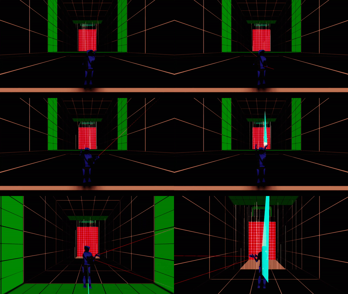
We’ve implemented an asymmetrical camera system into the game where people viewing the game sees the player from a third person perspective instead of seeing exactly what the player is seeing. This way viewers get a better sense of the environment and the different actions the player is taking.
Player Avatar
We’ve added a player avatar so the player can see their arms. This also allows viewers to see what the player is doing better as they won’t be watching a floating pair of hands or controllers. The player avatar also helps to better immerse the player in the environment by giving them a body and legs to help ground their sight while in VR (this may also help any percieved VR sickness).
Warp Lines
To help ground the player better and lower the chances of VR sickness we’ve added warp lines that appear based on the player’s speed. For now, the warp lines only cut on or off based on the player’s speed, but we do have plans to increase and decrease the number of lines based on the player’s speed.
Online Multiplayer
On August 24th, 2018 Exit Games released the second version of their incredibly popular Unity plugin Photon Unity Networking 2 (PUN 2). Coincidentally a week later was when we set out to implement multiplayer into DVNC Tech’s debut VR action platformer, Superhero In Training. We’ve dealt with the headache of bleeding-edge tech documentation before. We knew what we’d be getting into with a one week old API. All the tutorials and forum posts out there were for PUN 1. Fortunately, Exit Games made using PUN so easy that despite all the name changes we were able to use the updated documentation to work out how to upgrade the tutorials we read.
The real problem with implementing PUN2 was the fact that we are also creating a VR game. The way SteamVR Camera rigs spawn in Unity is not how we would’ve expected. In short, we did not need to spawn a camera rig for each player as they joined the online room. This was difficult because our player hierarchy was paired with the SteamVR rig. Because of this, we had to rework the player components and how the scripts call each other. We don’t know if this makes sense to anyone, but long story short we got it to work. We’ll show multiplayer gameplay once we connect the multiplayer to the player’s avatar systems.
DVNC is making SHT a multiplayer experience because we believe in the future of VR eSports.
Marketing
Since the last dev log, we’ve also begun focusing more on marketing. Below is an overview of the different places where we intend to promote SHT.
Game “Hubs”
A lot of modern marketplaces for games and developer websites have features for developers to promote their projects.
IndieDB / GameJolt / Itch.io / Gamedev.net
All of the above websites have features for implementing a dev log. A dev log is important for promoting an indie game as it allows developers to connect with potential players and to possibly create a small community for the game before the game is released. It also allows developers to document their ideas and thinking for review in the future.
When writing a dev log, it’s crucial to not only focus on your game but to promote sharing of knowledge. Try to teach others what you’ve been learning as you’re developing your game.
Twitter has become our favorite social media site for promoting SHT. The development community on Twitter is very welcoming, and Twitter has fewer “rules” than other platforms. We recommend it for practicing and learning how to market your project.
Twitter Tools
Below is a list of tools we’ve been using to grow our followers. Using these tools we’ve been gaining about 3–5 followers a day (they aren’t necessary for growth, but do help to point out potential followers).
Twitter Analytics — One of the best tools for measuring growth and engagement.
Tweepi — Great tool for building a following and finding users to follow.
Commun.it — Best tool for Twitter community building. Recommends over 25 actions to take to grow and build a following and increase engagement
Buffer — Best tool for scheduling posts and retweets.
Growth
Along with the above tools we’ve also been trying to engage the VR community more on Twitter. We do this by liking, retweeting, and commenting on tweets. We also use the Twitter search bar to find users who are interested in VR and potential influencers to start building a relationship with (this is important for promoting your game once you have something to show prospective players).
Ended the last sprint with 192 followers
Ended this sprint with ~260 followers
Conclusion
With the end of this sprint, we believe we have set a better course for the future of the game. We’ve begun building a community and are grateful for all of those that have started engaging with us on Twitter. We’ve also down-scoped the game and have started figuring out different design techniques for building levels. Hopefully, this will allow us to be able to create more content for players to enjoy.
What’s in store for next sprint:
			Sound Design
Narrative Design
More Polish
More Notifiers for viewers and players
Refined singleplayer and multiplayer core loop
Full-Length Levels
Thanks for Reading
Thank you for reading our dev log for SuperHero in Training. If you liked this log, please share it with anyone you think would also be interested. We can’t wait to share more in our next log and hope to come back with a nearly completed Alpha version of the game (SuperHero in Training Open Alpha Launching Late October).
Follow us on Twitter, Instagram, Facebook
You can follow us on Twitter, Instagram, or Facebook. Also, sign up for the SuperHero in Training Open Alpha and be one of the first to play DVNC’s first game!


0 comments