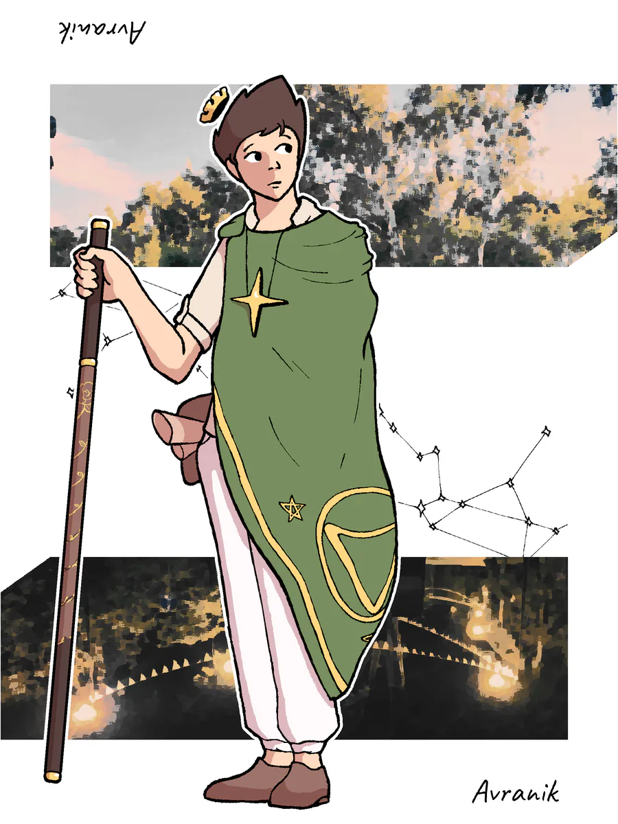
I think I'm too old for the previous fit I had for the longest time. As much as I loved the reference, neither of desings fit my personality anymore. The first one painted me as some sort of a "superhero", while the other one didn't deliver any meaningful image besides "cool guy".
I've heard some say that it's a boring downgrade in comparison to the previous flashy style, but is it really me? I'm the same guy to eager for an opportunity to go outside with someone, explore the corners of our city I haven't seen and take photos while no-one is around. They say I'm such a dreamer when I'm in the right mood, haha.
The point is I believe this design represents me more maturely and accurately, while preserving some of the iconic elements.
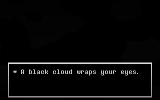
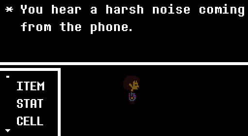
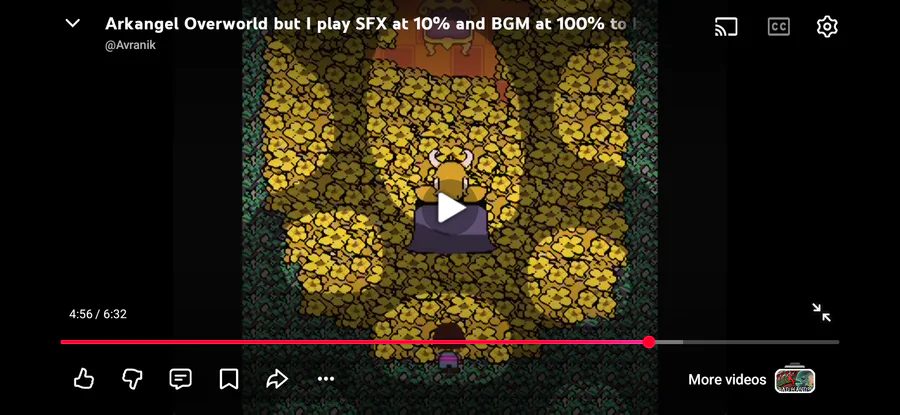
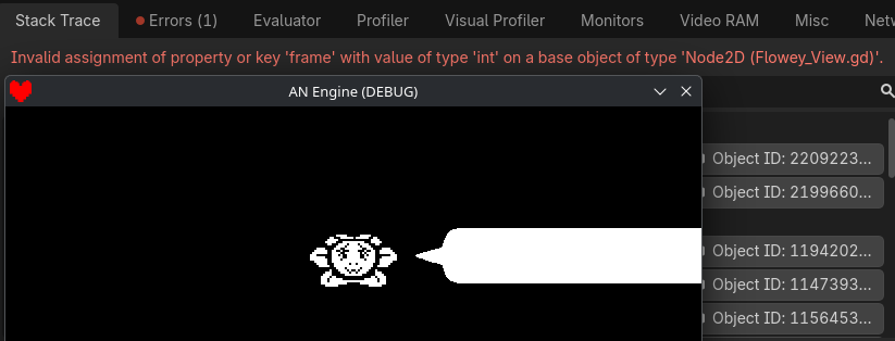
Before you say it, I definitely never heard of Porter Robisnon before, and I never seen his album covers of Nurture before making it. This old draft and a YouTube screenshot are the definitive proof.
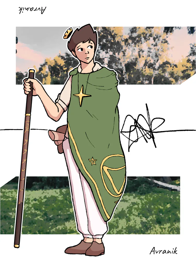
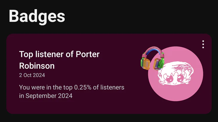
There's absolutely no connection between one of my favorites albums and the design that was inspired by its aesthetic.






39 comments