I originally used slate brushes for the inventory icons which made them less accurate to Hello Neighbor and the icons weren't the correct resolution. The current method is using Texture2D to set the inventory slot to the items icon.
I improved the animations just a bit, but it is noticeable as the player is switching items. I wanted this to look as polished as possible. I am using some animations from the mod kit as I thought the original ones were dated and didn't fit the item: an example would be the rifle.
As always, I do appreciate all the criticism I get. I find that it will help me learn what you guys would want in the final build.
Thank you,
Your Friend, Voxel.
PS: Sorry for the overlapping sounds. I know they suck, but I usually playtest this without headphones to prevent my ears from bleeding.
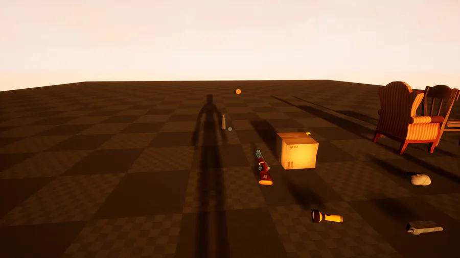
Next up
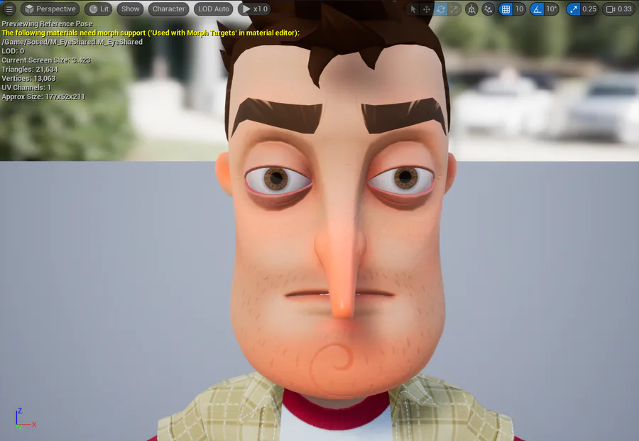
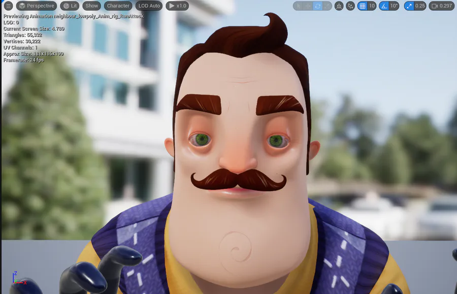
Fixed the eyes.
This explains how development is going:
Realistic eyes on these models actually look kind of eerie.
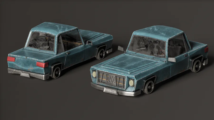
my second car in my life
Texture changes.
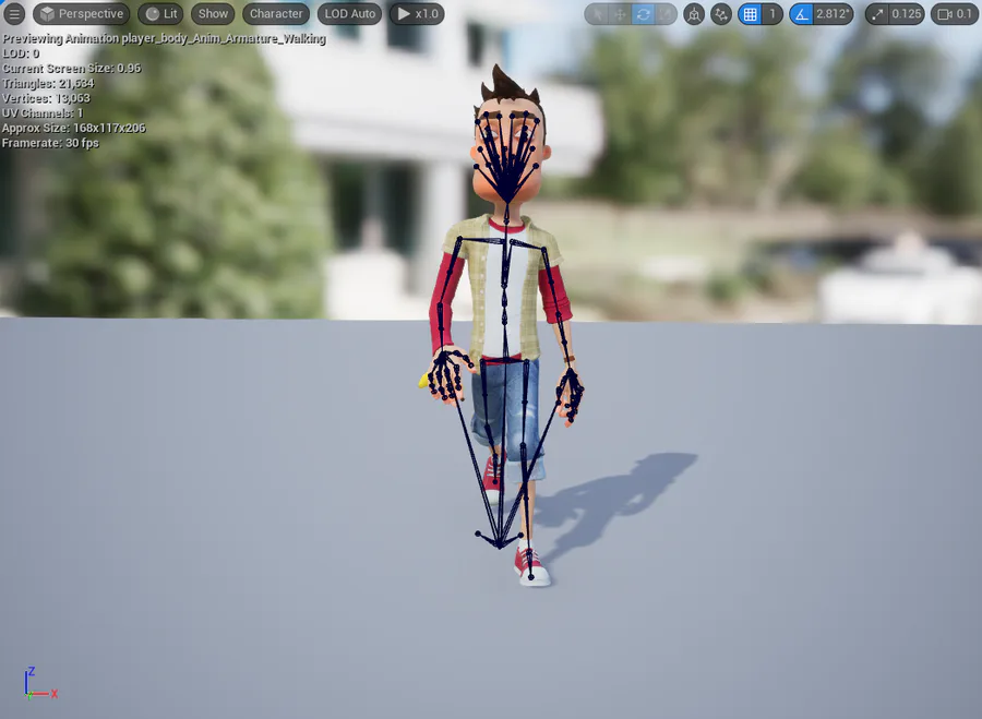
Currently working on the custom skeleton I was talking about a while ago so I can use the same skeleton between the two characters. It'll also make it easier for me to make proper IK through Control Rig.
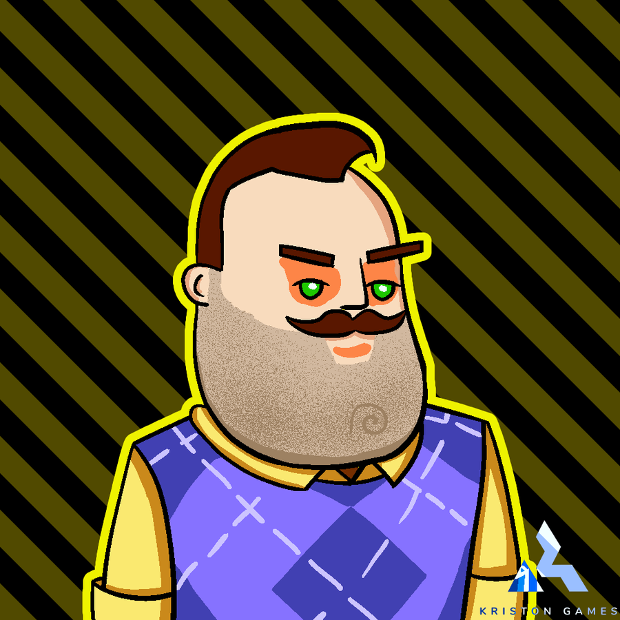
I decided it was time to do what I've been dreading most: developing more of the Neighbor and his AI.
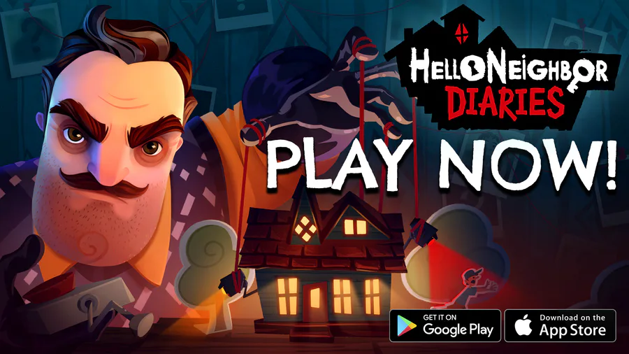
We hope you've got your jumping boots, EMPs and Jugs of Glue ready, as Hello Neighbor: Nicky’s Diaries is now available worldwide on Android and iOS! 📱 iOS: https://tblink.co/hndiOS Android: https://tblink.co/hndAndroid
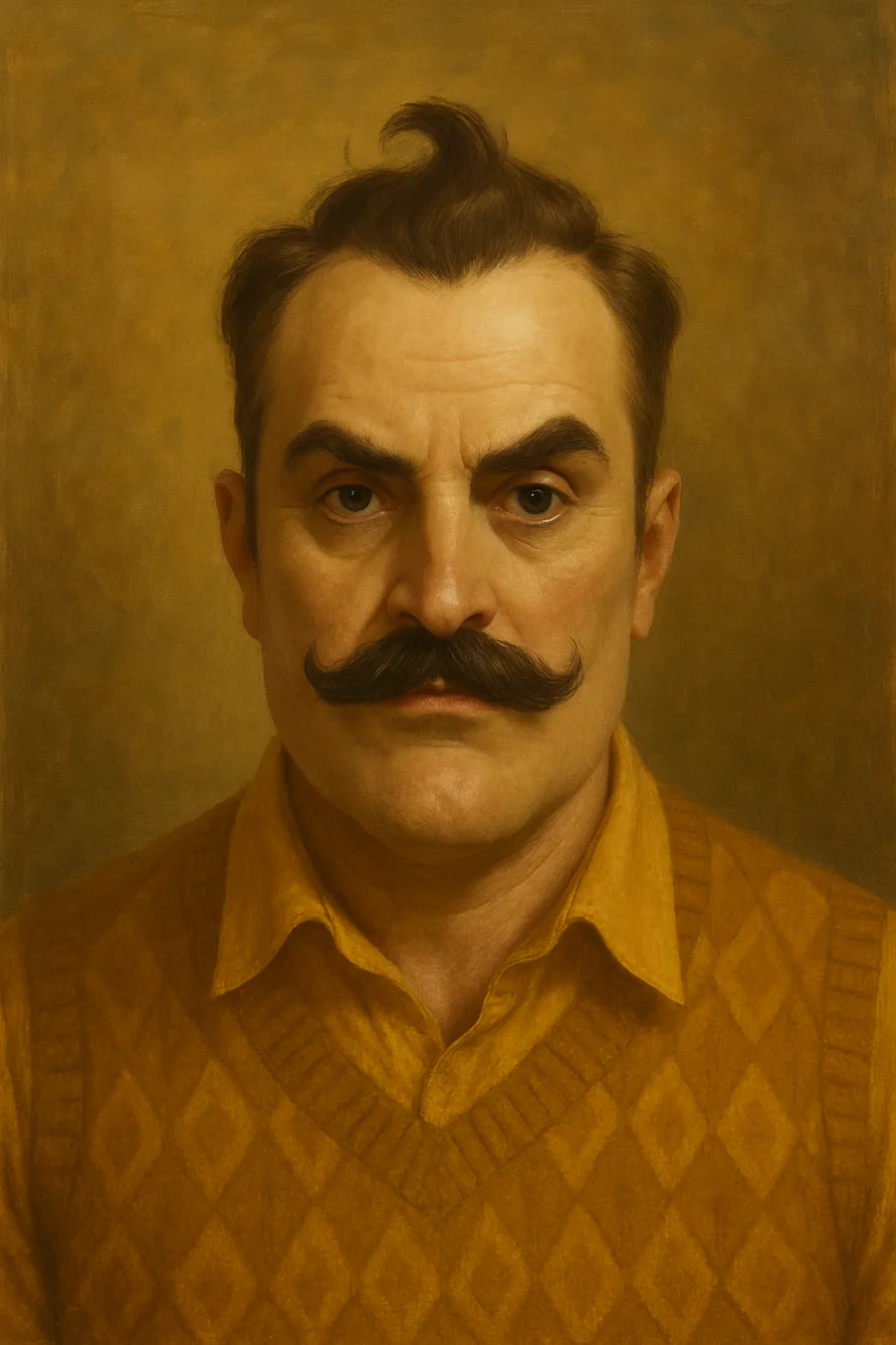
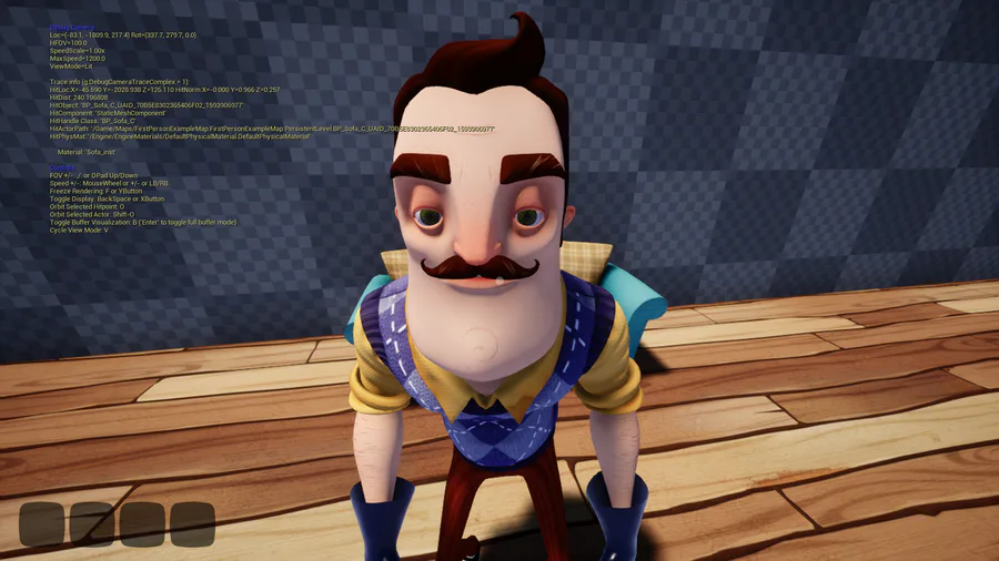
I am using AI to remake the paintings (I'm by far not a good artist and can't produce the same results) First is AI, Second is original.



0 comments