[Just a reminder there will be uncensored swearing bombs in this article. Read at your own risk.]
Because you know, for me, the whole video is nothing but merely summarized as “COLOUR WHEEL BAD!!1!1”. It gives barely any tips for beginners, and it's all because of the "not fitting the artstyle flow" reason thing. Again, it's basically “COLOUR WHEEL BAD!”, but expanded in around 10-minute long video. It's not a whopping advice, buddy. It's a personal rant. There's a significant difference between giving advices and spitting personal rants.
[Warning: Second-person for the one who gave the "advices".]
Your "advices" isn't helpful for beginners who might struggle with sliders, even some amateurs or hobbyists like me, and will never be helpful. I think the next time I feel really stupid, I'll just remember your so-called advice. Keep your "WHEEL BAD SLIDER GOOD" opinion to yourself, don't damage the reputation of people using colour wheels. It's basically "Phone bad book good" phrase, but it's the case of digital art.
“Triangle? Square? Both really suck as hell.” I disagree with your stupid, misleading brain. You only give the example on the square, and I'm sure that doesn't support your "COLOUR WHEEL BAD!" opinion much enough. In fact, there's a comment where they (the commenter) accept colour wheel with squares and/or triangles, but can't stand colour wheels with just circles. It's not something useful, bud.
“It discourages hue variation and/or shifting.” Okay, but have you heard of the colour theory? As much as I summarize your second argument, I'm sure you don't, at least in the classic way and only in your understanding. And about shifting, we can easily do that as much as the slider. And it's way simpler to do it! Once again, your "COLOUR WHEEL BAD!" can't be defended with such weak argument.
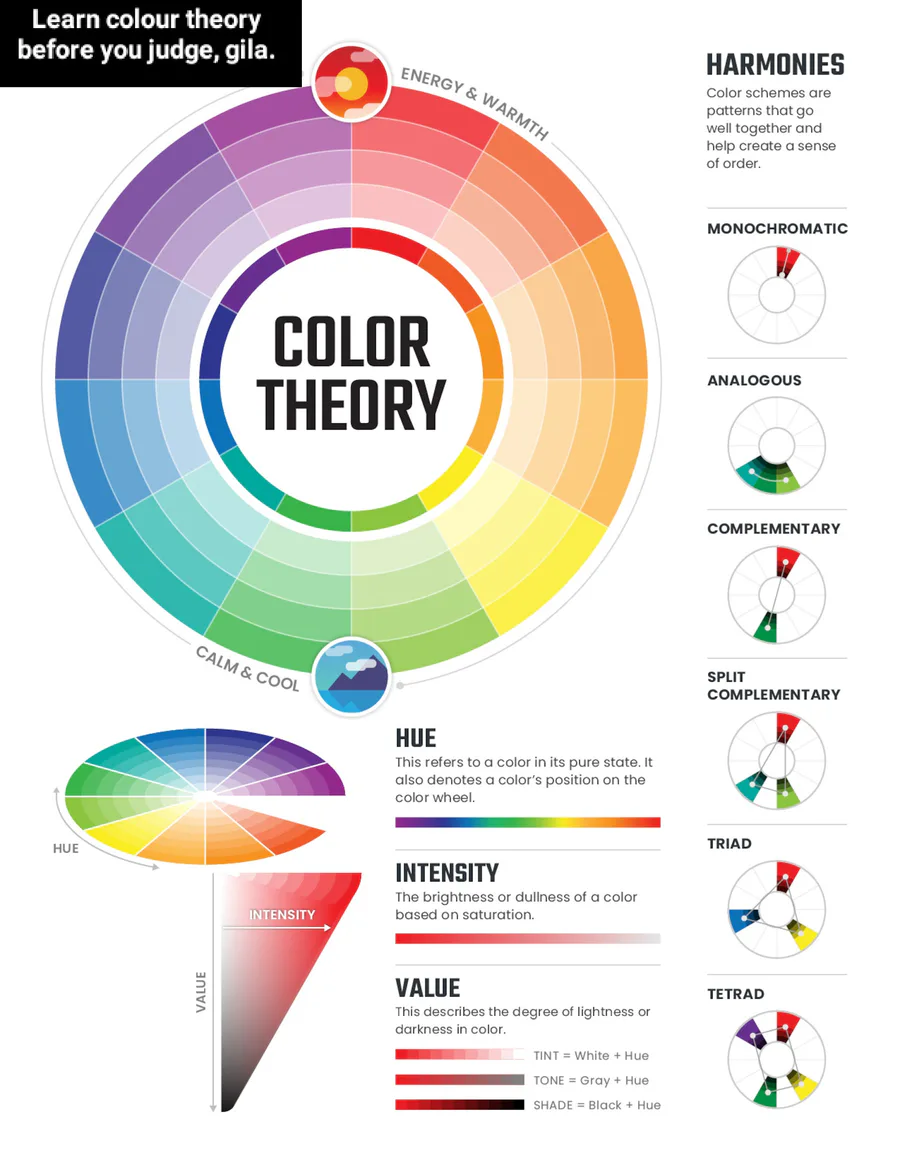
“Third of all, colours are viewed relatively, which is a really bad issue.” What in the world is that goofy ass problem? If only relative colours is next to the chosen colour in the ring and square is a big shit problem to you, then it's an advantage for others. In the colour theory, there's such things as "monochromatic" which only consisted of one specific colour with different shades, and "analogous" which is using one colour and some that are similar to them, with different shades as well. Learn the colour theory before you judge, crazy person. There's a wide variety of infographics about colour theory online, and it's not too hard to understand it. THERE ARE ILLUSTRATIONS. And if you call it useless, I don't know what else to call you other than stupid.
“THE COLOUR WHEEL IS TOO DAMN BIG!” Too big you said? So that's why you stick to your sweet little slider? No, it's not big enough, you bug. If you think it's too big, I can make it the size of a subatomic particle with coding. Kidding, it's impossible to make it small. It's big, because IT NEEDS TO BE CONVENTIONAL ENOUGH to see if your colour is accurate enough for your work. “It takes out half the slide bar.” ibisPaint, that separates its tool-switching, brush shapes, colour-picking and layer setting IN THEIR OWN PLACE in the corner is just behind, thinking "Am I a joke to you?". I think this is the dumbest and the most loser take you ever do for your defense on "COLOUR WHEEL BAD!" thing. I see your take on this one is extremely funny, but not in a good way. You should be a comedian, of course! (An extremely rare moment of a self-deprecative modest person being arrogant and didn't regret the whole damn thing)
“So the solution is, the colour wheel is a PIECE OF SHIT and you should throw it in a garbage. And you should use the juicy, delicious, scrumptious, tasty, harder zaddy colour slider!”
Nuh-uh. I have a 200% better solution to you if you struggle SO MUCH with the colour wheel: USE BOTH, AND FIND A PROGRAM THAT DOESN'T WASTE THE MENU WITH WHAT YOU HATE! I can't believe I finally found the Grinch of the Art community, and I'm so happy that I can increase my confidence way further than ever! Especially when I found this Grinch, IN THE MONTH OF CHRISTMAS!
I really hate the way you think such a useful tool for beginners as a curse, and something as complex as a Form 5 mathematics problem as a cure for artwork. And colour sliders, for me, IS WAY TOO HARD TO CHOOSE to begin with. Take an example, I go to Gacha Life 2, which has the colour slider option, and oh god it's so hard to control the piece of crap. Off-topic, but that's quite why I use the whopping colour pallette for my characters instead, despite the limits!
As I mentioned before, you can use both of the thing you admire so much and the piece of bullshit you're talking about! For example, using the wheel to select an initial colour, then the slider to adjust for your desires! How hard is that? Not hard right? Then don't give beginners advices that are as hard as giving a high school problem to a kindergarten kid. It's dipshit, I know, but don't force someone to use something that is somewhat not beginner-friendly JUST BECAUSE YOU HATE THAT DAMN THING.
As a conclusion, I would like to give the "all thing" I learn from this video, and it's fucking useless: “COLOUR WHEEL BAD!!!!”. I don't think this is a so-called advice, and it's just a blabbering nonsense to my Judgemental ears. I never feel so superior and confident before I see your nut-brain rant, and I think this will be the only time I feel so. So instead of forcing people to switch from something they are really used to to something they don't and are complex to understand, give some useful tips to give them improvement to their artwork, even if it's just those generic "Five Tips To Make Your Colouring Better". Not like "THE THING YOU'RE USING SUCKS ASS AND YOU SHOULD SWITCH TO MY LOVELY THING I'M USING!". That's it, have a terrible day to you, who made that stupid ahh video, and have a good day for whoever reads this stupid counter-argument.
(P.S: For fellow moderators of Digital Art community, if you see this as too disrespectful, I'll immediately eject this post from the community.)








18 comments