

The Blood and Gears demo released today and I gotta say.... it was very...underwhelming.
Before we start some basic notes:
1. Criticism will be present as there was a bunch of aspects in this demo that felt off or didn't click with the environment.
2. This is my opinion if you have a problem with anything I said few free to stop reading here :)
With that out of the way let's begin:
Menu Design

This is one of the only parts of the demo that I don't have to much criticism for. The atmosfer of the office is good in this menu, we will comback to it in a sec tho.
My only issue with this that the computer and font could have been better executed with layer filter or something along those lines.
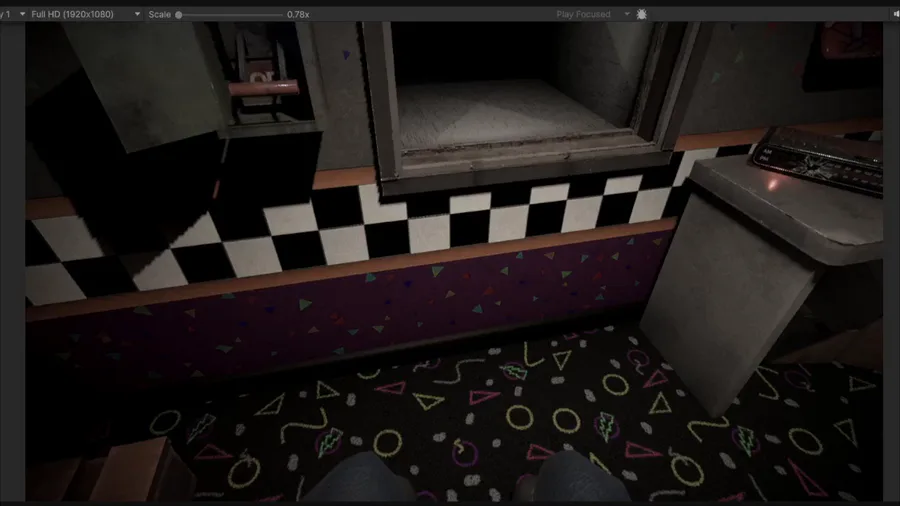
The office
(Front view)

This is where the criticism-palooza begins, let's talk about design. The office looks boring, it feels llike it was made last minute. The props are well made but a better choice of props would make it a bit more interesting. The lack of props or rather actual office material is quite upsetting and the pizzeria props that are in the office are repetitive... why would you need 4 bubble heads on the office. Don't you have other merch, like plushies? Why not add one of them in the corner.
(Right view)

The right side has a turned off monitor and a barely visible Foxy Bubble head...again what is with the bubble head obsession? The poster is a nice addition, but it feels out of place. Idk if is the position or the randomness of it but maybe add something else to the wall instead.
The big doorway is an odd addition, if your only option is to go left why leave the right one open at all?!
(Left View)

Something that i haven't commented on the front nor right view, was the addition of to many lightings.
There is a emergency light, celling light and a lamp, which feels so redundant, there is no need to have a desk lamp if you already have a celling light. Doesn't make much sense...
On that note why is the emergency light on... if the building light are on already

They only turn on when the lights of a building go out, just adding a red light just because it's cool doesn't make sense. So take notes on that.
Let's get outside to see the post night minigame, i'm sure it will be entertaining ... right?
THE POST NIGHT (The alleged meat and potatos of the demo)

I've never been so bored in a after night mini game in my entire life, allow me to explain.
The whole idea is that the player have to reach a certain highscore on the arcade to finish the demo, while fending off the threats, Bonnie and Chica that can appear on your left or right side. It sounds like a good idea if it wasn't so dragged...
Let's go by points, again:
Environment
The location looks very well put together, despite the issues with the office I mentioned earlier. The lighing doesn't feel as awful as it was in the office...
We will come back to the lighting topic in a bit, when we talk about the mascots ">_>
Mini game
The arcade gets boring after a few seconds, it's just the dinossaur chrome game, with a FNaF coating on top. The idea of charging your flashlight via the arcade is interesting but could be better executed.
It few odd to say the least, make a flashlight with a automatic charging or another way to charge the flashlight cuz it doesn't make sense how it's presented. It's not connected to the arcade as far as I'm aware.
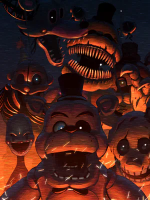
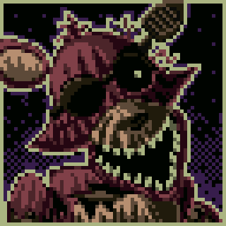
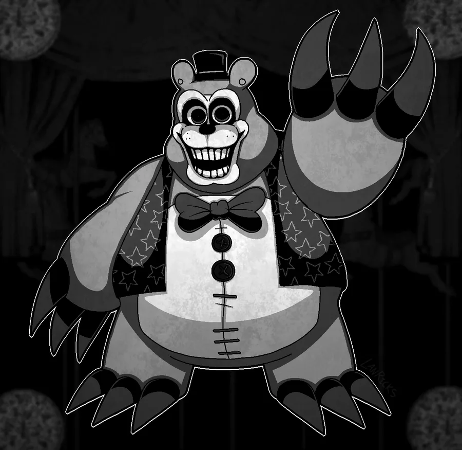
The Mascots "threats"

"Got any games on your faz phone?"
The mechanic behind the mascots is simple, if Bonnie appears and you use the flashlight on him. He won't appear again, until a certain time passes and Chica is delt with. Same mechanic also goes for Chica.
On top of being easy to deal with the lighting don't make they feel uncanny or slighly horrorfing...
Granted in the dark they have a slight scare factor, but as soon as you turn on the lights it just feels out off place, not in a horror way, kinda like a cropped render, heck bonnie has a black outline as seen on the screenshot above.
I was expecting to be at least on the edge of my sit but I wasn't .
The Big underwhelming "reveal"
After you beat the mini game the arcade just shuts off and slowly reveals the Puppet which felt... disconnected.
Don't get me wrong, it is a cool design, but it was the most random way to reveal it. If the same was added into the minigame in some way would makes more sense, or a better transition towards the big reveal, rather then the average FNaF glitch. The way it currently is feels like a render of the model on a dark background.
Final thoughts: I'd give the demo a 6/10
I hope @JDBRYANTdev  and the team actually revise this section and other sections, cuz this game needs some more time in the oven, just saying :P
Well that's pretty much my thoughts on the whole demo, if you don't liked any of my points above you are more then welcome to comment under this post :)
Have a great weekend
Arc Out


8 comments