NOTE: It is not possible to patch this over the previous versions of Ribbit. If you already have Ribbit installed, you'll have to patch this into another copy of Deltarune for it to work. Your save progress will be retained across versions, so don't worry about that. As always, please follow the installation instructions provided in the download.
Ribbit 1.5-F was supposed to be the last major update for Ribbit. So I thought. My main goal was to introduce a new ending that negated the original ending's nihilism. It didn't wrap up every question or explained every plot point, but that wasn't important at the moment. What was important was walking away from the mod, knowing that its true ending left things on a peaceful note, giving me peace in return.
I came to terms with knowing I might never be able to tell the full story as was written in my notes, but I s'pose the one thing that's been still hanging on my mind since January of 2022 is the way I left the art side of things.
Not all of it was bad. In fact, there were some pretty cool pieces of spritework in there, stuff that I would never change for my life. But, unavoidably, stuff like YOU's sprites left glaring first impressions on certain players that failed to convince them to keep on playing to see the mod get progressively more complex over time.
Which brings us to Ribbit 2.0. The update that only happened because I would've taken any opportunity to improve on the mod's spritework. And like a messiah, lo, comes Devilredd with his gold-laden drawing pencil, riding on the back of a MS Paint shaped horse, and a carriage with 12 screaming monkeys stuck inside. He raises his pencil in the air, and striking down the earth with it, thus births the changelog down under...
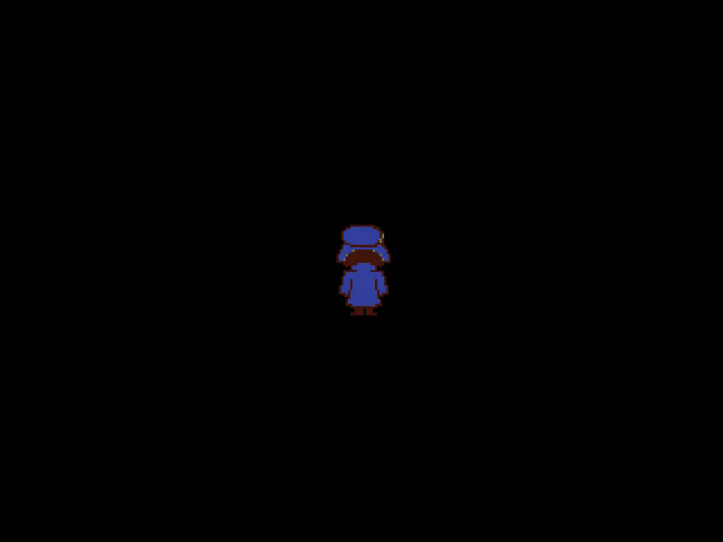
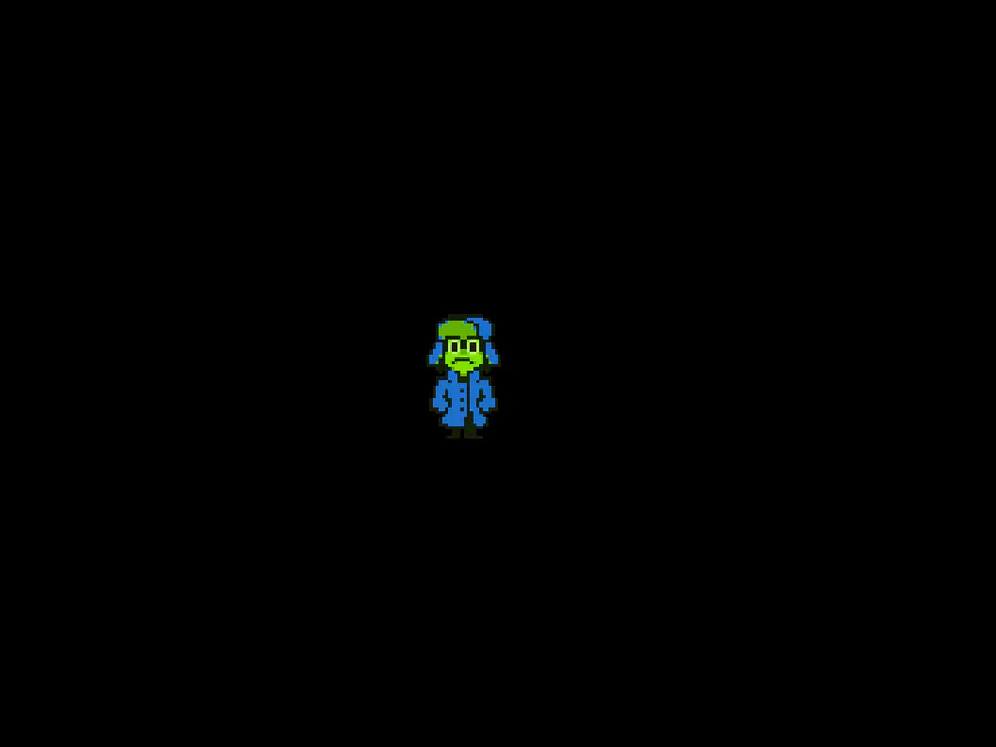
The biggest change, and the update's main focus, is The Redesign of YOU the Frog, the protagonist. (all spritework by Devilredd)
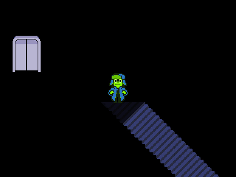
This not only includes replacing every sprite in-game. After all, if that's all I did, the game would break. YOU's new design is a few pixels taller and wider than the old one, so, because of that, pretty much the entire game had to be slightly re-adjusted to accommodate for this.
Many cutscenes were given very minor adjustments, and many hitboxes and collisions were reworked in order to feel right again. Now, if we're lucky, you might not be able to tell that anything's changed on that front. That's when I'll know I didn't fuck up.
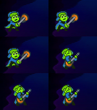
You might be able to tell however, that certain moments actually have more sprites or frames of animation than the original design had. This is particularly the case for scenes that were a bit too similar to their Deltarune counterparts. Regarding scenes that received the most drastic changes, I'll detail which ones received said treatment further down in the changelog.
Also, in case anybody missed it: Don't worry, we fixed the walking animation to look more natural. In the process, we also programmed in a unique running animation when you pick up enough speed. There are also different walking animations, which trigger based on the current tone of the mod.
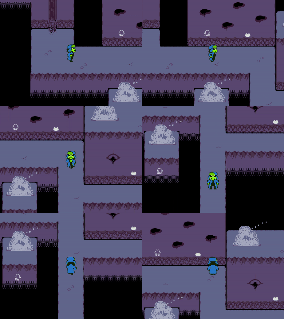
As for why I didn't include a toggle in the new version to allow you to switch between the old and new design at will... Aside from it being double the work required to get the whole game working, here's where I'll be real with you.
The old design is not something I'm fond of, in part because of the amount of problems it caused. The amount of confusion, which sometimes escalated into outright accusations... much of it stemming due to the old design's extreme resemblance to Kris, and my inability to differentiate the design enough from Kris. It was a fuckup on my part, and one that brought down people's impression of the mod. I want to leave that behind. The goal behind the new design is to have YOU be recognized as their own character, as was always my hope.
With their old design, all they'll ever be known as is "Frog Kris", "Kris with Weird Eyes", and I can joke about it all day, but that's... still not great. It's not a good standard to set. It strips the character of their identity, overshadowed by bad 2-minute edits of existing sprites. If you find that charming, that's alright, but it's not what I wanted. That's why the new design was made, because YOU is not Kris. They're their own person, and they deserve to be seen as such.
Do bear in mind also, I've been thinking about a new design since at least a handful of months into Ribbit's development. This was in no way a hasty decision. It was one that was reaffirmed by the criticism, but even if nobody spoke up, I would've still been waiting for the opportunity to redesign YOU.
The old version of the mod won't be publicly available for the time being, as I don't want people to mistake it for the new version. However, if you're really looking to download the old version of the mod, please message me either through here or on Twitter, and I will send you a copy.
But in the meantime, I encourage you to give this new version a chance. We have sunk months of effort not just into removing what was bad about the old design, but retaining what I felt was good about it as well. That combination of cute 'n cool, the weird and silly expressions, the nervous personality... I did my best to look back on why I made those sprites look the way they did in the first place, to make sure as much of that vibe as possible was retained. Alright, I'm done.
A "Writing Style" option has been added into the game. You can switch between "OLD" (Ribbit's writing as it was in 1.5.2) and "NEW", a mode that rewrites various lines, adds new ones, tightens up the pacing by reducing the amount of dialogue spoken, while extending the pacing on certain early scenes that felt too rushed.
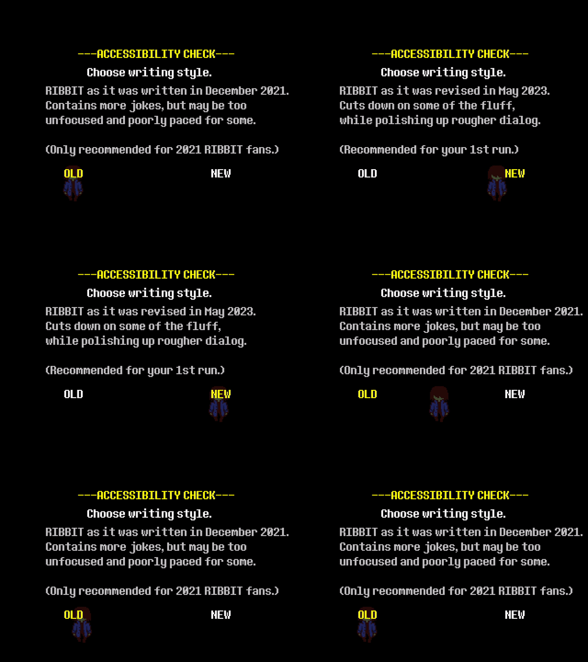
New players will get the option to select the writing style on your first bootup of the mod, but you can also go into the Accessibility Settings in the Dark World to switch between the two modes at will. For returning players, the mode will be on "OLD" by default, and the only way to change it will be to go into the Accessibility Settings.
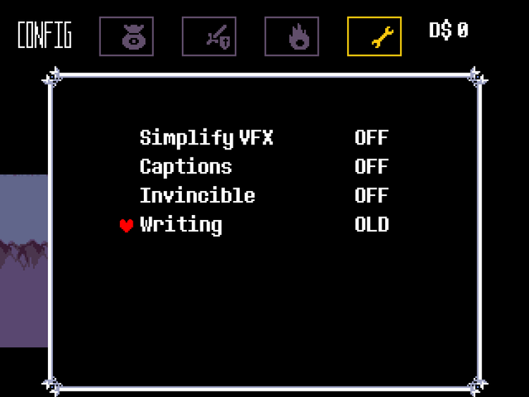
The NEW writing style has been added to accommodate players who found the mod's dialogue a lot more chatty and meandering than Deltarune's, and is treated as the recommended way to play for newcomers. It also came from a desire to improve certain remnants of my 2018 writing, and center the mod slightly more on story and characterization over the "1 joke per 2 lines" method of writing that tends to permeate the mod.
In spite of this addition, I still have fondness for most of the mod's dialogue (a handful of exceptions aside), as I'm sure some of you do. The "improvements" in the NEW writing style are purely subjective, they may not be "better" so much as they may be just "different." The "OLD" option was included for those who wish to see Ribbit's writing as it previously was, and for those who are interested in checking out both styles over multiple playthroughs. The recent Monkey Island did something kind of like this, I was probably inspired by that. Still, I'd recommend "NEW" if you're new here.
Note that a handful of lines in "OLD" still had to be rewritten, particularly those that were made with YOU's old design in mind. Anything that references their old look, or the sword, has been adjusted.
There were also grammar fixes applied, the word "sissy" has been removed (As I've learned that it's not just a word for a coward, but it also carries a derogatory and offensive meaning commonly used against people with feminine traits), and one of the Hidden Lore Files was slightly adjusted to use the same terminology that is used in-game.
Another minor change to both styles of writing was the removal of Susie's brother, "Frank." Along with "Mary", Susie occasionally mentions "Frank" by name, but this is quickly forgotten and serves no ultimate relevance to the plot. In exchange for removing Frank, Mary was given slightly more mentions.
There are too many changes in the NEW writing style for me to list them all, but one of the more specific ones involves a new NPC that replaces the talking chairs found just before the Forest Maze.
I figured, well, a pretty serious scene just happened... it'd be kinda ill-advised to ruin it with a 4-year old Metal Gear Solid meme, doesn't it? So, this new NPC grounds things a lot more in comparison.
Although, an interesting touch with this is that it's actually still possible to get the talking chair NPC's to appear in NEW, but only via backtracking to this room after exiting the Prison area. It's like the best of both worlds now. Even though the world with the talking chairs was pretty dumb...
Lancer got a glow-up too! His design stays the same, but the sprites were redrawn to meet a similar quality standard to YOU. Certain sprites that were too similar to each other were given unique poses, and the bike was redesigned into something that fits Lancer's idea of "cool" better, a red and shiny sports bike.
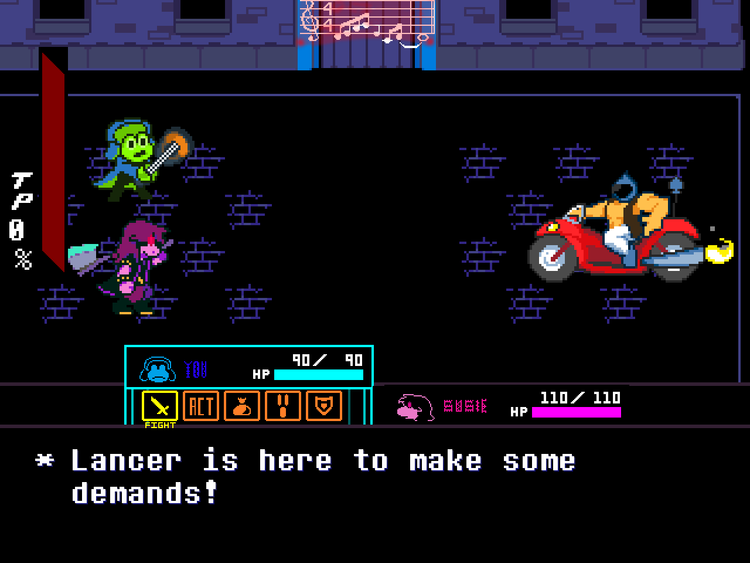
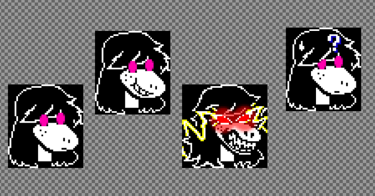
Susie's text box expressions have been redone to look less dopey. Her haircut in the expressions was also adjusted, based on an unused hairstyle from one of Deltarune's teasers.
Everyone's favorite character, the Opposing King, was completely redesigned.
During the mod's original development, the dream for this character was to create a design that resembled an NPC you'd see in Undertale, with a royal kingly touch to it. Unfortunately, due to our limitations at the time, we had to settle for a grayish humanoid design. This conveyed things well enough, but it kinda stuck out like a sore thumb.
This new design is to make it more stylistically consistent with the rest of the mod, but also to give the character a larger, more imposing look that I believe befits the appearance of a king. But, for probably obvious reasons, I can't show it here.
Noyno's Defend sprite during battle was redone.
He now puts up an entire barrier that surrounds him rather than one meekly wall. We almost lost the expression Noyno makes, y'know, the one where one eyebrow is raised higher than the other to make him look super smug... but don't worry, I went in and re-added it.Seam's shop was another victim of the mass redesign of 2023. Okay, it's not that bad, right...?
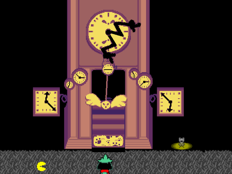
We stuck with the grandfather clock motive, but the pendulum was redone to be slimmer and more stylish. A couple clocks were added on the entrance, and also we accidentally made it too big. So, I added a thing where on your first visit to the shop, the camera pans upwards to reveal the rest of the building.
I also fixed the trajectory on the swinging pendulum, because boy it was all sorts of fucked up before.
Master Devotees has also received a redesign.
In a similar vein to BAD END, the Devotees are considered one of the most important MOTHERSPAWN designs, creepier and more threatening-looking than most enemies.
The thing is though, when we were converting this enemy from concept art to the final art, a couple things got lost in translation (such as the transformation sprite being intended to look like flower petals, not a rice ball), while other things were added (hair, and certain devotees being smaller than the rest) that wound up making the final design stray too far from the original intent.
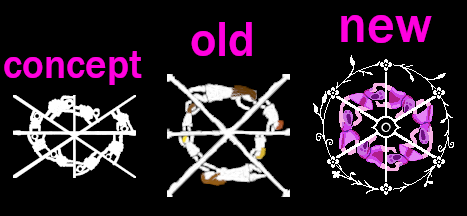
Present day onward, this is the one single MOTHERSPAWN design that I strongly wanted a do-over on, partially to make it more faithful to the original concept art, and partially to emphasize its importance through a different art style and unique colors, while retaining its disturbing elements. To that end, we implemented themes of nature, which were inspired by the setting and the characters that this enemy is based on.

Note that every other MOTHERSPAWN remains unaltered and identical. Sure, they're a little rough around the edges, but I didn't feel the need to mess with their designs, plus, that would've taken up a lot of time.
The sprites of "Hero" were redone.
For those not in the know, "Hero" is the red-haired human character seen in Noyno's flashbacks. Although they are never referred to by name, "Hero" is the one internally used during development.
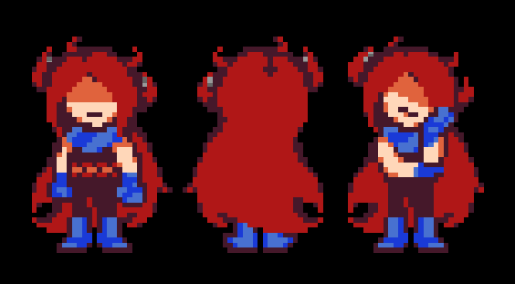
The overall fundamentals of the character were kept, so I wouldn't exactly call this a redesign, it's more like half a redesign, half an update like Lancer.
The character's height was slightly increased, the little teeny fire icon on their torso was changed into a fire bar, the scarf was enlarged, and the gloves and shoes were changed from red to blue, in order to better balance out the ratio of colors and prevent blending. Other than that, the haircut was overall retained, though the front was given something closer to a bob cut.
In hindsight, YOU and Hero have a kind of unified design now, don't they...? Like, obviously they're very different looking characters, but I noticed that both of them now share this dark jumpsuit as their primary cloth. It's like a stylistic theme, I like it.
I don't think I ever told this story by the way, but the way we came up with this design in the first place went something like... "try a nagito haircut. okay, now try a sephiroth haircut. now try both. perfect"
The Cell Phone produces bonus flavor text depending on where you use it.
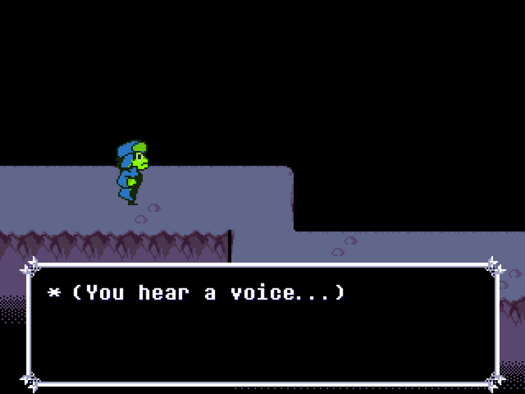
It's not exactly the "Noelle phone calls" thing from that one scrapped update, and it's on a smaller scope, but... the phone now acts as a kind-of receiver for ghosts, spirits, and voices of the past. Think of it like Echo Flowers as phone calls. Some of it is useless, some of it may hint at certain lore.
Most rooms have at least one unique piece of phone call text, up until Card Castle, where from thereon it changes into the original flavor text that accompanied the phone interaction in past versions.
The static sound is gone, though. Apparently the sound and the way it stereo-bounced from one ear to the other was fucking with one of my friends, so I changed it to a busy tone to be more pleasing, yet still eerie to the ears.
Please note that these new additions to the phone do not unlock some crazy new ending or something like that. These additional pieces of text do not influence anything, and are simply there because I've had one free day to have fun and write them.
Added a new variant of the Cracktro bootup screen. It automatically triggers between December 18th and December 31st.
The text for skip prompts (most commonly seen in New Game+, the stuff that says "Hold button to skip cutscene") was recolored from white to yellow.
I remember that during the 2021 release of Ribbit, one of the interesting bits of feedback I received was "I wish there was a way to skip the cutscene before the Forest Lancer & Susie fight." This struck me as funny, because, there was a way. After dying once, a prompt pops up that lets you know you can hold Backspace to cut right to the fight. Thing is, playtesters simply didn't notice this prompt.
I chose to combat this in multiple ways. Firstly, turning off your ability to skip through dialogue using [X] whenever the prompt is on-screen. That way, players would have time to slow down and notice the prompt. Secondly, I gave the prompt an afterimage effect to draw the player's attention to it. Thirdly, I repositioned some of these prompts to be in easier to spot locations. I was hopeful this would be enough, but... a recent playthrough I watched still didn't notice the prompt, somehow.
This is tough, because I don't wanna place the prompt on the center, and I don't wanna make the effects on it too obnoxious. It has to be notable, but also ignorable. So... maybe making it yellow will increase the chances? Maybe? Who knows!
Save points now have a yellow glowing spotlight underneath them, as to increase their visibility and decrease chances of players running right past them without knowing they were there. It's almost like a Seinfeld spotlight... I'll let you figure out what that sentence just now meant.
The location of Toriel's Inn Secret has been made more accurate to the game it is referencing.
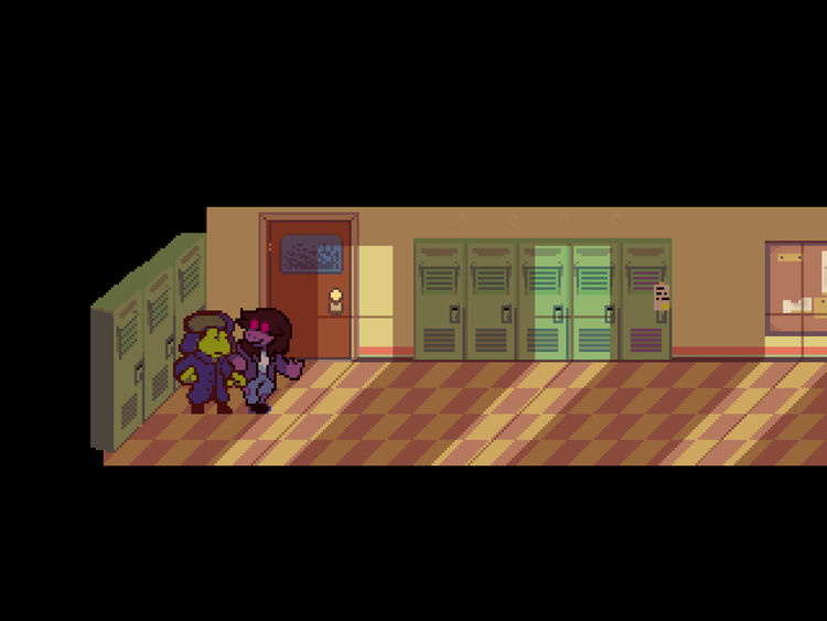
The locker scene has been reimagined. Originally, it stuck too close to the Deltarune scene, with Susie slamming YOU into the locker. Using new spritework, we changed up the execution quite a bit to make this scene feel more unique and fresh, though the dialogue for it dialogue remains the same.
The scene where you wake up in the Dark World was also reimagined.
The green glowing eyes on YOU's new design have a more subtle appearance to them than the older, harsher blue eyes. This raised a concern that people might not even pick up on the eyes being any different as you step into the Dark World, thus totally missing the whole "glowing eye" plot point. To that end, the new Dark World intro emphasizes conveying the glowing eyes to the player.
For returning players, the shortened version of this scene that you get on New Game+ now has to be activated by pressing Z at the beginning of the scene (while the birds are circling around you). That way, you have a chance to see how the full reimagined scene works, while still having the option to skip it whenever you'd like.
A new scene was added into the Cliffs area, with the intention of conveying YOU's main weapon to the player.
Fixed an oversight from when I rebalanced the "DELTA" difficulty in 1.5. The first overworld obstacle you find kills you in 2 hits no matter what difficulty you're on, when in DELTA it's supposed to kill you in 3. It's now back to being a 3-shotter.
The early chase scene where you dodge spades has had its difficulty rebalanced on DELTA to be somewhat tougher.
On previous versions, I think I went too overboard on how easy I made it, to the point where holding right the whole way was a very viable strategy. Now it requires you to pay more attention, but is still easier to react to than DEFAULT difficulty.
In addition, fixed an oversight with the chase scene's requirements for the "60HP reward."
By accident, it disqualified you from the reward if your HP was at least 60 and below, when it's really meant to be "if your HP is LESS than 60." This has now been corrected.
Lancer's bike attack where he charges at you was slowed down to be easier to react to. Then I thought, "now it's too similar to the original attack..." So I added a slight new twist to it.
The Lancer scene to the right of Seam's shop received a minor update to make "the big moment" of the scene have a more brutal impact.
The scene between Lancer and Quizzer that takes place after the 10-question quiz is over was reimagined. Note, that this reimagined scene only triggers on the NEW writing style. During OLD, you'll get the old version.
You may ask, "Why are all the other reimagined scenes mandatory, but this one is on the NEW style only?" Well, the thing about the other reimagined scenes is that they primarily change the visuals, not the script, the latter of which pretty much remains identical.
They may also convey important information that would otherwise be lost if I didn't force it on the player. In the case of this reimagined scene between Lancer and Quizzer, however... nearly every single line was heavily rewritten, and the scene was cut down to be about 10 lines shorter.
Though I think this is to its benefit, some returning players may disagree. That's why I felt it was best to allow the choice of seeing the original scene as is, for those who may prefer it.
But anyway, the reason why I reimagined this scene in the first place was because I felt I didn't convey the joke in it well enough. I went into it with the mindset of wanting to write an over-the-top soap opera scene that comes out of nowhere and just as quickly disappears, baffling the player.
The problem is, I think I leaned too heavily into the "emotional" aspect of the scene, and not enough into the "dramatic" one. As a result, the scene does not end up feeling like it's supposed to be funny, instead, it accidentally comes off as me trying to sincerely create a sad scene, turning it into melodrama, going against the tone that is currently established in that part of the mod. One of the several whiplash moments.
That's why, the reimagined version takes a reverse approach, and now leans much more heavily into "dramatic" over "emotional," thus emphasizing a comedic aspect, with a slight tinge of foreboding still in there. I was pretty happy with how it turned out, hopefully I'll remain feeling about it that way forever, a surely realistic goal.
Fixed Sansfield's voice being twice as loud as other text blips. Turns out, there were two text boxes playing out at the same time everytime you talked to him. Whoops!
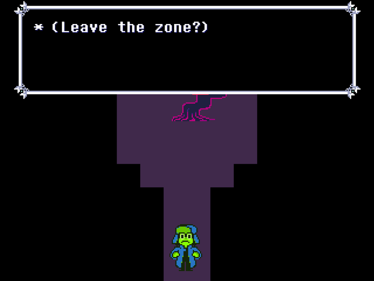
You now get a confirmation prompt when leaving Sansfield's room. There were a couple accidental instances of players accidentally exiting the room by wandering too far to the south, so now there's a choice to ensure you know what you're doing.
The "Where's the Cat?" microgame has a new sound effect attached. The last thing I heard before putting it in was Devilredd shouting "WAIT NO I WAS JOKING"
The dance minigame now has an extra 2 frames of input leniency. In other words, it is now slightly more forgiving regarding how late you can press the buttons before it considers you out-of-sync with the song.
The dancing minigame has been by far the most baffling thing to see feedback on, due to pretty much every playthrough I've seen having a player with a wildly different sense of rhythm. I've seen people absolutely nail this sequence, and I've seen others who couldn't even do one part correctly.
Upon further observation, I noted that these players often tended to press the inputs far too early, or far too late, to a very notable degree. Of course, I did understand from the beginning that some people are going to have problems with this minigame, which is why the ability to skip it or play it with infinite lifes was given.
Still, there's a dilemma I've been wondering about... Is this a problem with the minigame, or the player's sense of rhythm? To me, blaming a design choice on the player's skill is the last resort that a designer should jump onto, so, I do not by any stretch of the imagination want to come to the conclusion that this is purely on the player. So, I came up with a quick list of potential things that may be fucking with the player's sense of rhythm:
1) Timing is too strict. Hence, the 2-frame leniency that's part of this changelog.
2) The song itself does not have a strong, bass-y beat that jumps out and acts as your metronome.
3) The sound cue for whenever you and the opponent switch turns isn't conveyed enough as an "extra beat." In other words, players are trying to press the inputs right as the sound cue hits, instead of one beat AFTER the sound cue hits.
4) Rhythm games with a budget tend to have a setting that allows you to calibrate your response time, and thus adjust the rhythm to your own. I don't have a budget nor the coding know-how for this, so the player has to adjust to the sense of rhythm that I had as I was building and testing this minigame.
5) There is one objective issue with this minigame, and that's that there is nothing to re-sync the song if your game stutters or lags. Although this rarely happens, I have seen at least one playthrough with this issue.
2 and 3 are issues that I consider subjective, and am not certain on them being the real causes. 4 and 5 are issues that I would like to fix, but am not good enough at coding to figure out how. At the end of the day, though... because of the wide disparity of players who are good at this sequence, and those who find it a miserable time, maybe the problem really is that different people simply have different senses of rhythm. Either that, or the sequence is jank. Or maybe both! We may never truly know.
During the flashback scene preceding the Susie and Lancer Forest fight, flashback Noyno was given additional younger-looking sprites during moments that are intended to take place several years before the events of Ribbit.
During the Forest Susie & Lancer battle, a Mario & Luigi Superstar Saga reference occurs, but with the wrong sound effect. This sound effect has now been replaced to be accurate to the game it's referencing.
The Forest Chase's difficulty has been re-balanced.
Before, bullets came at you either at a straight or downwards arc, generally positioned above the player. There is a giant amount of these bullets, which led to me dubbing this part "The Touhou Sequence."
Said sequence however, was brutal, and necessitated being constantly on the move in order for the bullets to not completely overwhelm the screen, creating roadblocks.
Although I justified this in the past by advising the player's strategy to be "back away, until the bullets spread out", Devilredd made me clearly realize that there are simply too many of these roadblocks, causing the aforementioned "back away" strategy to get tiresome, and downright annoying.
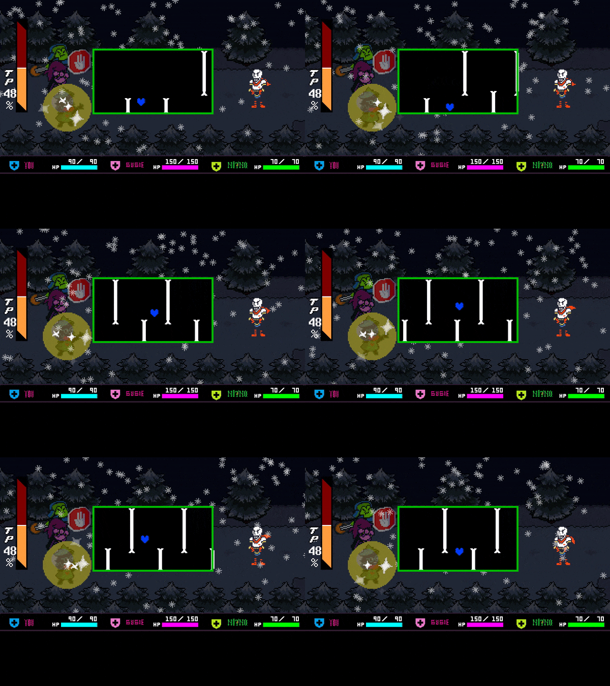
The solution was to further spread the bullets out, so now they come in straight, downward, and upward arcs. I wanted to preserve the original intention of learning the SOUL's small hitbox, and that you can perform some tight squeezes in-between bullets, but now it should be a little more reasonable to get through this part. In addition, being on the DELTA difficulty, or dying 7 times will activate an easier, even more spread out version of the attack.
In the EveryName fight, fixed the blue SOUL jittering sometimes when it lands on ground. Movement should be overall smoother now.
Card Castle overworld enemies will activate their teleportation ability a little more quickly after they spot you.
This was done to prevent a case scenario on the 1st floor where by simply running straight at the enemy, you can get into a battle with them before they activate the teleport. Don't worry though, there's still ways to do it, you just have to get closer before they spot you.
A new sign was added on the 2nd Card Castle floor. This sign is intended to clue you into the unique hitbox that the red spikes have, where compared to the rest of the obstacles that target your SOUL, the red spikes deal damage to you when you make contact with them with your legs. Text is blatantly Silent Hill-inspired.
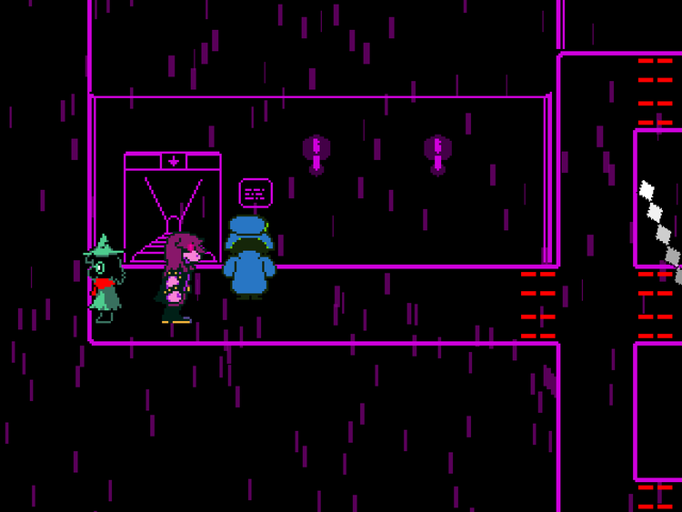
The enemy on the 3rd floor's side room now appears 100 frames earlier. Basically, that's like 3 seconds earlier, so the change is extremely minor. I figure at least one person could view this information as useful, though...?
The Final Boss can now be skipped using the FIGHT button, but only if you're on New Game+ and have the most powerful weapon in the mod equipped.
Remember when I added that thing in 1.5-F where depending on your result in the Rock-Paper-Scissors attack, the boss won't deploy their most time-consuming attack? Right, so I did that after looking at a couple speedruns of Ribbit and seeing people be mildly irked about that attack being left up to random chance, and eating up precious world record time.
As someone who's been speedrunning a lot of Resident Evil stuff in his own time, I try to be wary of sequences that are not left up to the player's pace, and I try to find ways to allow players to skip these sequences, though preferably on subsequent runthroughs, or with a good knowledge of Ribbit's secrets.
Anyway, so I had a realization as of late. The only thing you can do to speed up the final boss is avoid triggering its 2nd longest attack. That's fucking lame. Why not just give the player the option to skip the entire boss altogether?
Well, ya'll better start getting that Frog Dust more often, because by equipping the weapon you get from it, getting a single hit on the boss during any of its phases will get you some massive skips. They differ from phase to phase as such:
1st Phase - When the enemy is damaged, the fight will skip to the final 1st phase attack.
2nd Phase - When the enemy is damaged, the fight will skip to an abridged version of the final 2nd phase attack. Rather than lasting around 2 minutes, it'll last about 20-30 seconds, but be a lot harder to compensate. Different music will also play to signify the change.
3rd Phase - When the enemy is hit, they dead. The boss ending cutscene will promptly start.
For my next final update, I'll be sure to include a skip that lets you not play the game at all. Look forward to it!
Requirements for accessing Susie's extra dialogue in the "Remains Uncertain" ending have been lowered. You no longer need to be in New Game+ to see it. Instead, all you gotta do is listen to Susie's story after the final boss.
During the ending cutscene for the "Future/Thoughts" encounter, the sign that displays text was slightly adjusted to look less sloppy. The bigger chunk of these adjustments can be seen in the NEW writing style, as the OLD one left most of the text for those signs exactly as is.
Developer notes were given a basic "how many out of how many" counter, so you can know how many there are and not find yourself asking "oh god when will they end."
The "List of Music" text document has been adjusted so the Opening Screen 1 song is attributed to what I believe is to be the correct composer.
There's a bit of a story behind this one, actually. Now, originally my thought was that the Opening Screen 1 song (which you'd be most likely to recognize from the Spyro Year of the Dragon PaRaDoX crack) belonged to the "Core" cracking group, under the song name "Big Money Deluxe." This was the most popular search result on YouTube at the time.
But apparently, that was not quite right. A person DM'd me on Twitter, who graciously went down a rabbit hole and contacted the original composer of the song, known by the name Estrayk, very very formerly of the PaRaDoX group.
Estrayk clarified that the song's real name is "trainer2.mod", also known as "her3.mod". The confusion originated from "The Her Collection", a music disk released by Paradox. Here's what they had to say about it.
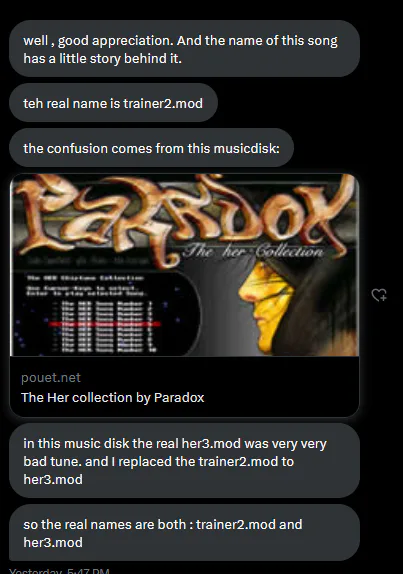
To be honest, the details are kind of confusing, but... looking into "The Her Collection", her3.mod sounds nothing like the song in the Spyro crack that we (or at least I...) know today. So, Estrayk is either saying that the song found in the collection was the original very very bad song that ended up being replaced with the one we know today, or, vice versa.
Whether this whole story is 100% truthful or not, I'm not quite sure, I don't keep up with the demo scene so much as I just have post-mortem nostalgia for its 20 year-old aesthetic. It is true however, that cracktro music tends to get misattributed to the wrong groups, some of which reused music from other groups. Kind of like how I did, also!
In any case, there's little reason to doubt that Estrayk is the original composer of the song, their name pops up in tandem with many demoscene compositions, including this one. So, the "List of Music" text document was updated to reflect they were the one to compose it.
This whole journey made me wonder, what about the other Opening Screen songs? Opening Screen 2 still has no proper credit attached to it, as I have no clue who made the song. Opening Screen 4 is also credited to Core, but now I'm wondering if that's just another reused song from a different cracking group. If anybody is curious enough to do the research, let me know what you've got.
One last thing. In hindsight, it's kinda nuts that someone got in touch with the composer of one of my childhood songs, and that 20 years onward, they're still kicking and making music to this very day, in the exact same style they used to. In most cases, change is necessary, but here? Nah.
Demoscene compositions are a certain form of art that needs to be preserved and maintained in the exact same way it used to be back then. Audio technology moved forward, but the old ways are still welcome in a certain corner of the internet. There's something really comforting about that to me. Also, shoutouts to people using ORG Maker, you guys still exist, right?
So, that's that... if you've read all of that, well done. You have been imbued with ancient knowledge. Speaking of ancient, I feel like I am that after the last couple days setting up this release. It is surely a time for me to retreat back to my lair of tired people, maybe pick up a fighting style or two, and then, come back when you've completely forgotten about me. It is what I do, even if I don't realize it. And even if I do realize it, I probably won't change anything about the way I do things.
Oh, and if you read that above paragraph as well, then don't.
Bye, and have fun!



23 comments