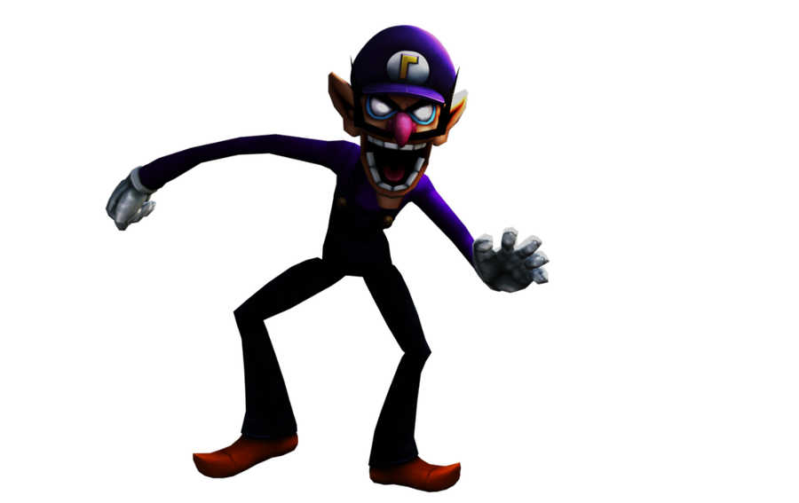
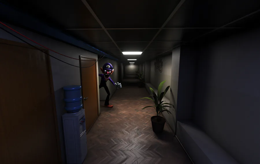
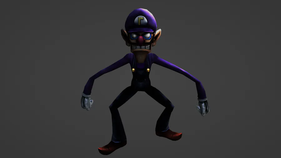
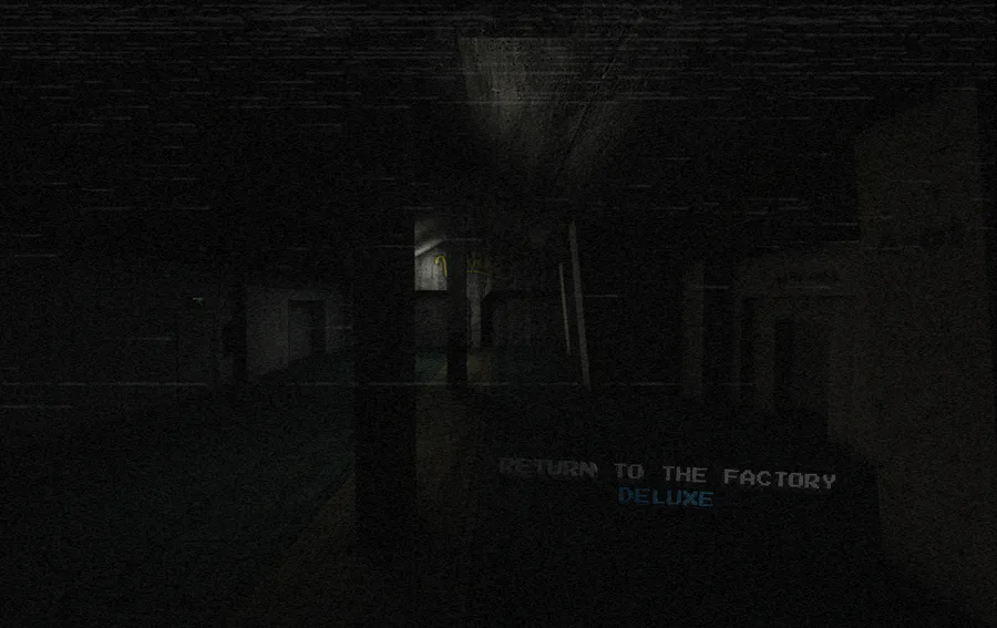
As you see from the image, the corridor is now with the looks of an office area to fit better with the enviroment of the game. in the previous render of waluigi, the lighting was too warm compared to the original Jeb-Yoshi's dx render, so i de-saturated the render of my version and i increased a bit of saturation of waluigi's face to get that white/red look. plus the light on top of his hat is now white compared to the purple-ish version wich was't fitting well. I think is a huge improvement for the design philosophy i want to implemnent for the other character too, to keep the consistency between them. For last topic i want to talk about how i made this render: i rendered the room without waluigi but i kept the shadow of him using a copy of him with a transparent material wich still casts a shadow (thankfully), and waluigi has a differend lighting compared to the room, so that i can use the dx effect on him. I rendered waluigi with the viewport rendering because if i did it with the complete render with all lighting and shadow, he would've been too dark for the room, wich wasn't very good looking in my opinion. then i used blender to composite all the layers for the complete render.
Oh and one more thing, the lighting for Waluig was all made in Blender btw.






1 comment