
While this doesn’t make that much of a difference for me, I think it’s a neat twist to the combination of the orange Scratch logo and the purple color. It reminds me of the that discontinued Cheetos snack.

However, I can already predict that how sensitive the Scratch community is, a lot of people is definitely gonna get triggered from this change, saying that it is “ugly” and whatnot.
Though, most of us have Scratch Addons so we can easily revert it back to its traditional blue color.
One thing I am very disappointed is that some 2.0 pages STILL has not been revamped to the 3.0 style. They’re just flat-out recolored.
I mean, OK, we got the studio design update, but why did it took so long for the Scratch Team to implement something that looks like it does not take that long to make?
But then again, the Scratch Team has very little members and they spent most of their time moderating the website more than making changes to the designs of the back-end servers.
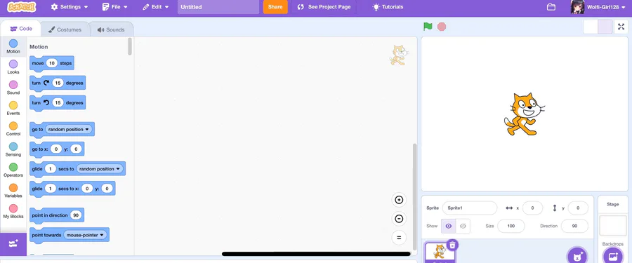
I do praised the new icons on the toolbar menu, such as settings, file, and edit button. They give more life to the editor. But sadly, that’s just it. Nothing else.
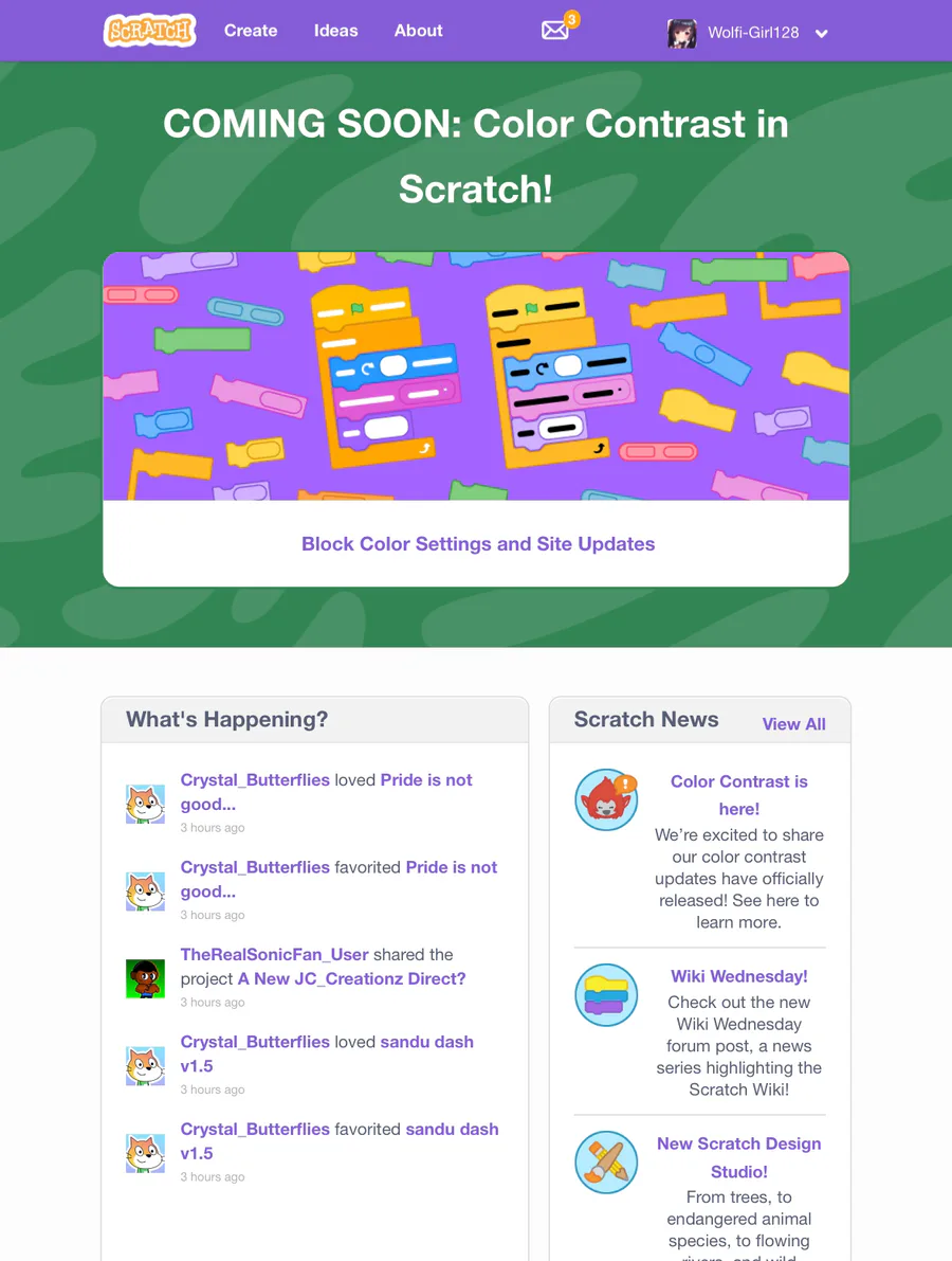
Now for the high-contrast blocks, I honestly don’t have an opinion for them other than saying that it is nice while still maintaining the same block colors. I would use them myself.
That’s pretty much all my opinions I have to say for now.
I would love to hear your opinions below. 👇


23 comments