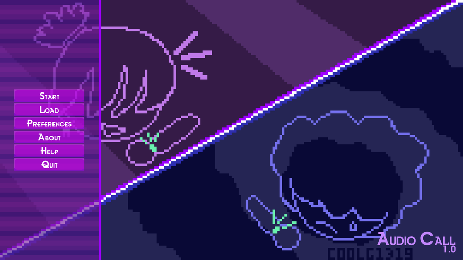


Buttons
The buttons took quite a bit of fidgeting to get right. They were first purple, but they stuck out against the menu overlays too much. Then I made them pink-ish, which looked better but still had the same issue. That was until I got the idea to lower the opacity of the buttons! I was satisfied with the result. 
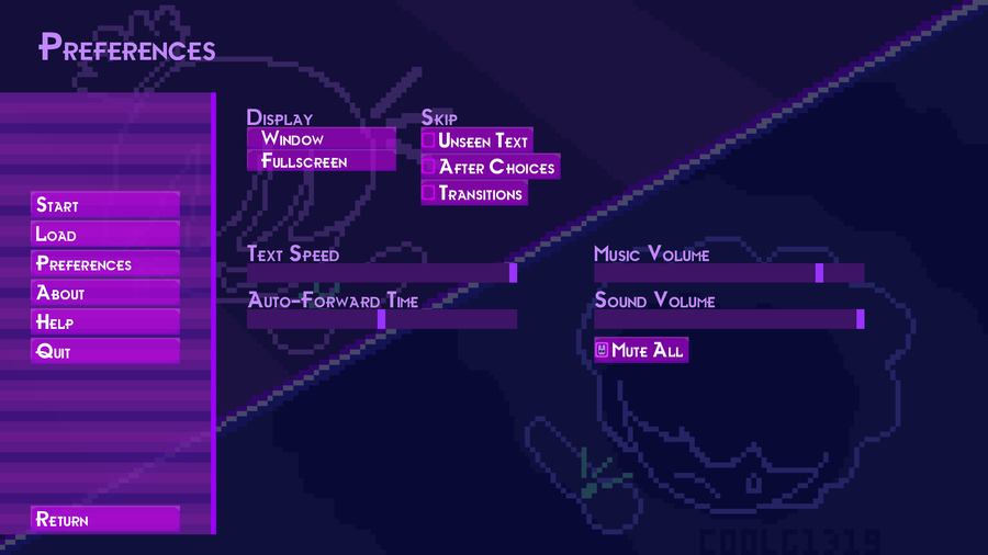
Checkboxes
This also took a bit of fiddling. It involved:
Getting the size right: solution - not filling in the whole canvas when designing the unchecked box, and leaving some space to the top and left empty.
Giving it a reasonable thickness: a 3px thickness sufficed.
I decided to have a bit of fun with the design of the "selected chackbox" by adding a lil rabbit  (can you spot it in the second image?) My reasoning is that the novel's appearance would resemble that of Andrea's wristwatch. And she likes rabbits sooo

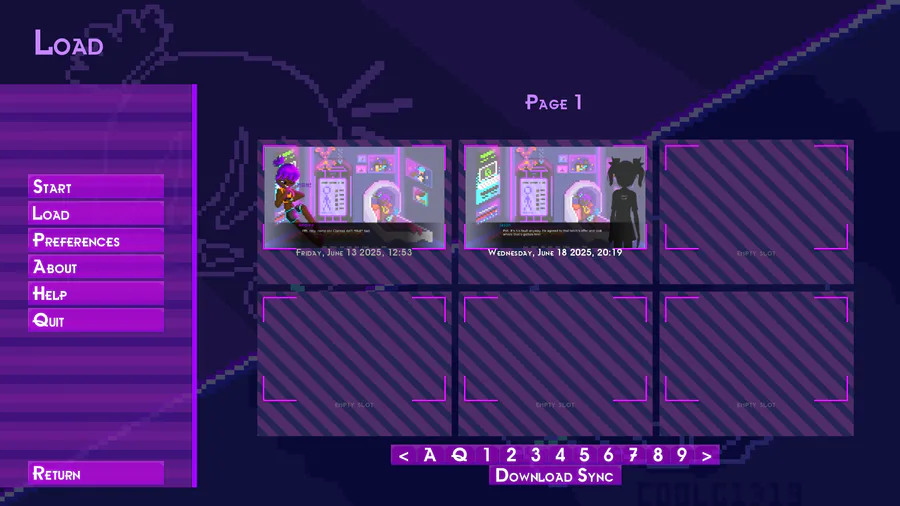
Slots
These were to easiest to do Their design was sort of meant to resemble camera slots - like the spots where you save images you take (does that make sense?  ) I quite like to detail that the saved gameplay is displayed within the slots' lil borders :D


3 comments