
and to clarify my question; I mean as in what was the theme behind the logo and why was it all glitchy and all and why did you decide to ditch most of the ideas behind the original logo for what was offered in the popgoes evergreen & popgoes arcade logos?
Next up
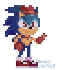
Dupli Sonic Sprite :D
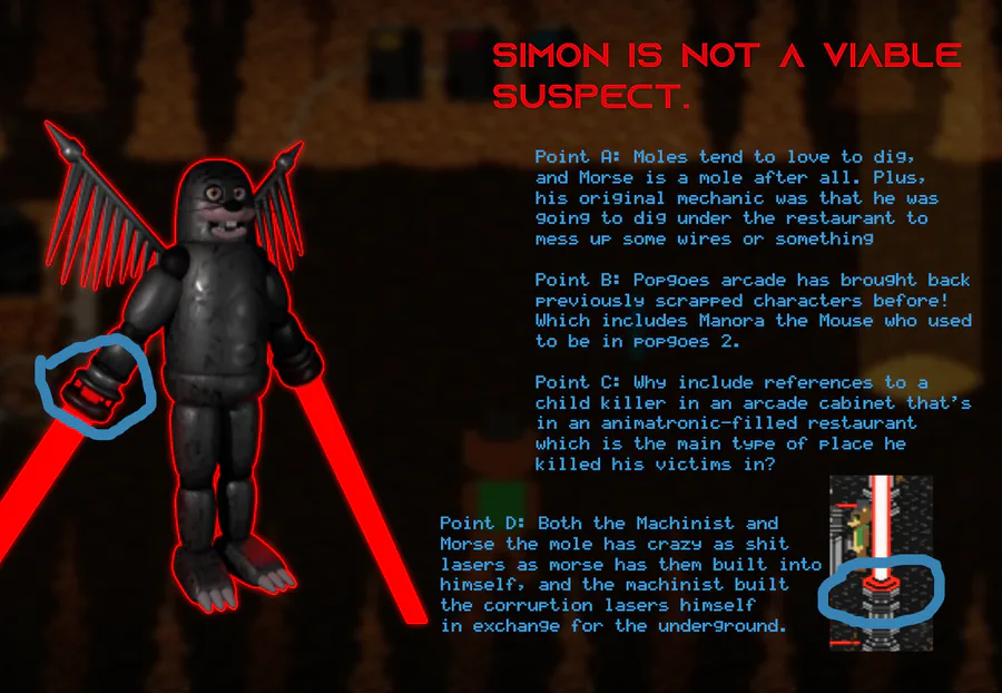
I've came to a definite conclusion about who the machinist might be, and it definitely isn't Simon.
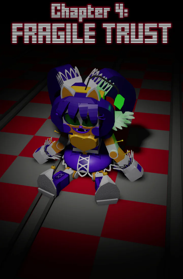
Chapter 4 of my SPS rewrite is here, go read it if you want to.
https://archiveofourown.org/works/62537755/chapters/164278501
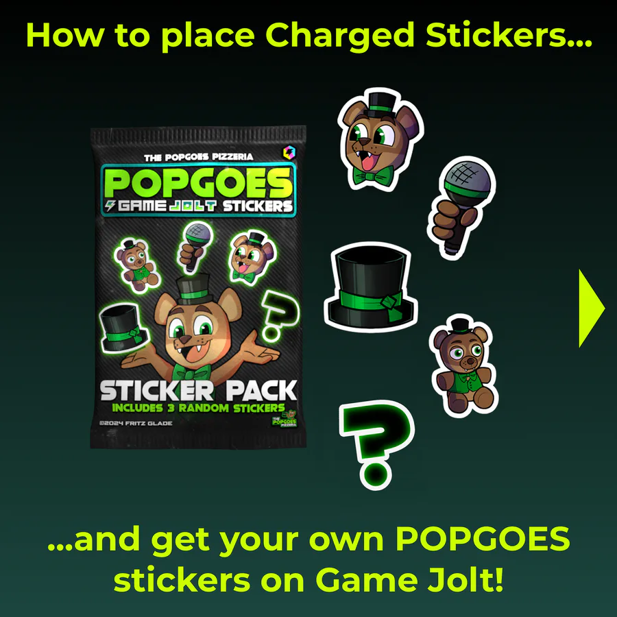


A guide on how to place Charged Stickers and get POPGOES stickers on Game Jolt!


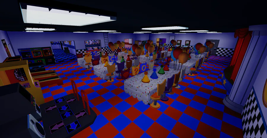
FNaS Generations is still alive and well!! Check out these cool screenshots for a new FNaS 1 map and give ur opinion on it
myPOPGOES Mobile is out now on Android and iOS!
Android: https://play.google.com/store/apps/details?id=com.clickteam.mypo…
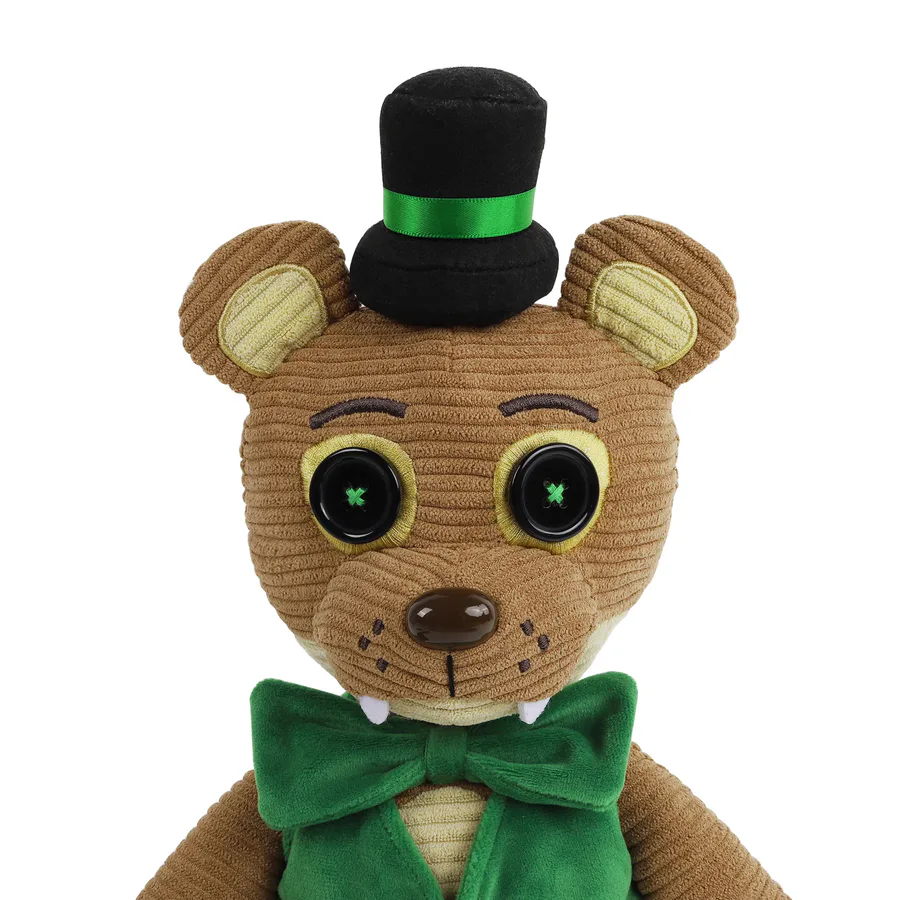
YOU CAN STILL BUY HIM!
The Popgoes the Weasel Hex plushie is STILL AVAILABLE TO PURCHASE!
Fewer than 100 Popgoes plushies are left! Once they're gone, THEY ARE GONE. Don't miss out!
Hex Popgoes: https://hex.store/collections/fanverse/products/pop-goes-weasel-…
Bundle: https://hex.store/collections/fanverse/products/hex-x-fnaf-wave-…
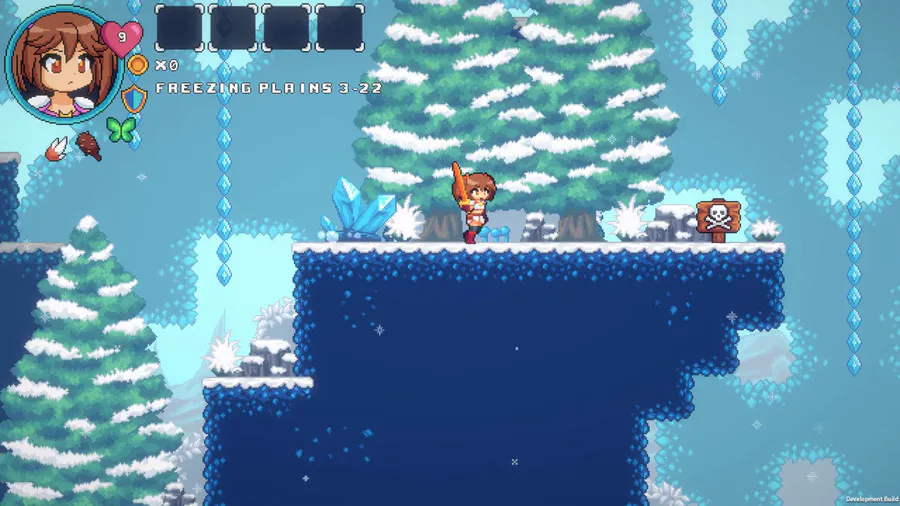

We made a lot of improvements on the Freezing Plains visual. Things like pine trees, tiny bushes, some rocks, and others game props!
#IndieGame | #IndieDev | #GameDev | #PixelArt | #WaifuQuest | #WifeQuest | #screenshotsaturday

Have a good Boi
3 comments