Official Posts in Moth House

Start Typing Away!
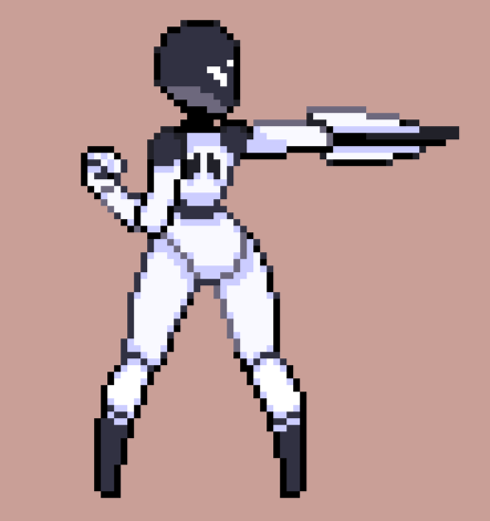
Here is another completed sprite for Mio.
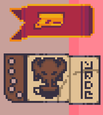
two bookmarks for a scrapbook which will be your like Ammonomicon in game for that alien roguelike I've been starting work on for fun
 Loading...
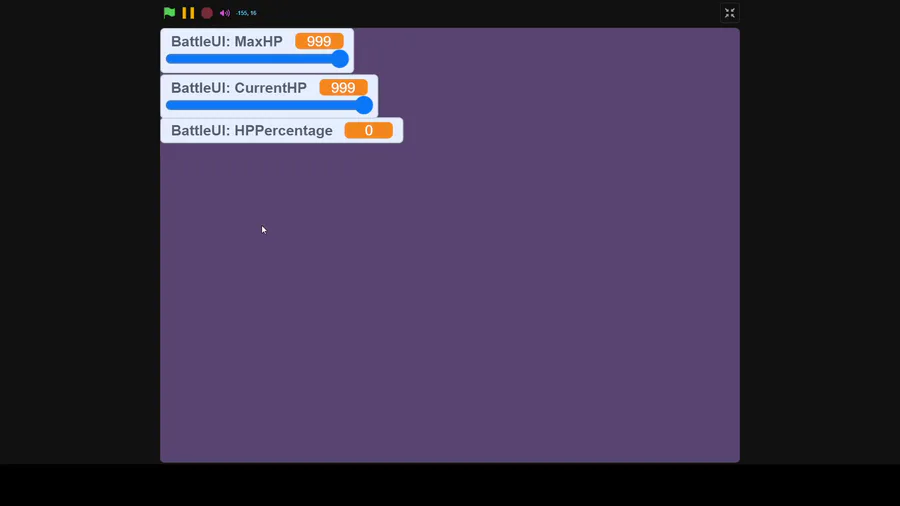
I got lazy for a couple days, my bad, but the gauge code is done, ta-da
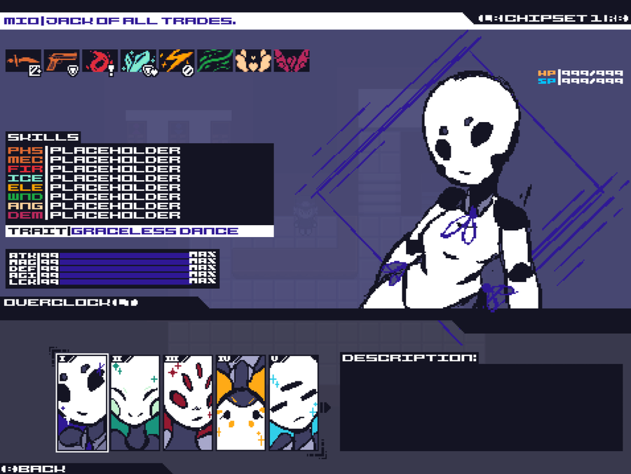
what would you guys think about this being the character stat screen, its just a messy concept so far
but i wanna know what you guys would think
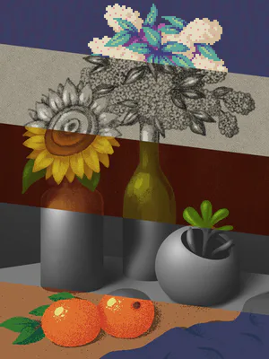
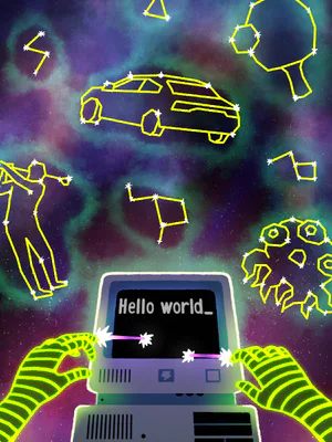
it's a lil difficult working in 3:4 lol
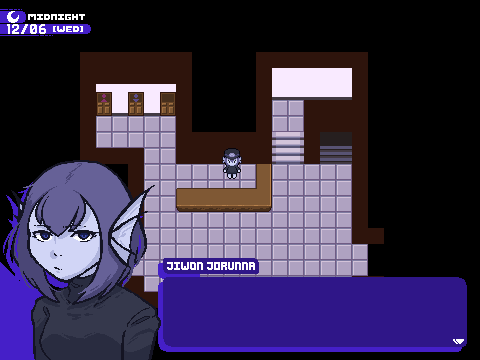
What do you guys think about this being the look for the Text Box?
I think it looks nice, but you guys are gonna be the ones staring at it while playing so your opinion is pretty important to me
So tell me if I should keep it or changes (with suggestions)
