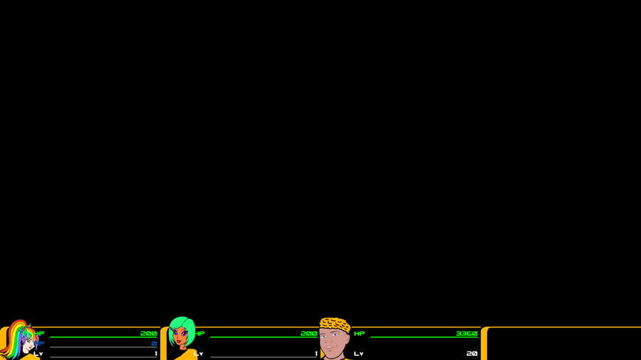
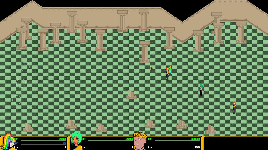
Yup, the player status bar, which you will see during the entire game.
Now as you can see, the changes with the original game are minimal, as was planned, however if you look well, you may see that a few things have changed. In order to keep the game a bit speedy I removed a few things that looked nice, but which people would most likely hardly have noticed, and if people are gonna ask what things I removed from the original that would only confirm my case. The most notable change however is, is that the current bar is stretchable. Although the portraits of Wendicka, Crystal and Briggs will always remain as big as they are (for obvious reasons) the stat bars themselves can be smaller and bigger based on what your screen can handle. This was given the ember colored curved bar (which is by the way a kind of reference of which I wonder if people noticed to what) marking the left and the top quite a challenge.
Now the empty space will also change a little from the original, but as the game starts with 3 party members you cannot see that now. As I do want the make the game portable to mobile devices now (somebody will have to help me on that when the game is about to get finished though. At this moment I need to change the underlying engine too much to even think about doing that), I'll also add a leader switch button there, so you don't have to use the right mouse button for leader switches, although using the right mouse button will on desktop computers (and laptops) still be supported.



0 comments