big changes are coming
Next up
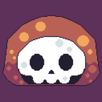
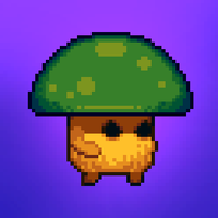
It's been a year since the last post. We're sorry to say that the game has not started it's programing yet. But here are some concept arts our artist did! make sure to follow him on insta (@/kotvls). And hopefully we'll update again soon, with more news.
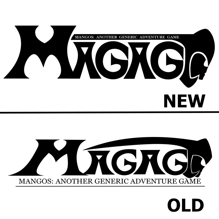
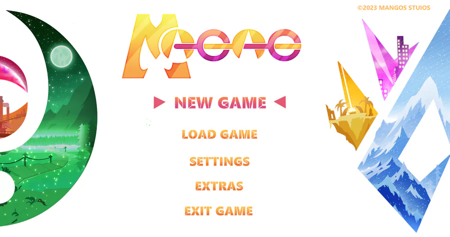
What's up guys and welcome to this dev log!
In this case, we wanted to show a comparasion of the old and new version of the game logo
In the old version, it looked stretched and the "G" letters looked weird, but in the new version, it is more symmetrical
Bandana Dee the Dream Friend
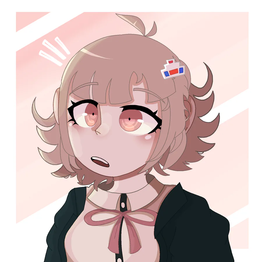
Chiaki Nanami!
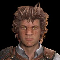
Heya! I wanted to show some gameplay progress i made so far. I hope you like it ^^
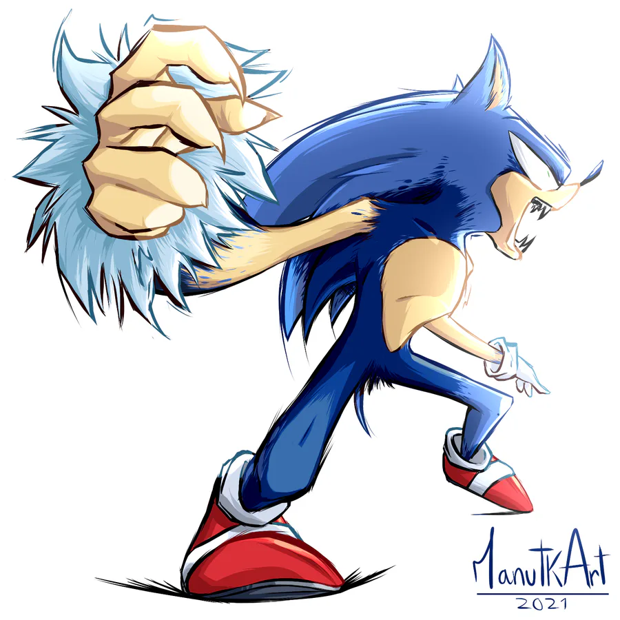
Werehog transformation process. #sonicunleashed
Update 2.627
New challenges & new effects!
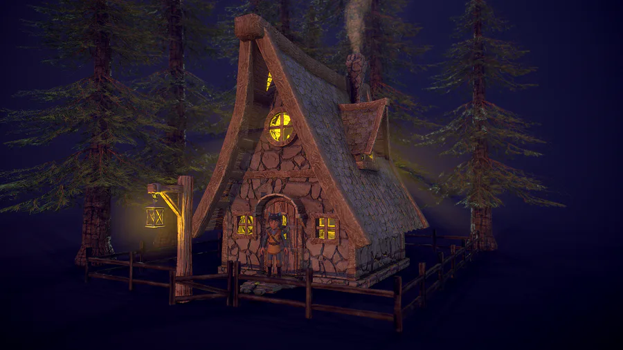
Hi everyone! I started to create some environment props for my new video game, here is a cozy house in the forest. I'm planning to switch from Unity to Unreal... Let's see what new challenges I have to face. Made in Blender and Substance Painter.
Why walk when you can jump?
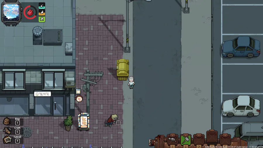
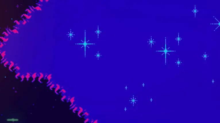
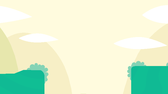
Call it 'wrong turn'!🚫 The feeling of running into a house with only one exit🚪, and being doomed to die. #pixelart #pixelartist #pixelartwork #art #pixel #indiegame #IndieGameDev #indieartist
0 comments