This week’s post covers the creation of our painted Campaign Map and the interactive Chart, starting from their humblest beginnings in our creative director’s tabletop role-playing game materials to their eventual manifestation in-game, covered by a node grid and expanded with interactive options.
Beginnings
To kick it off, let’s start by taking a look at how it all began for Vagrus.
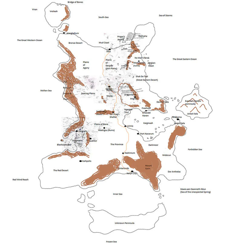
In many ways, this map – while representing an absolutely enormous area – seems basic, a drawing on a digital notepad. It’s minimalistic, only denoting the larger regions and geographical units of the continent of Xeryn. It had many predecessors on paper of course, drawn and redrawn over the many years of the setting’s existence. The above sketch was merged with all the notes and map snippets that existed on paper and a new, definitive map came into being digitally, drawn by Geri, the creator of the Riven Realms.
Eventually, this resulted in a huge, sprawling, very detailed chart that became the basis for every map-based endeavor related to Vagrus. It is constantly being updated, tweaked, and expanded, because the Riven Realms are a living, evolving world.
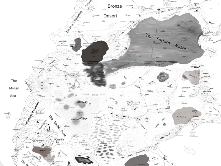
Even though this detailed chart of the continent served as a basis for both the Campaign Map and the in-game Chart, at this point the two diverged into their own processes to become digital assets in the game.
Campaign Map
As the process continued to create the Campaign Map that players traverse using the node network, the basic but detailed chart was taken by our graphic artists and it was divided into sectors. This is both for technical reasons for later implementation as well as for ease of production. The graphic artists then paint these sections in the style known from the Campaign Map.
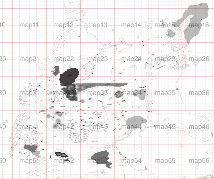
Each quadrant had to be allocated to be painted, which is a time-consuming and meticulous process. Since we always iterate throughout our processes, there is a lot of back-and-forth between the creative director and the artists.
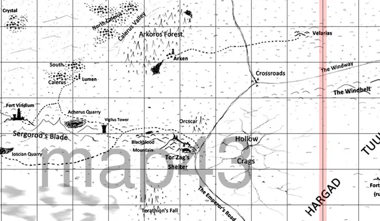
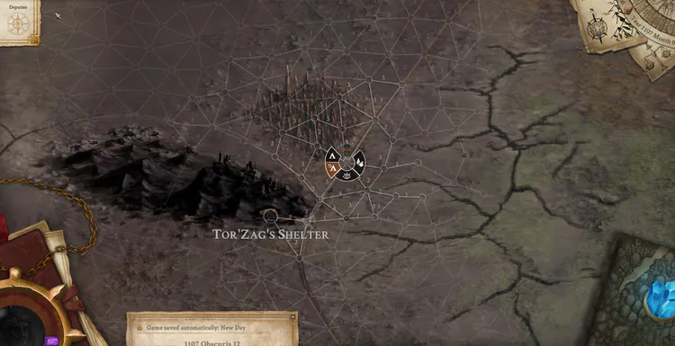
Below is a section of one quadrant with a staggering amount of details. Distances, positions, topography, and colors have to be perfect even at this stage. If everything lines up perfectly, then locations (such as Tor’Zag’s Shelter or Arken below) are painted using detailed instructions from the creative lead as well as based on a “bible” we keep on locations.
In the end, after many corrections and tweaking phases, the final painting is uploaded into Unity and is attached seamlessly to the other sections. The node network is built by our designers over it, resulting in what you can see in the game.
Chart
The parchment-and-ink-colored in-game Chart diverges from the process above early on but they have to line up perfectly, which – due to the single source – is mostly streamlined. Szonja, our graphic artist who worked on it, used the original, sketch-like chart and drew over it.
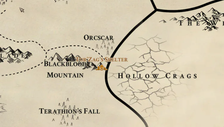
We decided to go for the parchment-like appearance to present it as a real map the vagrus would hold but also implemented the appearing and disappearing of certain details on different zoom levels. Needless to say, it was tricky to implement and we are very happy with how it manifested in the end. Later on, we kept adding features to it, like the ability to leave notes, the use of markers, or the journey distance calculation. These are all possible because the Chart makes use of the underlying system of nodes that is tied to the Campaign Map.
And that is all for this week folks! We hope you liked our little dive into the cartography of Vagrus. As always, be vigilant, stay safe, stay ready, and conquer the wasteland!
– The Lost Pilgrims Team
If you like Vagrus, please consider sharing our pages and posts with your friends through your favorite social media channel(s). It is much appreciated!
Steam | GoG | Youtube | Twitter | Facebook | Instagram | Patreon | Discord

0 comments