Hey folks,
Hope everyone is having a fantastic start to their New Year. As with most of you, the holiday season has been extremely busy for us. In the spirit of sharing, we have a preview of the new UI and visual effects we have created for the Ekosi battle board.
As part of our complete overhaul of the game during our engine update, most of the focus initially was on fixing core systems that got broken (or completely replacing them) and working on the overworld environments. However, it’s been a while since we’ve done a full upgrade of the Ekosi board. We’ve recently completed rework on every element of the board and updated the visual effects that occur at the conclusion of rounds.
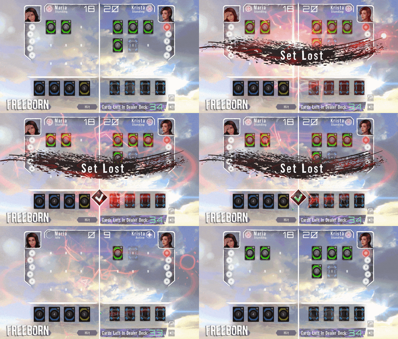
The rough paint-stroke aesthetic is combined with electric particle effects in the new set outcome messages.
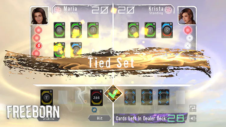
In this screenshot, the set is tied. Wins, losses, and ties have unique brush stroke and particle effects.
As you can see, we’ve completely changed the main dividers separating the different elements of the board. We felt that the white boards offered a much cleaner separation between sections. Besides making the board look more visually attractive, we looked at ways to make each part of it easier to distinguish. A wavy effect was added to the bottom of the board to make the player hand area more visually distinct from the main battle field.
If you are a veteran player of Ekosi, you may notice that we’ve also replaced the font we were using for all our text, created in-house by our very own Tyler!
We’ve also added completely new particle effects for when the player wins, ties, or loses a round.
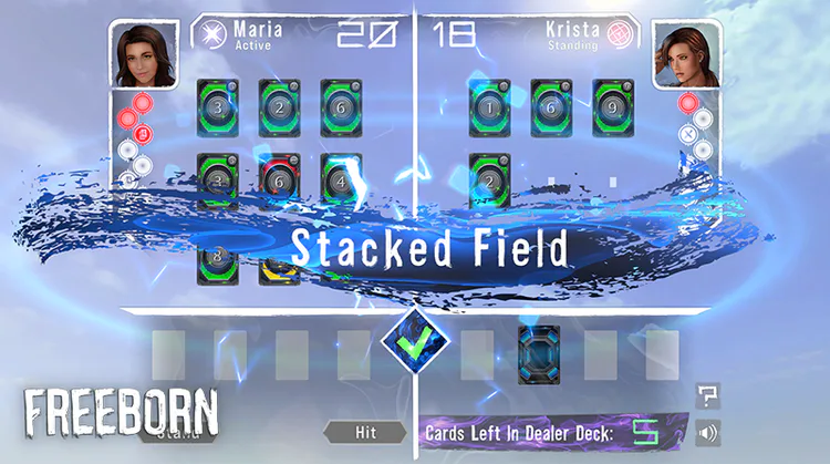
In this screenshot, the set is won via a Stacked Field. A unique brush and particle effect is rendered.
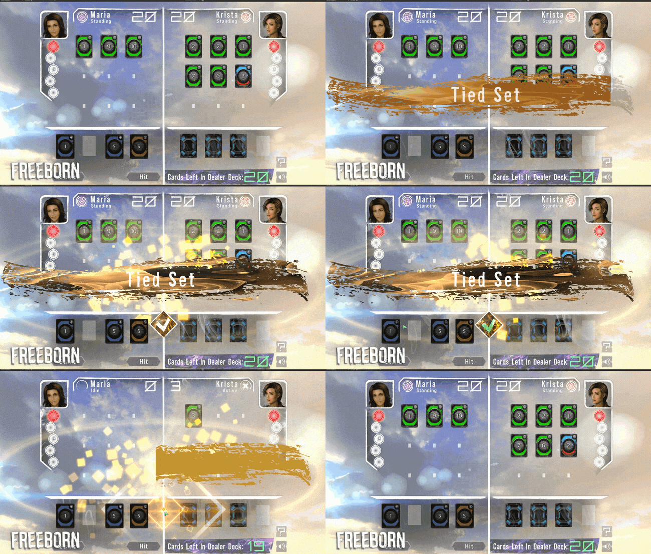
In this GIF, the set is tied. Tying never felt so good!
This update to the UI was a long time coming because our previous UI did not support 4k resolution or ultra wide screens. With our update almost complete, Ekosi will be ready to shine on all modern setups!
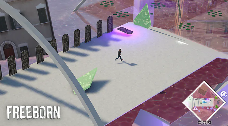
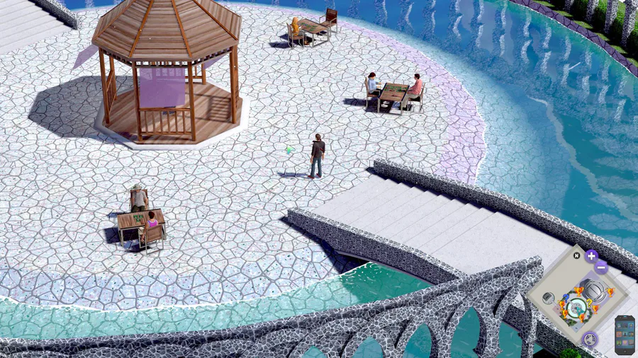
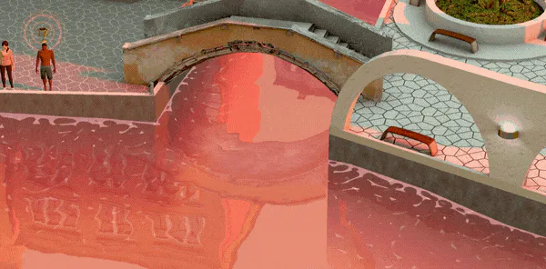
In this screenshot, Mark runs across blood-red waters. To where?
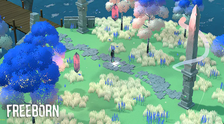
In this screenshot, Mark stands amongst strangely colored trees and floating crystals.
Our next demo release should have these new UI features implemented, though there are a couple additional reworks that need to be completed first. We will preview those changes in the next update. We also have a completely new gameplay component that will change the nature of the player’s journey. We can’t wait to show you it, but we can’t spoil it yet. For now, let’s just say it will drastically spice up the social dynamic of the game.
Until next time!


0 comments