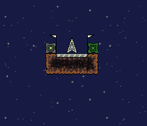
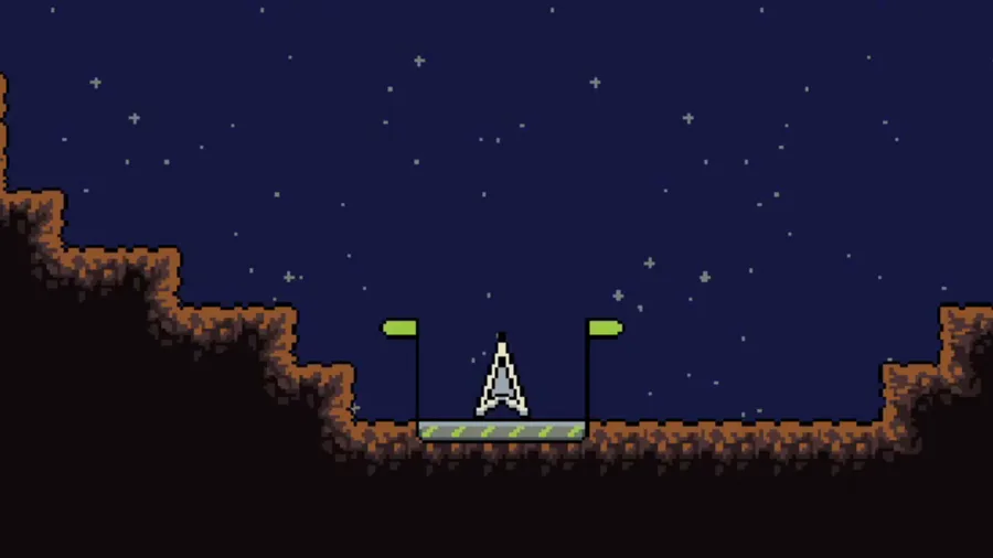
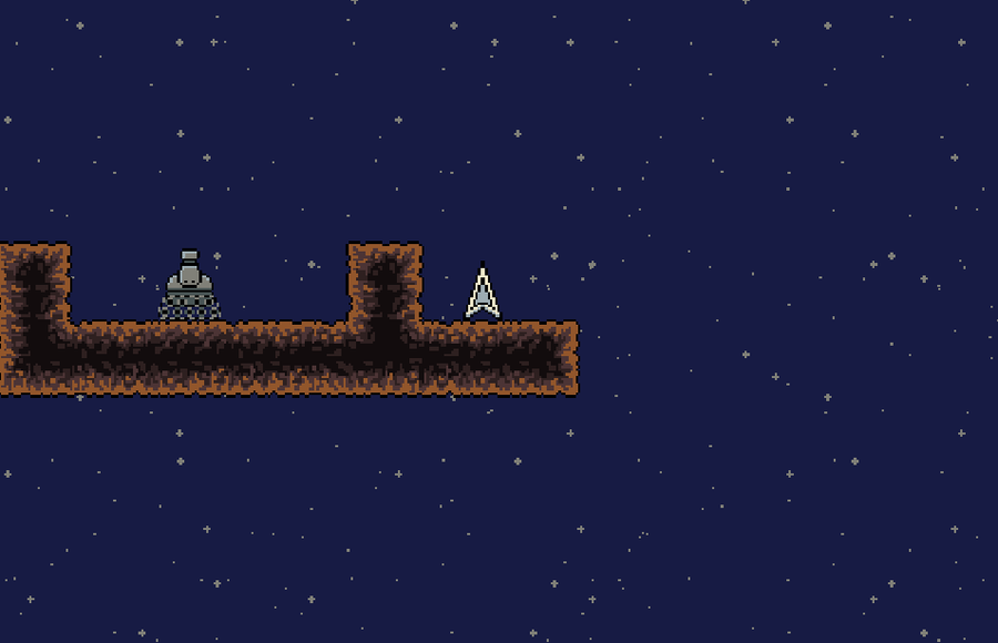
Here's is how I got from "before" to "after".
I posted my last progress on reddit and got some good feedback about contrast issues. Apparently my background color caused poor contrast with soil tiles and menu items. It had to be darker, which kind of makes sense since it's space...
So, I've found a darker color that still has that nice blue-ish tint, as you see here:
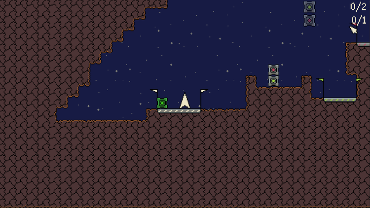
While posting about these changes on reddit, a user informs me it would be much better to use a solid inner color for the tiles, cause moving repetitive elements tire the player's eyes faster.
This was new to me and in the following few days this user helps me to create whole new tiles that do not only solve this problem, but look many times better than the previous ones:
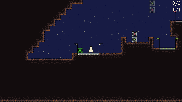
Still few redditors inform me there might be some contrast issues cause the tiles a pretty dark. With more help of the privously mentioned user I rework the tiles even more and finally get to this amazing result:
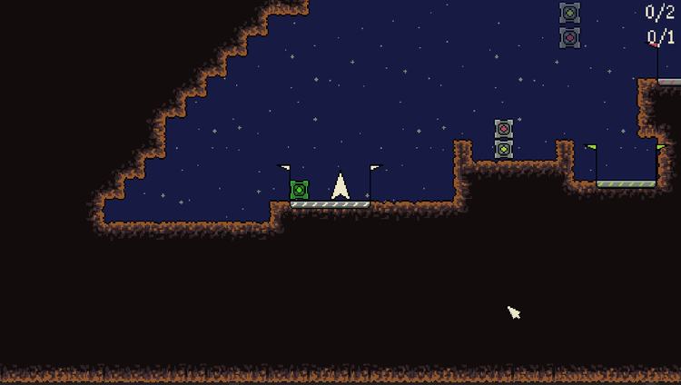
I am ecstatic with the new design. While playtesting I immediately notice a major improvement in game feel. My eyes are directly drawn to the playing field, the star parallax is much more noticable and the overall gameplay feels even more like you're out in space!
Additionally to this I made the grey UI buttons a teensy-weensy bit brighter for that little extra contrast as well.
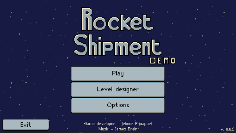
Even though all this work slowed down my planned work for these days, it was most definitely worth it.
I have updated all game pages with this new style as well, and hope it will draw in some new followers with this new look.
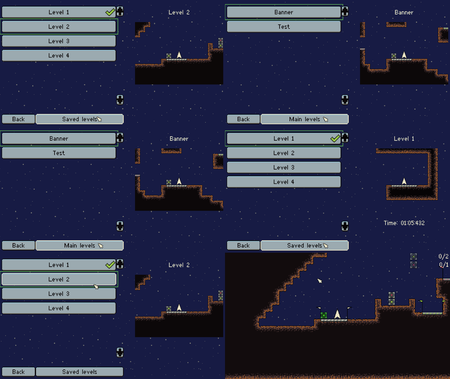
I've also gone ahead and improved the level selection menu in a couple of ways:
1. The levels are now shown in a scrollable list instead of a grid
2. The player can now switch to custom levels and play them
3. The preview will already update when you highlight a level button. The level will start on click of the button, making the previous "Play" button obsolete.
Here's how it looks (with the old darker button color):




0 comments