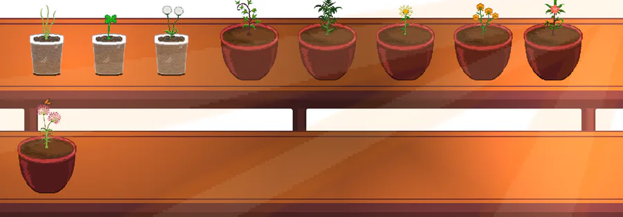
Alright, so I thought the old main screen was pretty bland, boring, bleh -- this is what the game looked like a week ago.
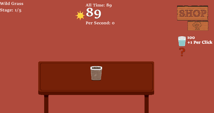
Fun fact though, the version we know is technically a version 2.0 to a 2019 prototype, which looked like this:
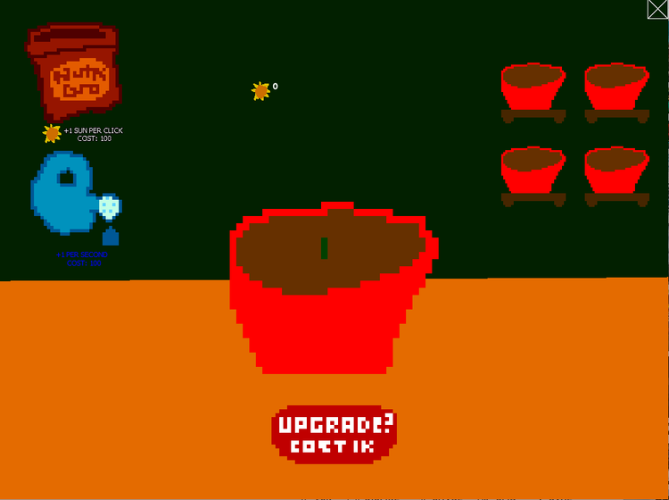
I mean compared to that, anything would look good. Garden Clicker 1.0 is charming despite its complete lack of fun gameplay, not dogshit good graphics and horrible code.
I implemented the shop items, and tweaked a bit of the UI to make the game a bit more easy on the eyes.
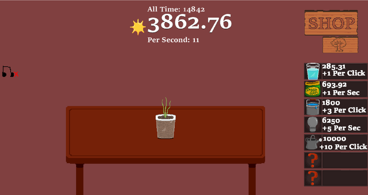
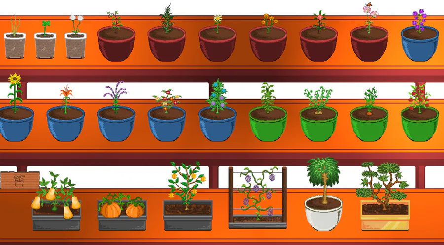
Still, a bit bland, but better than the first screenshot. So last night I was tinkering around with some ideas to create a screen I'm pretty happy with -- with the new work in progress upgrade systems.
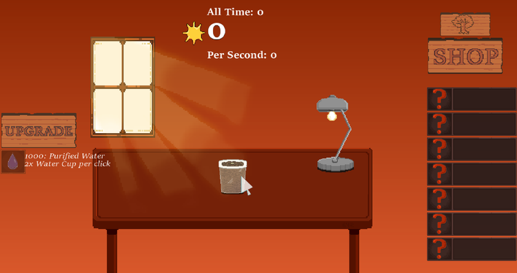
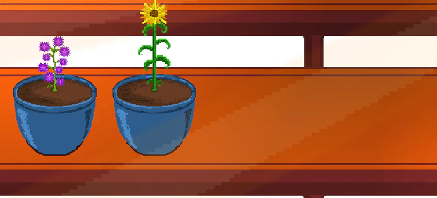
In comparison, I think it looks way better and visually appealing. While there is still a bit of jank, most notably the chunky light beams, this is roughly the final game screen for now.
My goal is for the lamp to be customizable to replace it with unlockable trophies, plants, etc. The room maybe customizable? With curtains? Wallpaper? Who knows, that's way down the line.
Starting work on the upgrades system. Wish me luck.



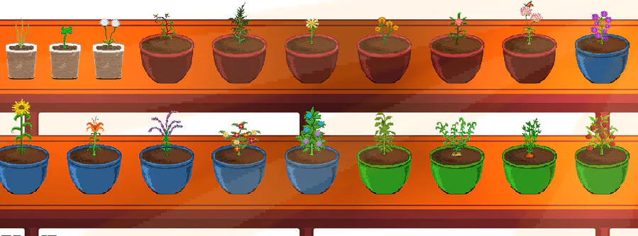
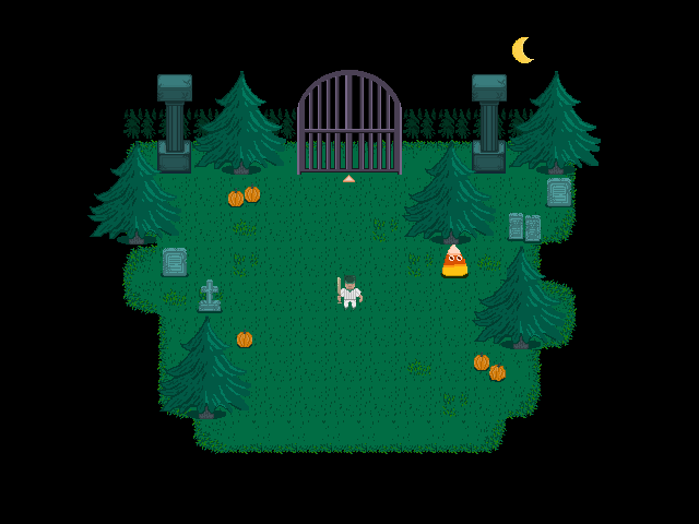
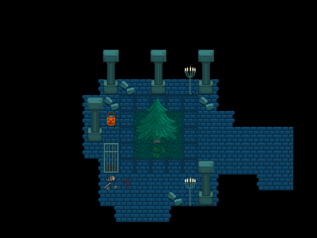
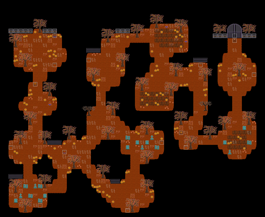
2 comments