Greetings, Tusslers! If you’re wondering where last weeks blog post was, then that means you aren’t following my Twitter and didn’t know I was having an amazing time in Colorado watching my favorite band, TWRP, live in concert! What does this have to do with TUSSLE? Absolutely nothing but it was so awesome I’m still stoked about it a week later!
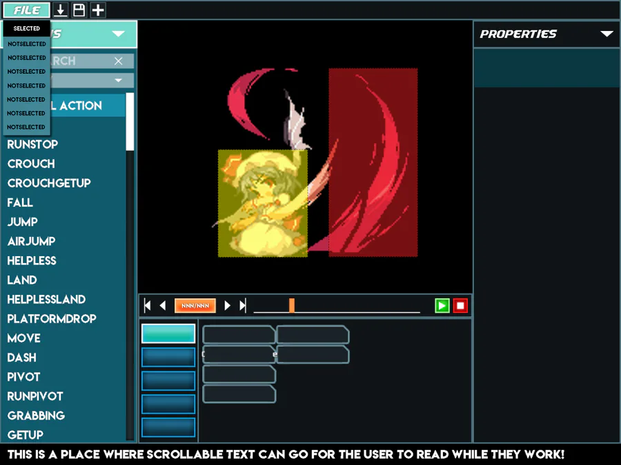
Anyways, on to today’s topic: UI design, and the importance of making sure it’s done right from the get-go.My issues working with Unity’s UI tools are well documented on this blog already, but with the updated design of the menus in the last post, I’ve had a lot of time to structure my thoughts and make sure that everything is done right this time.
Currently, the menus are being created through the NGUI free edition, which does solve some problems with Unity’s clunky system, but comes with more than it’s fair share of problems as well. Working on this new builder, I’ve discovered a few “commandments” that I’m going to need to always follow if I want this to be as painless as possible.
Every object in the hierarchy needs to be either an NGUI widget, or a panel. If I have an empty game object used to structure the code, or to set an anchor point, it had damn well better have a panel component or the layering will get all kinds of borked.
Use some kind of convention for ordering the depth of widgets. NGUI allows you to assign a depth value to everything you put in the scene, and while it does allow things at the same depth, it tends to yell at you about it and occasionally screw up the ordering. This time, every depth value is a three-digit number, with the first digit corresponding to the panels the yare a part of. This means that everything on the action panel starts with 1, properties panel starts with 2, etc. to make sure that if I need to reorder some things around, I only need to mess around with that one panel’s depth values. The rest should be unaffected by one panel’s depth settings.
You can chain together anchor points. This one I figured would be possible, but had no idea why I would do that instead of just changing the anchor point to be in a corner, but I’ve found it quite useful for panel backgrounds to be anchored along the center of a screen edge, and keeping the content anchored from a corner. This means I can keep the panel background and elements close together in the hierarchy without needing to give up the flexibility of a responsive design.
Work in the dimensions of your mockup, then scale it to wherever it needs to be. Being able to measure exact pixel distances in photoshop and porting them over to the menu has been a godsend for aligning everything properly. Beforehand, I was just sort of eyeballing it, or needing to do calculations to convert from one basis to another, but making sure the menu is created to the same size has sped things up drastically.
If you’re planning on implementing a “command history” for the user to be able to undo actions, make sure the system is in place before you do any actual programming on the menu. It’s really easy to miss actions that you might need to implement an undo mechanic for, but if you make it so that you just plain can’t add any events unless you’ve created an undoable action for that, then you’re guaranteed to have made every action undoable.
I’ve been keeping these in mind this time around, and while this does mean another ground-up reworking, I think this time it might actually just be doable. Once the builder is done, that’s a huge chunk taken out of the “minimum viable product” checklist, and we’ll be one huuuuge step closer to a beta release!






0 comments