So I have two versions of a cave mockup and i wanna know which one you guys like most:
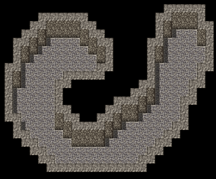
Version 1
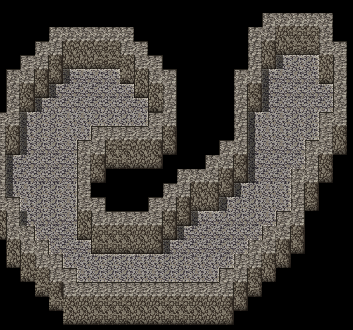
Version 2, if you notice a slight difference that because this second one takes inspiration from @ninesoulssea ![]() 's "Into Draconia" with the walls on the outside. I like the second one more but I want your opinion.
's "Into Draconia" with the walls on the outside. I like the second one more but I want your opinion.
Also, should i make it darker like this in the caves? I feel like sometimes its too bright:
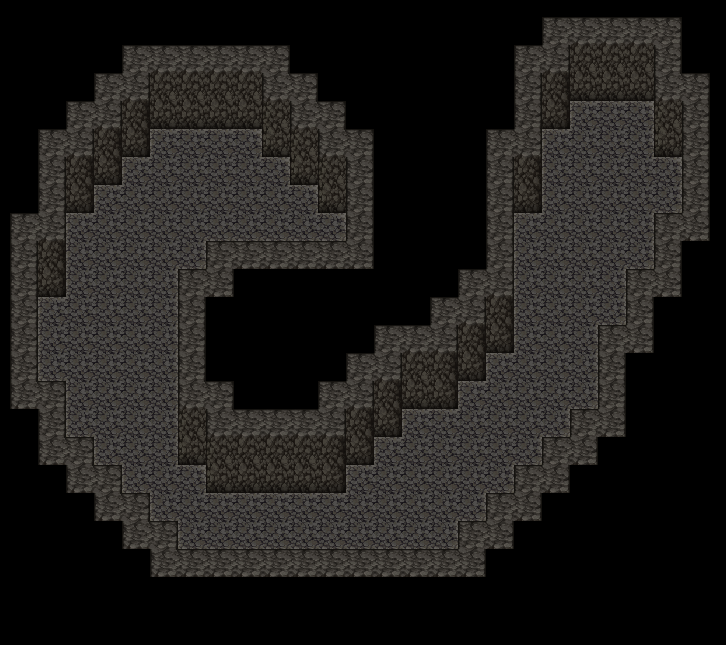
Lemme know what ya think in the comments!









6 comments