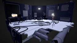
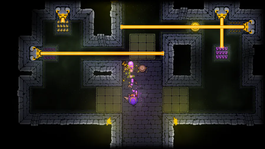
My name is Austeja Vaicyte and I work as a 3D artist at Tunnel Vision Games. Over the last 3.5 years, we have been developing a first-person puzzle game called Lightmatter. It was released on Steam January 15th 2020. Here's what I learned while working on it with Unity and Blender.
Here is a trailer with the results of this development:
And here is our Steam page:
https://store.steampowered.com/app/994140/Lightmatter/
___________________________________________________________________________
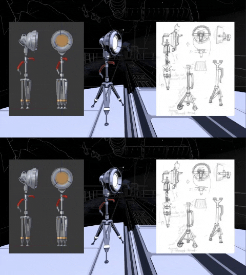
1. Sketch. It helps with vision. And makes for good reminiscing content. All the thoughts that are not on paper get lost. It’s anything 101, I know, but, seriously, sketch.
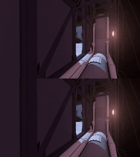
2. Use natural seams. Even if working in a style where you don’t need to hide seams. The world is full of seams, tiles and modules. If there is a way to use them in building modular environments, then let’s do it. Building a modular pipe? Well, let’s make it visible. Let’s make a seam, and even some bolts holding those 2 modules of pipe together. Because most of the things in the real world are held together by one kind of means or another, and without modular environments, we may not even notice those details. Now we do. Yayy, us.
3. When making modular things, don’t think of how stuff looks when disassembled, think of how it looks sliced. To be a bit less poetic about it, if you disassemble a watch, it is only a watch you can make out of those parts. But if you take a square cake and cut it into tiles, you can assemble all kinds of shapes of cakes. Modular parts are meant to match, not make tangible sense, unless they move.
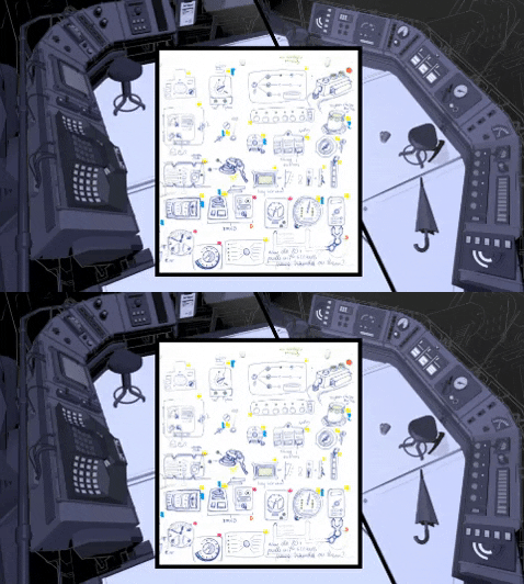
4. Speaking of, move everything. At any point, if there can be a lose part in a prop, make it lose, if there is a fan, spin it, if there is airflow, put something light in front of it to demonstrate. Make every clock tick, every coffee steam, and every pendulum swing. If it can be moving, it should be moving. Environments are static by default unless you move them, and unless they move, they are not real for the player. They become a theatrical set piece, and way too boring to look at, especially when one has no actors (visually).
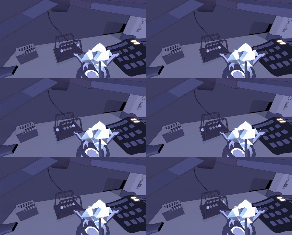
5. Everything that is smaller than a honey melon is not important, unless it is important for the story. When populating the environment, focus on the big things. The bigger they are, the more impact they make. And anything small should only be there for a reason, otherwise, you will drown in a whirlpool of making countless small items that no one is going to notice, because they will be marveling at the vast emptiness you failed to fill with bigger items.
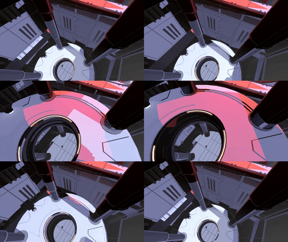
6. When making environments, picture the people that created them. Know the name of the janitor who left that broom there. Know that he was a bit too old to be a janitor, wore a cap and drank coffee from a yeti cup. Make that cap and a yeti cup. Make up a douche who kept on leaving a leaky umbrella leaned on the wall, every day, make that umbrella, place it near the broom. It all ties together and makes the place more believable, and placing things the way grumpy old Bob placed them is different than the way Lauren from accounting kept her desk immaculately clean and arranged her pencils by size and sharpness. The environment has to be lived in, not only by you, but by all the people.
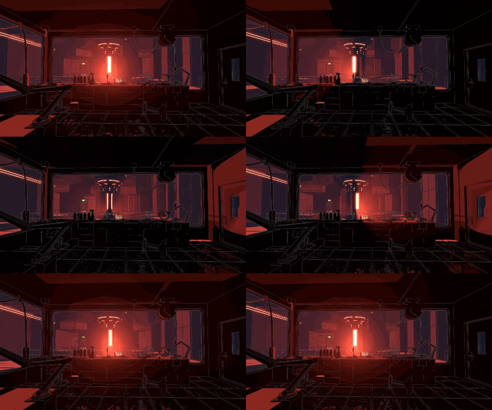
7. Cubes are boring. And so are cylinders. And yet sometimes you have to make a cool and interesting prop that is initially cube or cylinder shaped. Oxymoron? Yes. Impossible? Not so much. Slice it to segments, remove some too defining segments, bunch them from groups of other shapes, take the other segments, dent and bump them in unimportant parts, until you can barely recognize it as a cube or cylinder, and the lines within have become the dominating visual interest and outshine the outline. Which is also important, but hey, it has to cast a right shaped shadow, you can make all the other outlines around be much cooler.
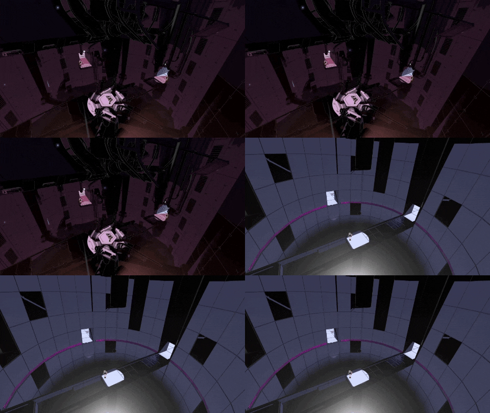
8. Variation is a good thing. One can appreciate a distinct style for a certain amount of time, and the more distinct the style, the less time it takes to get bored of it. Visuals are like food, they need to vary. Even if pancakes are your favorite food, if you were to eat only pancakes for a week, would you not want to have an option of topping them with different kinds of stuff? Give your player the metaphorical blueberries, chocolate sauce, bacon, jam, syrup and anything you can.
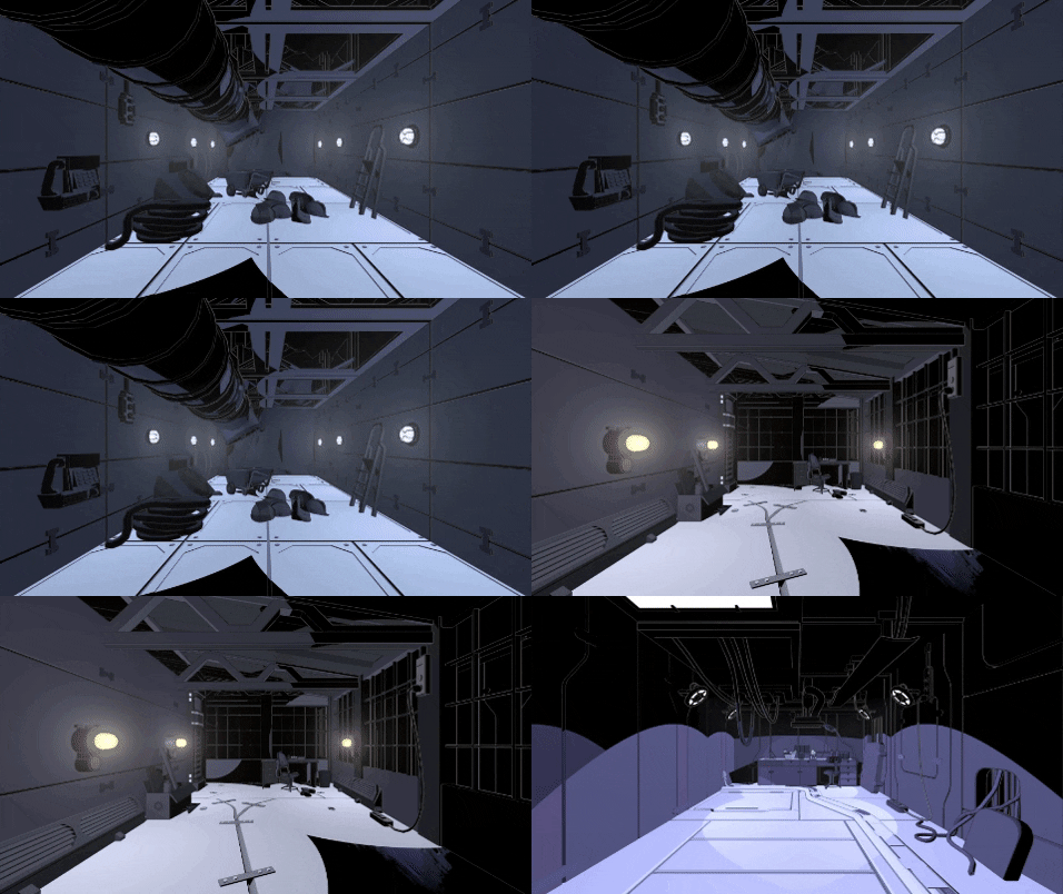
9. Enjoy. Yes, there has to be a certain amount of focus put into your work if you want it to be any good, but never forget that you are working on something you love to be working on.
0 comments