So I'm getting close to reworking the colors/function of some skills, but it also occurs to me that I have a chance to optimize this for my future self.
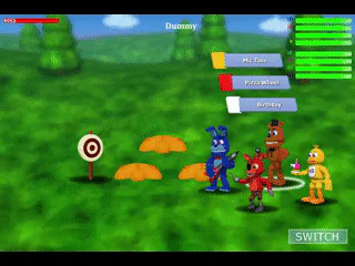
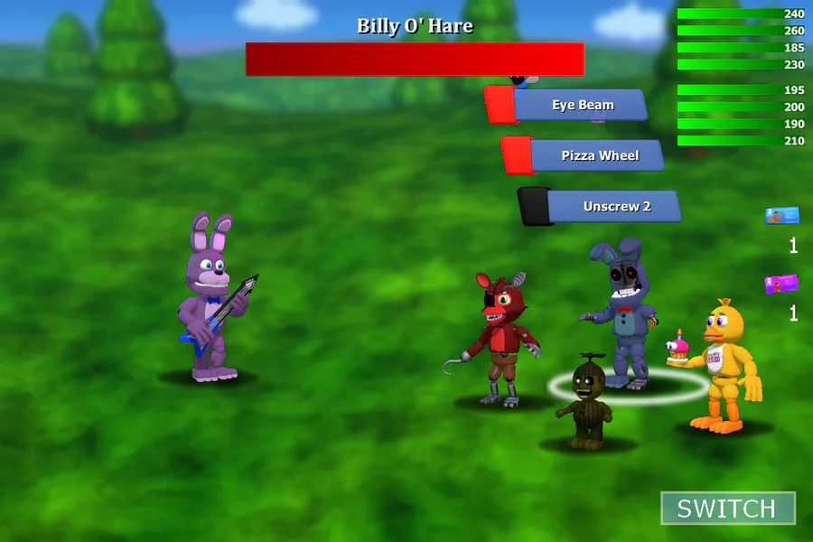
To put it in context, the current setup for the buttons is trying to recreate the original button design and also account for devices that would not have that font type installed.
The current total number of moving parts to keep track of (including both the Showtime button and the Enemy skill button) is 19 active objects. Pretty stupid and tedious setup, in hindsight. And also, ironically, the buttons themselves are not as accurate as I would've hoped.
(But I suppose I did make those back in 2016, and 2016 me had no idea what he was doing.)
---
There's an opportunity for me to just do what I was likely gonna do for the Redesign and give the buttons themselves two big changes:
Replace the active objects that display the skill text with some actual text objects, swapping Leelawadee UI with Tahoma
Replace the button itself with a unique design that looks more streamlined and is (possibly) more user friendly
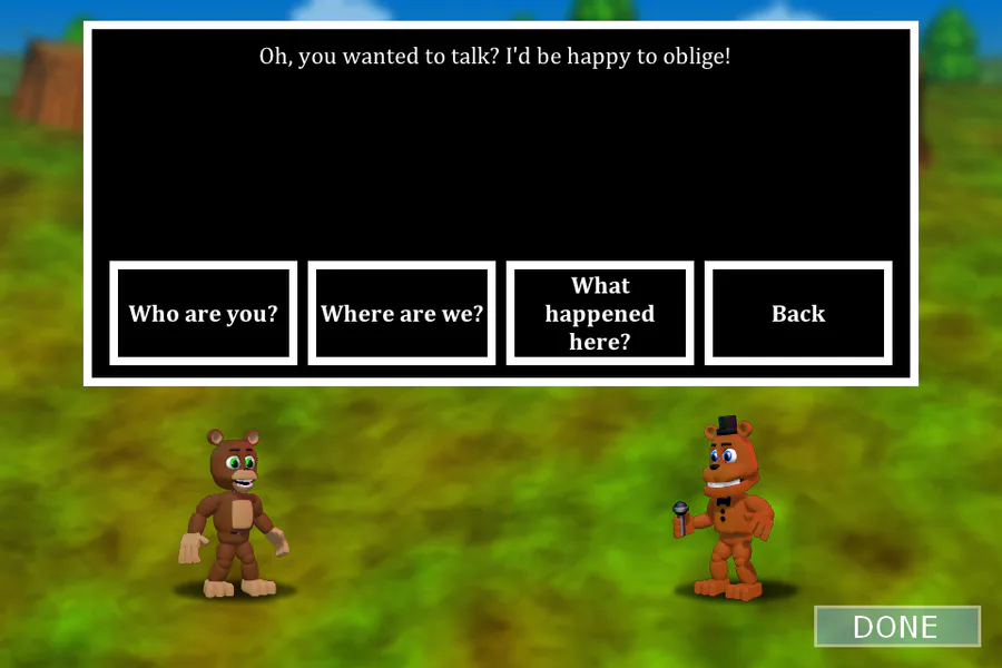
The updated button design would likely look something similar to this*:

*Example button is in no way final
---
Alternatively, I could also be an unhinged lunatic and attempt to remake the buttons, but instead go for even closer accuracy to the original game's set.
This one would involve baking the text into the button renders themselves, and possibly changing how the buttons even operate to account for 77+ unique active objects.
---
So, tl;dr: button could be fixed and will likely get the text updated, regardless of the poll outcome. How are we gonna handle the rest of it?
---
Option 1: Keep current button design in-tact (for now, at least)
Option 2: Redesign button with a unique design
Option 3: Redesign button, but go for original game accuracy


1 comment