4 months ago

Just wanted to point out @gamejolt that some color combinations look REALLY bad with the red dot here.

Maybe if the dot was black it'd look a lot better?

edit: have another idea in article


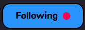
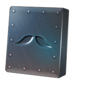
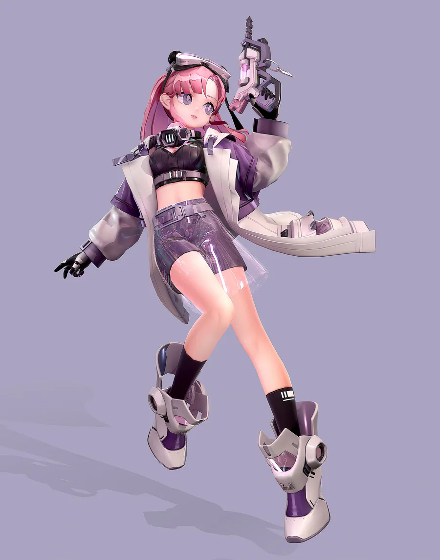
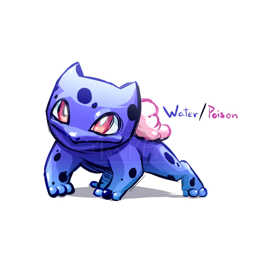
What if the boxes looked more like this?

screenshot_2025_02_03-1.png

Then the red dot would pretty much always look, at least decent if not straight up good. It's also a little more minimalistic-feeling to me personally, which is something I really liked about the previous version.


30 comments

Loading...

Next up

Hey Jolters! ๐Ÿ‘‹

Answer this survey to help us build cool things for ya: https://bit.ly/gjsurvey2025

Answers are completely anonymous. We will store no personal data that will allow us to identify you.

#gjbroadcast

This week's #FanArtFriday celebrates the release of #SecretOfTheMimic!

Accept the quest to get started.

LGBTQ+ Game Dev Icons:

Rebecca Heineman is a trans woman, award-winning Space Invaders player, and game dev who worked as a dev on The Bardโ€™s Tale, Myth III, and more.

She was inducted into the International Video Game Hall of Fame in 2017.

Bandana Dee the Dream Friend

Smile! Here, take some happy pills! โœจ๐Ÿ’Š #Blender #3DModelling #3DArt Buy me a Ko-fi: https://ko-fi.com/barbarafb_

Another house i made long time ago.

Finished work on the emotions of a new character for the tank universe

Very ambitious construction going on in Planet Zoo on Plays today. We're tryin'. LIVE: www.twitch.tv/dreamhackplays

My D&D art for my family so far (WIP if you couldn't tell)