Hey there!
I've recently realized that I never really showed how I draw my illustrations. And I think some of you might like to see a more in-depth view of my work process.
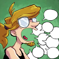
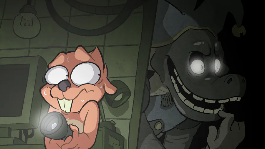
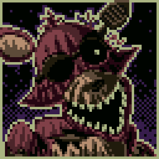
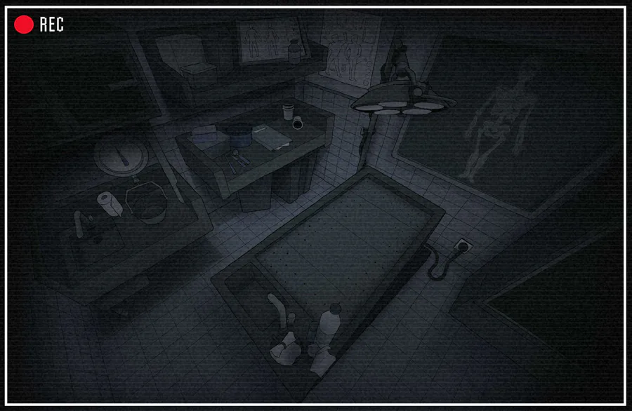
So anyway, here's the latest illustration I've made. It's a thumbnail for a Youtube video featuring @AmazingBeaver and the character Tealer from @NeeTroo 
 's game, Tealerland.
Here's the video:
https://www.youtube.com/watch?v=akDRkx0S-t0&ab_channel=AmazingBe
And here's the game:
https://gamejolt.com/games/TEALERLAND/466109
Keep in mind that I'm not a professional artist. Even though I've studied art for a while, I still have a lot to learn. Every advice given here is based on my own experience and might not work with your personal style.
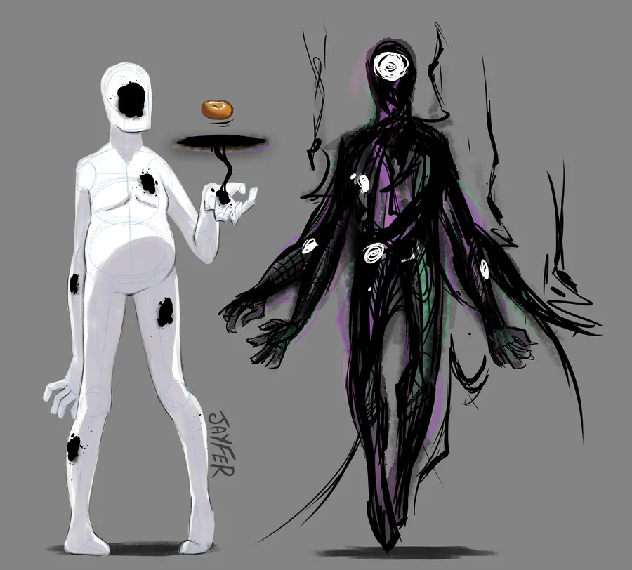
STEP 1: CONCEPT SKETCH - BRAINSTORMING

All my drawings start with a quick sketch. I usually just draw without caring about the final result. I just scribble on my graphic tablet, trying to come up with a cool composition for my drawing.
Even if it is really rough, it's still an essential stage. This is the moment I determine the mood of the drawing, the poses and the expressions of each character.
Since this is the first step, I allow myself to move stuff around a lot. The transform tool is your best friend! Use it as much as you need to 
STEP 2: ROUGH/FINAL SKETCH

So, initially the rough and final sketch were two different steps. However since I got more experienced, I actually combined the two together. If you're still a beginner, don't hesitate to make at least 2 or 3 sketches before starting your final lineart. If you're more advanced, making less sketches is a plus since your drawing will feel more dynamic and natural.
Remember that it'll be easier to ink a clean sketch rather than a messy one. So don't hesitate to erase, redraw and move things around in this stage.
Also, since this lineart won't be your final one, you can still use the transform tool to fix unatural poses, crooked perspectives or just details that don't look right
Extra tip : Flip your canvas vertically once you're done, you'll immediately spot a lot of mistakes that you've made
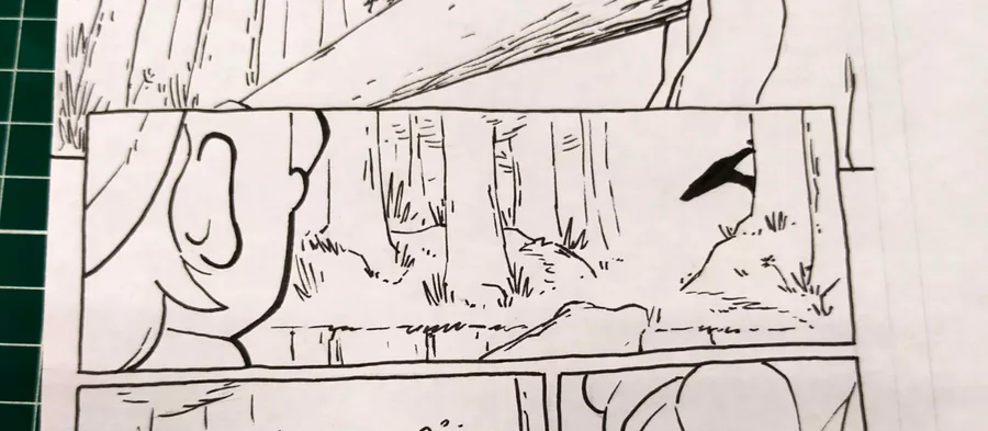
STEP 3: LINEART

This is one of the trickiest and most complex stage to explain. You'll need a lot of experience to make good-looking and dynamic lineart. It personally took me 5 months to assimilate most of the basics of lineart and apply them in my drawings. It might take more or less time, it really depends on you.
Here's a few tips that'll help make your lineart stand out;
-Vary your line weight and thickness. A lineart with the same thickness from start to finish will look boring and dull.
-The closer an object is to the camera (or viewer), the thicker the lineart will be
-Try to make the lineart of your character stand out. Creating a clear contrast between the characters and the background is primordial!
Also you might notice that I changed the position of Beaver's pupils. I felt like the two characters didn't interact enough. This eye contact makes the scene more intense and creates an invisible link between the Beaver and Tealer. (which works well here)
STEP 4: FLAT COLORS

No need to explain what this step is about. I just grab my bucket tool and fill in every elements of the drawing.
HOWEVER, keep in mind that similarly to the lineart, you'll have to use the colors wisely to make your character stand out. Try to play with the contrasts and luminosity of each layer to get a nice color palette.
One method that really helps is to add a black and white filter on your drawing to check the contrasts. Here's an example:

(Although keep in mind that this drawing is meant to be "moody", so the color palette of Tealer is really similar to the background's color palette)
STEP 5: FLAT SHADING

Like step 4, there's no real explanation needed here. I choose a light source (in this case, the flashlight along with a lamp off-screen) and start adding shadows to give the characters more volume (and create a cool ambience hehe)
STEP 6: COLORED LINEART + ADDITIONAL DETAILS

This stage is optional. I recently started to color some parts of my lineart to give more volumes to my characters and make the colors blend-in more naturally.
I also like to add some additional details at this point, for example the little sweat drops on the Beaver's face to better convey his emotion.
STEP 7: TEXTURING + ADDITIONAL SHADING

Again, this step is completely optional. I like to add textures on the background to make the character stand out from the frame. In this particular case you might notice that I've also added textures on Tealer, that's simply because he's not organic but rather a lifeless (kinda?) robot. That way the viewer will be more appealed by the main character and center of focus of the drawing: The Beaver.
STEP 8: COLOR FILTER

Here's a simple yet really effective step.
I just add a colored rectangle over the drawing and set the blend mode to "colors". This way all the elements (background + characters) will have a slightly altered color palette.
This is a simple trick to make the characters and the background more fitting together. Making the scene more believable (if you don't mind the fact that the picture represents a Beaver hiding from a murderous robot in an underground facility)
STEP 9: FINAL DETAILS

And here we go! This step does vary depending on the type of artwork I'm working on. I just add the final details and fix the mistakes that slipped through.
In this case I added the light effects to the torch and to Tealer's eyes. I also added another layer with some subtle shading.
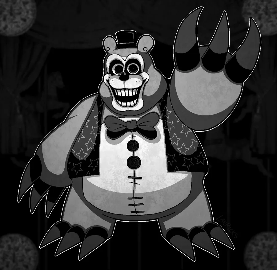
And that's about it! I spend roughly 3 to 6 hours to make an illustration such as this one. Being an artist requires a lot of patience and years of practice. I'm still not considering myself as a professional one since I still have a lot to learn.
Stay tuned if you want to see more!
(Also, I miiight be working on something really big that will be released on Gamejolt in 2021 or 2022. I'm not giving more details for now since the project is still in early development. Just keep in mind that I'm not done with making games just yet hehe)


36 comments