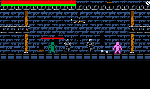
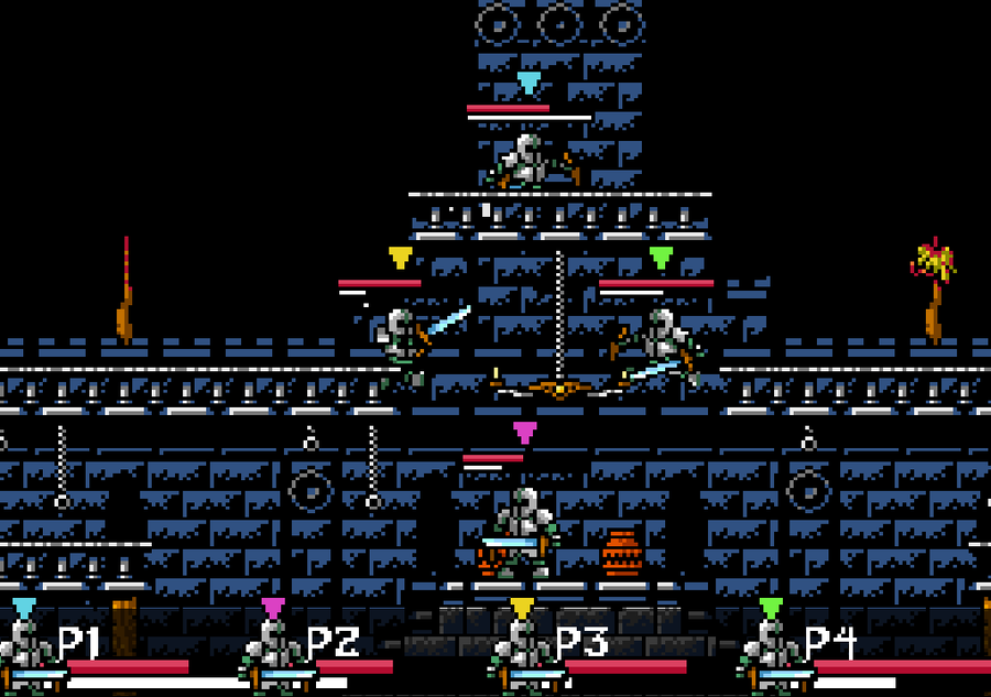
Hey everyone! I spent most of my day working on animating the normal armour sets so we can actually see some decent fights! Not that anything was wrong with the placeholder image… I mean, who doesn’t love the pink and orange men sliding around the floors?
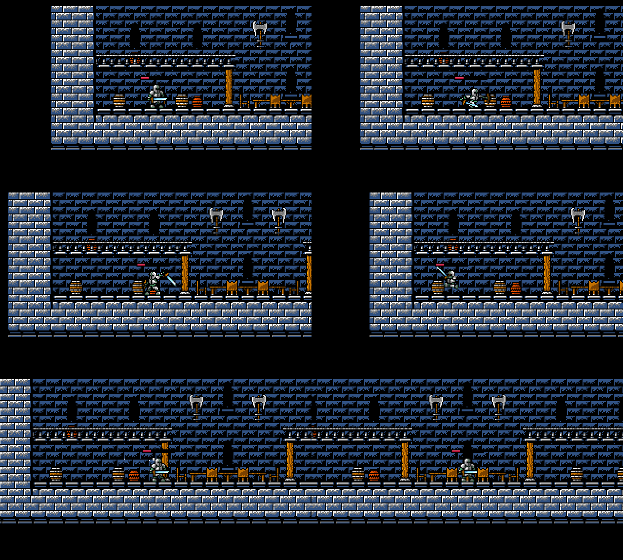
The entity animations are essentially done for the next release - all that I would like to do now is add a player/ai selection screen where you can select if you want to use a controller or keyboard.
I’m also planning on showing the next release of Grimstorm: Colosseum at the Game Jolt Develop Party. I’m hoping the crowd will like it so far!
What do you think about these animations so far? Is there anything I should tweak to make them better? I’m wanting to add multiple colours to distinguish between multiple opponents, using the more vibrant colours from the previous post about sprite designs.
Thanks for all the feedback so far, it’s been so helpful! I’ve been streaming the majority of development on Twitch, so if you’d like to see what’s happening in real time and want to give some advice, check it out when I go live!



16 comments