 Loading...
9


Next up
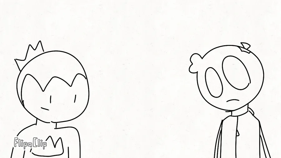
we MIGHT just be back chat
[read the article or you no cool >:(]
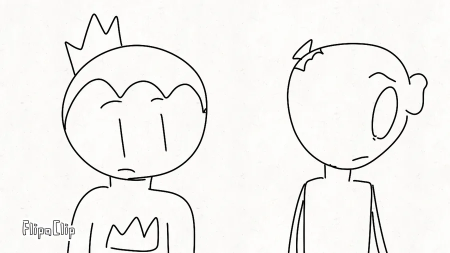
why do you have hair

I know ball
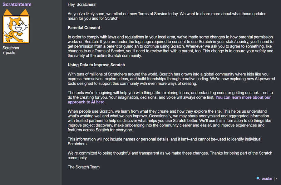

The Scratch Team has just recently updated their Terms of Service yesterday, letting you know they now have full permission to use your content to train AI models.
ease in and ease out test thingy
ok i FINALLY finished dropsane teto
i think i still got it
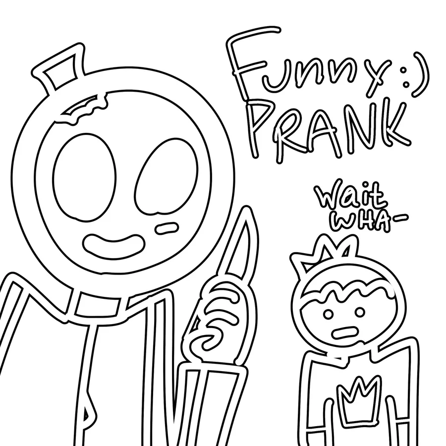
guys today I'm killing all of my friends! let's start with sparks. 😀 It's gonna be a funni prank
f is for fun :)
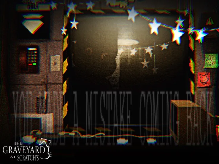
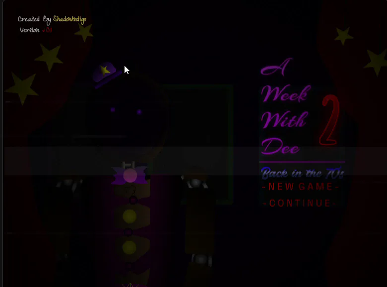
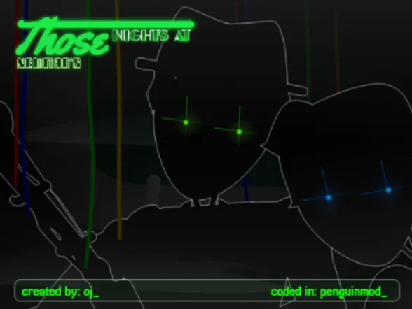
Teaser 1
don't ask
2 comments