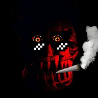
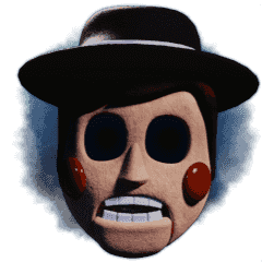
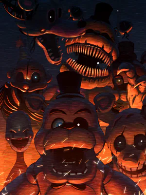
Getting this out of the way The Puppet is the worse one, The Puppet looks like me every time I hop onto the PC to find out that a game has been cancelled to which I cope myself into thinking it's all okay or I don't wanna live anymore which is mood. The rest however are "okay" with Dug, Buster, Lockjaw (design) and Sugar/Kitty being the best ones out of everyone but that's not saying much (although Withered Sugar is lazily done). Bonnie and Freddy are the only ones that have TRTF 3 MU models and it's just the same models but have darker shading and exposed stuff on there body's like wires. I have a problem with TRTF 2 specifically with the fact They all are too "bright" for my taste and imo doesn't fit with TRTF.
To me TRTF is one of those series that is lad back when it comes to it's colors where it's not obnoxiously bright to look at and some games look really nice like some of the screenshots of FRANKBURTS, TRTF 5 and even TRTF 3/4 despite the entire game being that color (3 dark green and 4 dark red). But with the models for TRTF 2 MU 2018 lack that imo, I'm okay with Dug, Buster and the cats because they look like "toy" models and fit that bright look since that makes since, the rest however don't and look stale and jarring to me.
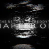
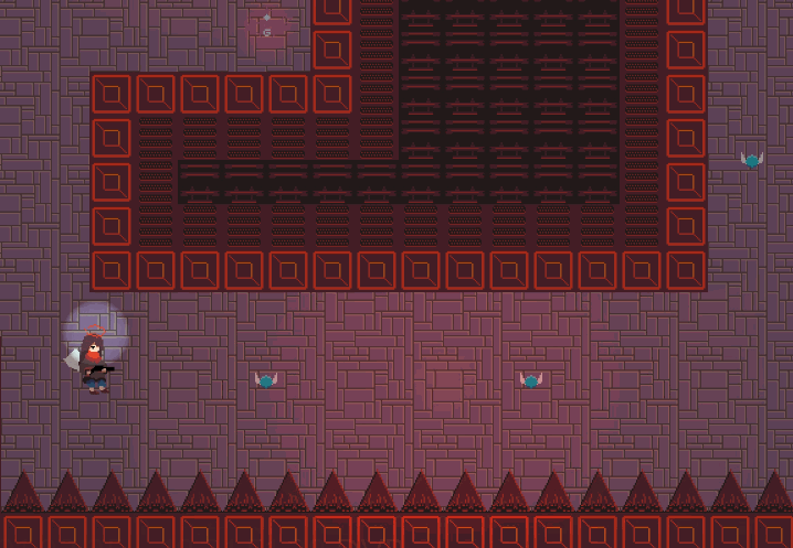
This is a guess on my end and it's prob the case as to why they look like this, take a look at the office that most likely would've been final:

Would you look at that? The office is dark with little to no light and the colors are grounded so they aren't in your face all the damn time, hold on? Why would the office and by chance the location be dark but not the animatronics? Well it might be obvious as to what I'm getting at but in case you haven't picked it up yet I believe they've chosen to what I call "the Ying Yang design", they made "bright" animatronic models to go against the "dark" atmosphere to create a unsettling mix of using the darkness and light to create something where somethings don't belong in the setting there in but it's done by design. If that was the design choice that they wanted to go with then I'll say that it could've worked if the designs themselves weren't scary enough to pull something like this off, The Puppet I talked about already but Chica, Bonnie and both Freddy's are not good designs for this because of how stale they're faces are. Maybe you could get nice posies with Chica and Foxy but both golden and normal Freddy and Bonnie just don't work because they're faces are stuck and can't give good expressions that look scary, the same could be true for some of the others but I'm not sure.
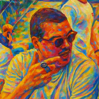
One quick thing is that they prob were gonna do the same but in reverse for TRTF 3, take a look:

It's brighter then the original game but the robot models keep they darkness for the most part, but as I said before it's the same models from TRTF 2 MU but with changes. Still not a big fan of the models but they least they're not so bright that I go blind... which I already am since I ware glasses.
Overall that's all I got to say, if you like the models and stuff then that's great but to me they don't fit with a series where almost everything is depressing, gory and creepy designed animatronics. Have a good one now :)


1 comment