Heya, Rousseau here!  Ever wondered why your map looks too much like the backrooms? Boxy, empty and perhaps you just slapped whatever tile you had in mind for it to look just right? I don't know why but it’s probably because you’re rushing to get your project done or it's just plain ass.
Take this for example, see what's wrong in this map?
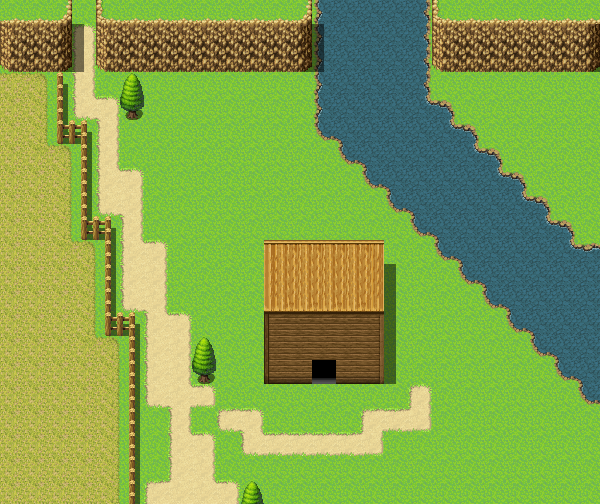
It actually looks... okay for a starter, but let's make it better, shall we? For this tutorial, I'd want the same layout of the map, so we'll use the image above as our little reference... (Of course you can use whatever reference you've got.)
So let's make a scenery...!
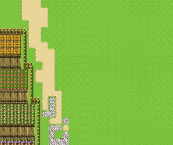
I'd like to show you something. First, we create a pathway to help us plan the area. "Why does the pathway look like that?" you may ask...
If it's made by Nature, it's not meant to be uniform or perfect! On the other hand, the little farm area I've added seems Manmade, so it's fine for it to be uniform!
Moving on - The other side seems to be empty, so let's fix that...
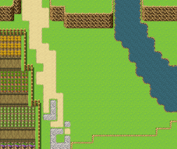
The idea of adding small mountains and waters gives it a nice nature feel, but it still feels off because there are still many more empty spaces, it looks awkward - we may wanna add more to it...
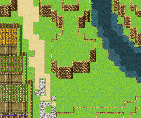
Much better... we give the river a little curve and we can see how deep it is! Along with our new small little mountains giving it some height looks very excellent!
Let's add more life to it then?
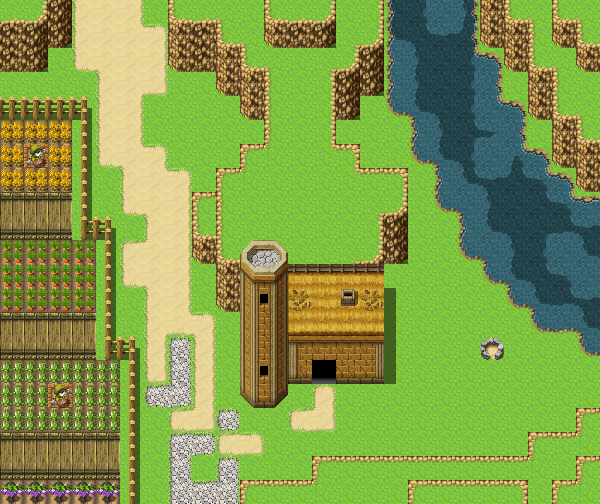
Already seems like we've put much love into nature, speaking of nature, We don't need to change more of the layout but just add the final designs like trees and things that makes it more lively!
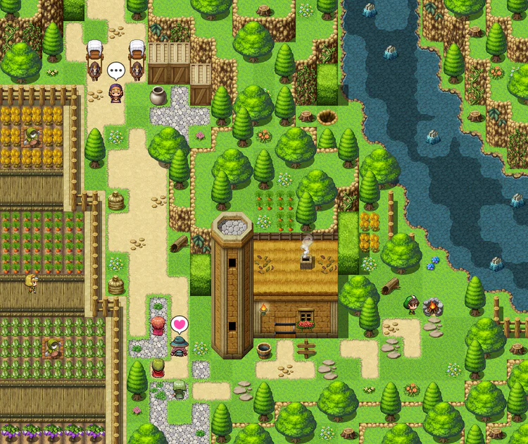
And voila! A simple forest scenery/landscape yet it shows many life (and maybe even love + effort) in just one map! You may add more events like animals roaming around but that itself is good enough, I think this turned out to be amazing!
Hopefully this serves as a good tip, get creative! 
#RPG #RPGMaker #RPGMakerMV #Building #Tutorial #Landscape #Landscapes #Scenery #Mountain #Mountains


















2 comments