
The Evolution of Our Game Jolt Page Header
Welcome to our very first devlog! We wanted to give you a peek behind the scenes at how our Game Jolt page header has evolved over time. This devlog is a bit lackluster, but we hope you'll enjoy it while we work on something more substantial. Let us know your thoughts in the comments!
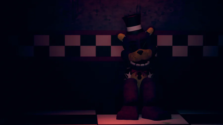
1. The Initial Concept
Our journey began with brainstorming various ideas for the header design. Among the concepts we explored, the first image stood out as our best initial idea. It was inspired by the FNAF 2 Bonnie teaser, however, as promising as it was, we felt it lacked a certain level of polish.
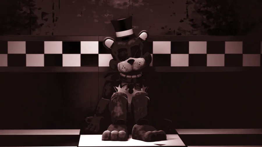
2. Adding Effects and Centering Freddy
To enhance the initial design, we decided to change the lighting and set everything in a single color. We also repositioned Freddy to the center of the image, which improved the overall composition. Despite these changes, something still felt off about the quality.
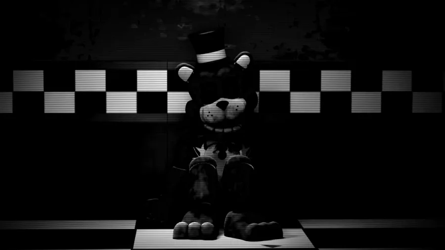
3. Experimenting with Black and White
Personally, I wasn't satisfied with the color palette, so I tried converting the image to black and white. To add a bit more character, I applied a CRT effect, which gave the header a kind of vibe. We felt like it was finally ready for the logo.
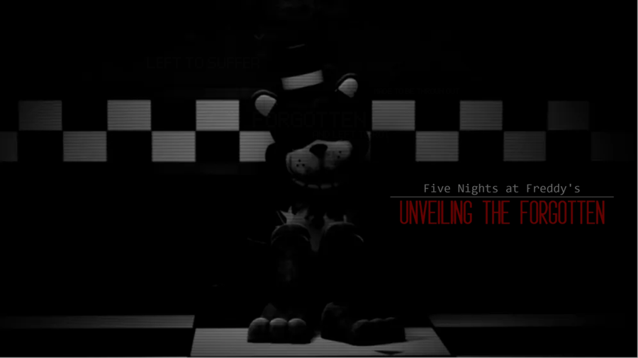
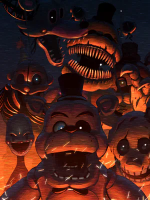
4. Unlocking Potential
Seeing the potential in the black and white design, we experimented with various adjustments like adding the logo etc. After multiple iterations, we landed on a version that felt much cleaner and well-balanced. Not much changed visually but it looks much better.
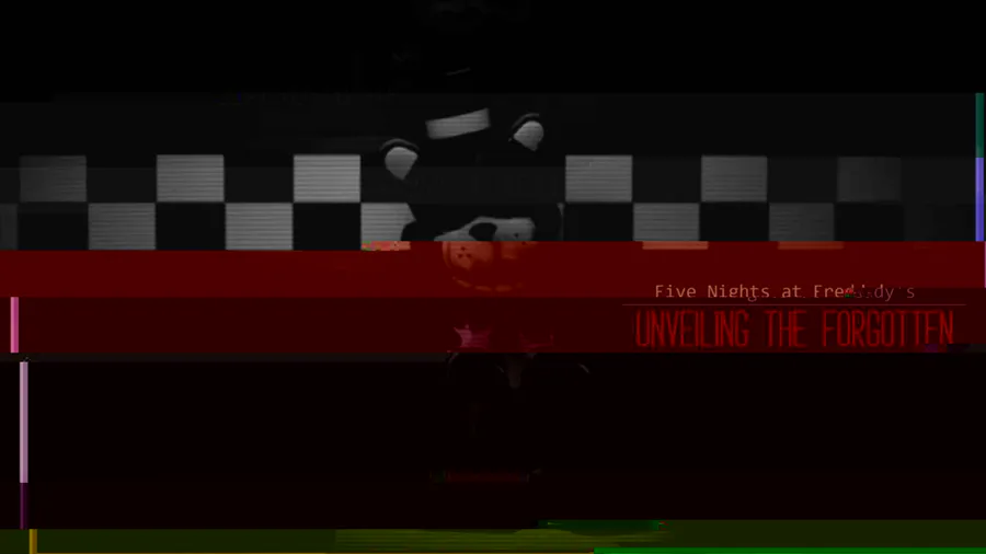
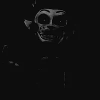
5. Experimenting with Corruption
Though version 4 looked great, I decided to push the it further by corrupting the image. This gave it a unique, distorted feel that we absolutely loved.
In the end, we chose to go with Image 5. It might be a bit unusual, but it resonated with us in a way that felt right.
We'd love to hear your feedback! What do you think about the evolution of our header? Feel free to share your opinions in the comments!


4 comments