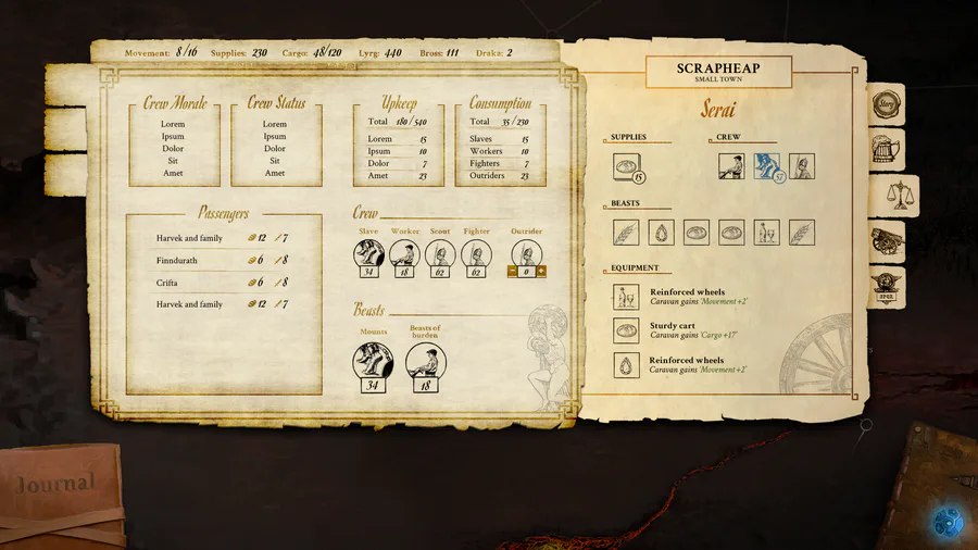
Today’s post takes a short trek down memory lane. Long, long ago, before any of the team at Lost Pilgrims sported grey hairs, we set about creating the UI for the game – an indubitably difficult ask for any game studio. Yet despite any trepidation, we forged forward and created one of the first renditions of Vagrus’s UI.

Even in our humblest beginnings, one can see the marks of a UI that would come to characterize later iterations. From this, our first UI in all its unpolished glory, we would transition to the mansio tab so many know and enjoy today.
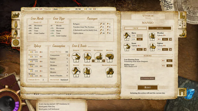
But that would not be enough. We opened Early Access (mostly to patrons) in July of 2020, but in so doing, more iterations of the UI would be needed to account for all of the added complexity.
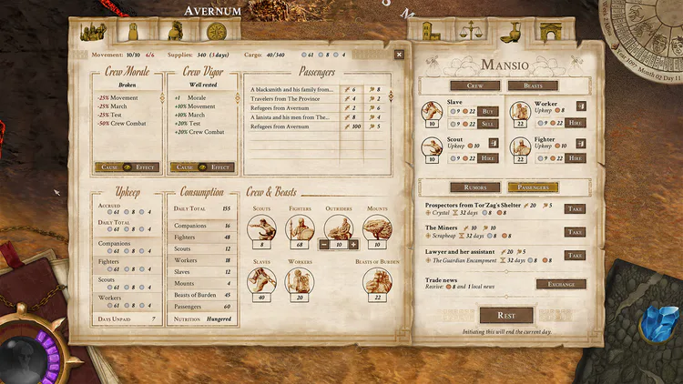
If one looks closely now, one can easily see the trajectory taken. Still, this is not the polished UI many of you know today – we’ve included that below to underscore just how far we’ve come.
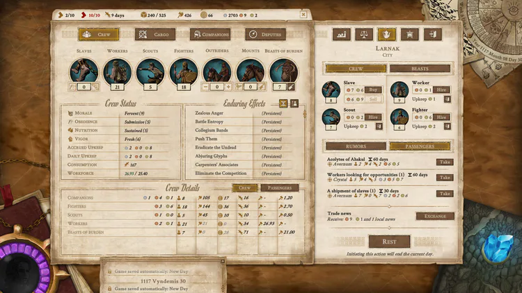
Perhaps most importantly, this stage of the UI took many, many years to get to. And while there will always be room for improvement – especially in a game as complex as Vagrus – we’re happy with how far things have come. We’ve made a lot of changes since release, and we aim to continue iterating upon these.
That’s it for today’s post. In parting, we’ll ask you to do as you always do: stay safe, stay vigilant, and conquer the wasteland!
- The Lost Pilgrims Team
If you like Vagrus, please consider sharing our pages and posts with your friends through your favorite social media channel(s). It is much appreciated!
Steam | GoG | Youtube | Twitter | Facebook | Instagram | Patreon | Discord
0 comments