I’m honestly shocked at how popular this game is. Ugh is (so far) my best received title, quickly catching up to my pet project Starfire’s views, and just recently overtook my shitpost Let That Boy Cook. Ugh was never even intended for release; I just decided to put it up for the sake of calling it “finished”. I worked on this largely by myself (playtester input from others) over the course of 2 weeks.
The whole project was intended to be a space to create a really clean and nice Player object that I could quickly and easily stick into other scenarios.
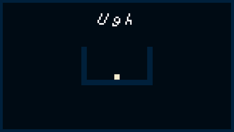
Quite simple, right?
What went Right
The intention went pretty well! To be a little more specific, the concept of intertia for the player went miles in this title. Inertia in this case basically translated to the player sliding around instead of just shifting positions, which for someone who never played pixel perfect platformers, was a weird idea.
One of my playtesters really pushed me into the idea with the release of Let That Boy Cook, which in that case was all about acceleration for the input. I reworked that idea into Ugh’s player and helped give the user a higher sense of control over the player. To be honest I’m not entirely sure how that sense of control comes into it as opposed to having the player immediately stop, but my guess would be that users expect the player to keep moving, as in real life. Replicating that expectation makes the player much more predictable to the human, albeit less predictable to the computer.

(“I have no idea what is going on!” -computer probably)
The second thing that went really REALLY right was the styling. Throughout playtesting I had people telling me that the feedback on the player with respect to walls was lacking, and that there was “a slight lag” between the user jumping and the player jumping. However at the time the color scheme was black+white, with pure red for the death blocks, and there was no sound. I had implemented the particles that happen when the player jumps/slides, but the whole game was mute and colorless. These details may seem unimportant at first glance, and counter-intuitive to the source of a lag based problem. At the time, I was in the same boat. I figured that fixing the “lag” problem was important, but would come later, since it was bound to be an incredibly complicated solution, so I decided to spruce up the game a bunch by adding color and sound.
The color scheme was quick, and in retrospect a lot more powerful than I realized, and the sound was two files that I made in SFXR in all of five minutes. I took it back to my playtesters to see if they liked the sounds, and forgot to mention that I changed literally nothing else. All of them liked it, thought it was crisp and responsive, and thought I had solved the jumping issue. Lesson learned: add sounds and make things look nice.

(same thing, but with sound now!)
Frustration was something that this game became built on towards the end of development, which isn’t saying much in this case, but gave a nice mechanic a good avenue to travel down and really honed the game to what I wanted. The frustration that I wanted to achieve in this game is perfectly demonstrated in this hilarious Let’s Play by TheJJGamer https://www.youtube.com/watch?v=G7_xqnsiWQI. The frustration isn’t a “this is bullshit” but an “I’m an idiot” type of frustration, which is a very important distinction, because it reflects the fairness of the title.
I had been introduced to game fairness over the course of my life, but had never really practiced implementing it until this game. The basic idea is that you can have the game be as hard as you want, so long as the potential failures are all understandable to the user before they are acted on. In other words, the things that make the game hard need to be things that the player can predict and act on. The first obstacle of Ugh is a good example of this: visual feedback through particles shows the players exactly where they were at each step, allowing them to analyze why they failed, and build on it. Having the checkpoint at the same level as the obstacle allows the players to take in the death feedback as slowly as they want.
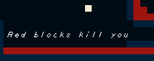
The color scheme strangely adds to this; the player and obstacles blatantly stand out from the rest of the scene without being too painful, and allow the user to quickly identify where important pieces are to the section they are in. Having background elements be blue also added to assisting the player by taking advantage of the fact that blue soothes the user and falls into the background, allowing the user to be maintain the game for longer (a few extra seconds can be all the difference) as well as giving the user a heightened focus on the right pieces.
What Went Wrong
Level design. I’m absolute TRASH at level design. The initial version of the game had the hardest section of the game at the very beginning (right after the leap of faith) and had the horizontal speed section at the very VERY end. Eugh. I really need to work on my level design; specifically introducing the player to concepts, having them play with them a little and understanding the intricacies of that mechanic, and then throwing them at something hard with that mechanic.
Coding is something that I’m still awful at, practically speaking. I can code things and have them work, but to have them work well, and have them work all the time? I can’t do that part so well. Every single release I’ve had has had something that just ruined it in some way or another before the player could even appreciate it. For example, when Ugh was first out, the up arrow scrolled the window as well, making the process altogether frustrating in a way that I did not intend. Thankfully I found a way to fix it rather easily, which helped. There is still a case of horrible lag, and that’s only the one I heard about, which is unsettling. I’m trying to think of what could cause that to happen. What I need to do in the future is hide the page and test the distribution in GJ browser before I do anything else; which should hopefully help with these issues.
To be a little more specific with that, the player movement code is a behemoth mess at the moment, and really is a frankenstein’s monster of a few different methods I’ve seen for code. In the future I need to clean that up and make it more centralized, and hopefully that will make it more efficient/robust.
This game also lacks a menu system, or any sort of true “end”; the timer stops, but the player can still run around and basically repeat the whole game again. In the future, I need to add a more complete experience.
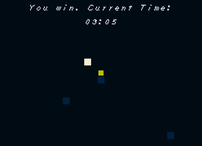
(alright, now what?)
One thing that I think I fucked up but I’m honestly not too sure is the Achievements. Yes! There are achievements. You probably have all of them. I’m honestly not sure. I have all of them and I did not earn all of them. A visual feedback for the achievements would be a good idea, too.
The final thing that I failed at was testing, both unit testing and playtesting towards the end. If I had had someone who knew nothing about the game play it near the end, I could’ve fixed the horrible ramping problem in this game, and made the whole thing much more enjoyable without detracting from the overall difficulty.
Also, I need to get better at marketing. Ugh! I’m so bad at it.



0 comments