Game
Mobile Lacrosse 2017
11 years ago

UI Design


So the first thing I started to do with artwork was the UI. Here’s what I got so far:

5d0c2accdbd28.png

NovaSC stands for Nova Sports Channel, something I came up with on the top of my head. The second gray box is where the time will go, displayed in 00:00 format.

The black boxes are placeholders for team flags for world teams, and logos for local teams. The three gray buttons below them are timeout buttons, and will have yellow circles when timeouts exist. The score will go in between, displayed in standard 0 - 0 format.

That’s the top bar so far, tell me what you think!


0 comments

Loading...

Next up

Chiaki Nanami!

Runestones: from concept to in-game model🗿

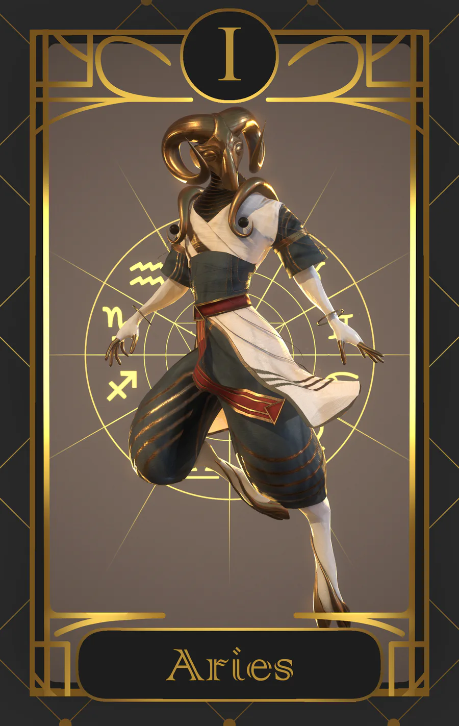
So here's the first of the zodiac signs i will make for the next weeks.

Why walk when you can jump?

An infected room from the second part of Cybel ! Are you up for some cleansing?

Path of Kami, running around the shrine area

We're knee deep in multiple large features and "game feel". Quick peek behind the scenes in this weeks Dev Blog: https://bit.ly/2QmmaQM

Coming Soon...

Some time ago, we posted a screenshot of the Mexico level. A curiosity about it is that, like some other scenarios of the game, it was inspired by a real landscape, The Basaltic Prisms of Santa María Regla. It is one of the natural wonders of the country!

Animation test. Not an actaul conclusion to who wins sonic vs Mario. Just a test animation combo.