This week I revisited the targeting system to see if I could improve the behaviour of it since some testers found it to be a bit too “click needy” (too many clicks).
After various attempts, I decided to go with these steps needed:
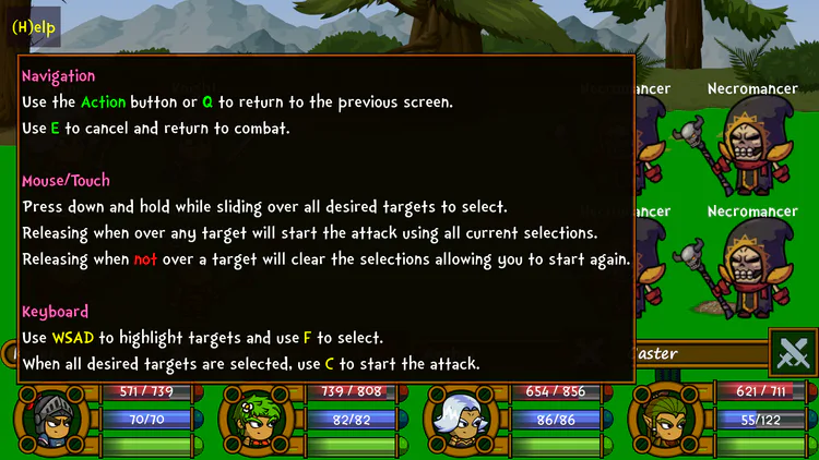
Press down and hold while sliding over all desired targets to select.
Releasing when over any target will start the attack using all current selections.
Releasing when not over a target will clear the selections allowing you to start again.
This has resulted in a smoother flow that I think will continue to work well on both desktop and mobile devices.
With these changes, the UI that previously had several buttons on it, was removed since it was no longer required. I then added a small “Help” button in the top left of the screen for those who might need it.
Here’s a quick screen shot of the help screen:
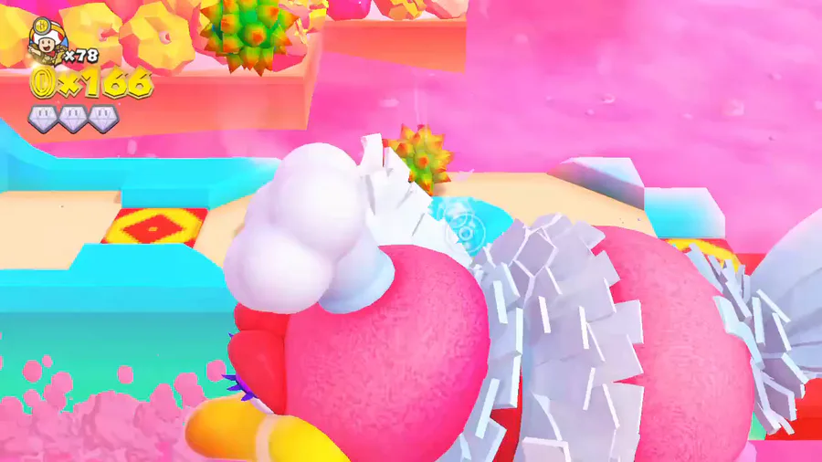
And here’s a really quick video showing the basics:



0 comments