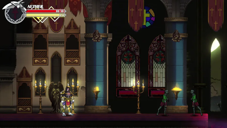
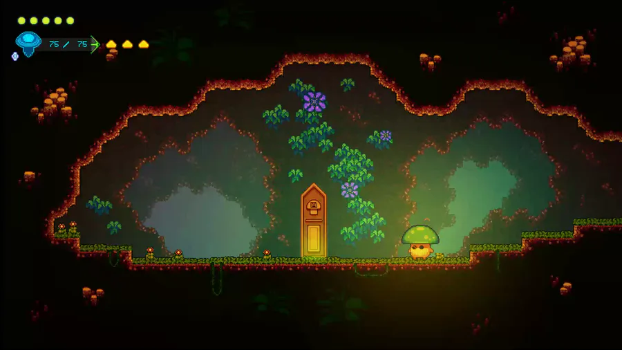
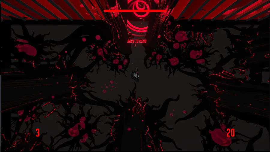
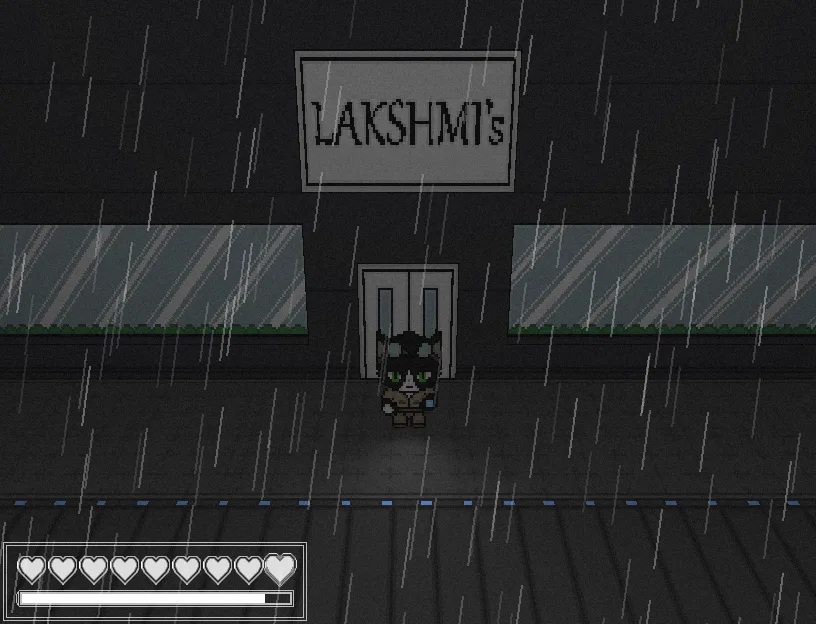
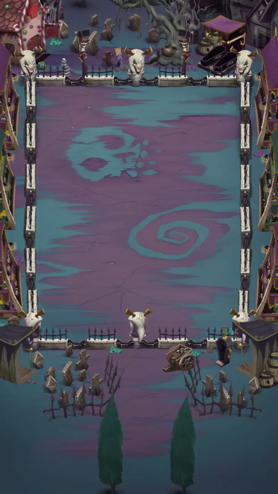
So I just thought about how the game would look, small things but still add to the style of the game. So heres some screenshots that I’d like to hear your opinion of;
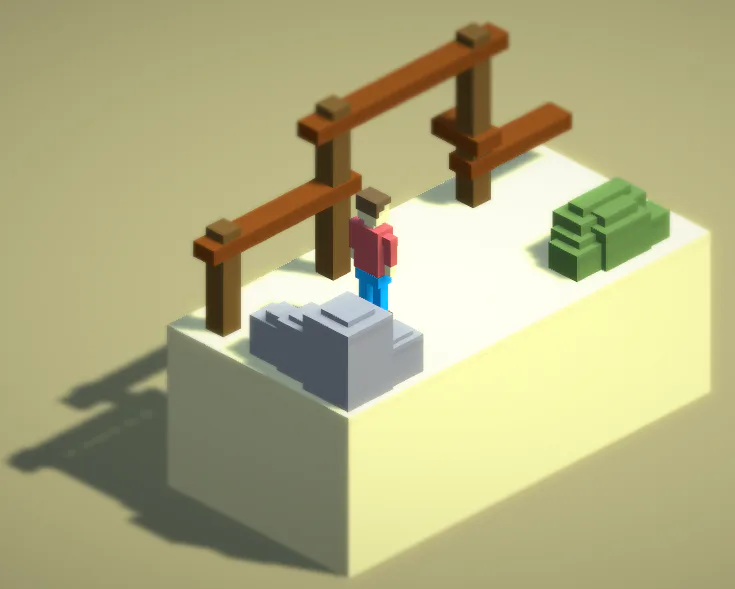
First of all the camera angle.
45 degree angle
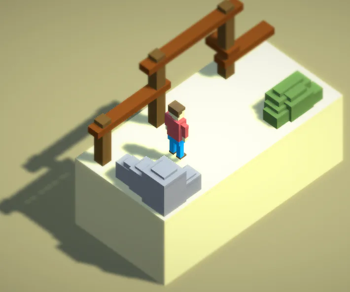
Slighty Lowered view
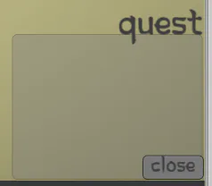
Quest Log Font.
Old style font
Modern Style Font
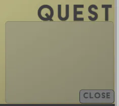
Comment down below what you think looks better :)

13 comments