


Bro, I legit made a line-break and the window went from the bottom of the screen, to the top. Like- we don't need a reply button on top please make stationary on bottom plzzz 🤣

Maybe have a "skip to bottom" button somewhere instead? I'm guessing it's probably meant to be for long threads since scrolling was tedious, but I don't think this is the best solution.
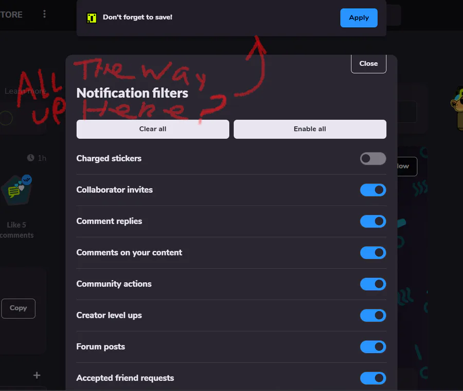
As for saving the notifications filter, this is FAR less fluid than it was before, and this is something I have to do often. I see no benefit to designing it this way, so please turn it back to the way it was, or close to it. 
Thankyou for your time 
Part 2, please check it out (didn't wanna @ you twice lol, but this one shows a video of me describing what I think might be a bug and also giving a little more detail on thoughts)
https://gamejolt.com/p/as-long-as-you-re-working-on-ui-maybe-when-you-re-typing-something-2x2mdivh


12 comments