Game
DarkEdge: Rise of K'thgyar
8 years ago

Comparison


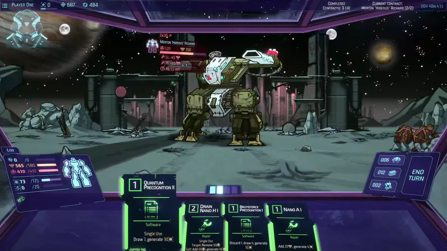
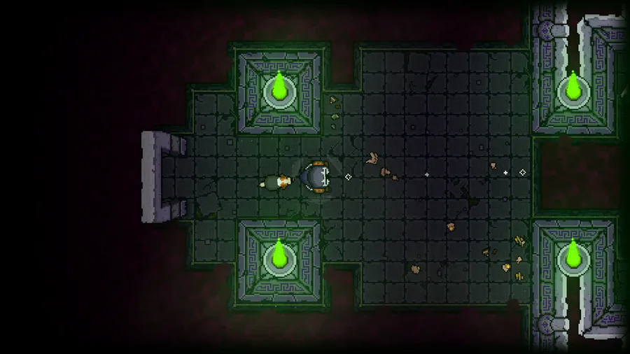
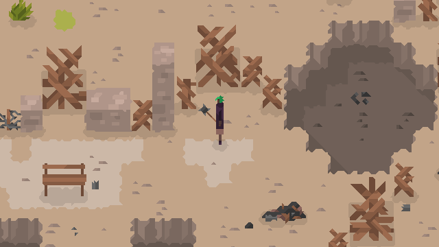
Before I started work on the game, or at least very early in development (pre-sprites) I drew a little mock-up of what the finished project should look like, so I decided I’d post a little comparison of the original mock-up and an actual screencap.
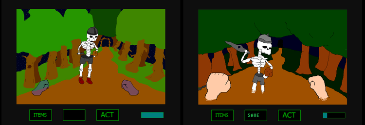
5d0b93c02b90c.png

It actually came out better than the mock-up, in my opinion.


0 comments

Loading...

Next up

Animated GIFs of Enemies

Here's a peaceful little forest scene for this #screenshotsaturday, from the beginning of the game.

🍒Did you like the game? A demo is available for free on Steam.

✌️ Thanks for playing IndieGameiacs!

⚙️ Free Demo: http://bit.ly/UniDuni

📺 Full Video: https://youtu.be/5qEbVXg7GaQ

#steam #uniduni #clops #screenshotsaturday

Another house i made long time ago.

Family band complete!

Sometimes the suction cup get sticky. Small animation I made in Blender after doing my tutorial on picking up/dropping objects in animations. Crate model by jQueary (https://sketchfab.com/3d-models/game-ready-sci-fi-crate-d98deca6…).

Shuiro Haname. #Commission

Commission for @ShuHaname

Spaaaace~

These are background sprites I've created for a game I'm working on at school ^w^ Click on the post to see how the sprites connect. You won't regret it! (personally, I think it's pretty heheh)

Drawn in Piskel using my mouse. Whaddya think?

Who's is this little cutey👸 here? Thanks🙏 for a gorgeous fanart @WheNa! Feel free to share your arts, screenshots, or videos with #playzelter or #zelter hashtags! #pixelart #animating #unity3d #animated #indiegames #unrealengine #animate #conceptart

Coming Soon...