
Hello,
My name is Oliver; I am the user-interface designer for the game Great Ape. My main focus on this project is to create a streamlined user-interface.
I am going to write about the first two weeks spent creating a main menu. I approached this task with a vague idea of how I wanted the main menu to look like. I wanted a style that fit the tone of the game but that was also simplistic.
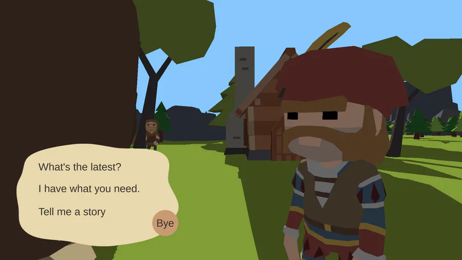
Rulebook
I used a ‘cartoonish’ font to capture the cartoony atmosphere of the game. Making the UI simplistic was as simple as using primitive shapes, specifically rectangles.
These two ‘rules’ makes the foundation of the UI. Using a foundation like this will make sure that the UI is consistent throughout the game.
One major part of my focus point is to create a streamlined user-interface. In other words, the user-interface has to be:
Easy to use
Easy to learn
Natural for the user
Following these rules should produce a streamlined user-interface as the end product… hopefully.
Preparation
After creating the first UI-element I realized that it would not be sustainable to re-create every element again and again. Thankfully Unity have the wonderful feature called prefabs.
I made several UI-elements that I thought would be useful for me and saved them as prefabs. Added bonus with prefabs is that if you change the prefab every instance of that prefabs updates with the changes. Which makes it easy to adjust the UI to our liking.
With a collection of prefabs, I was ready to finally tackle the task at hand, creating the menu.

Examples of elements saved as prefabs
Implementation
The idea was to be efficient with screen space, have everything start from the left and expand out to the right.

First iteration of the main menu
The menu is setup in a way where all the content exists in different windows.
Let’s use the options window as an example.
This window consists of two main elements:
Title
Button holder

The title is simply the title of the window, in this case “Options”.
The button holder is where all the button prefabs go. The holder also has a script which controls the navigation through the menu.
The buttons that go into the button holder are positioned automatically which cuts a lot of work for me. I can easily adjust the menus just by dragging in prefabs to the button holders or rearrange buttons in the hierarchy.
Summary
Adding all the parts together creates a modular UI that can easily be built upon, adjusted or rearranged. It has severely cut the time to create new UI-related content for me and I will most likely use similar practices in future projects.
I think the menu turned out good, I find it is easy to use. But I am the one who made it, I can’t wait to get feedback on it from other users.
For the next blogpost I’ll be writing about the level select screen which is a beast on its own to handle.


0 comments